Journal
Practice & process notes
Occasional writing on my art practice, techniques, process, and the ideas behind the work.
31 articles on realism
November 8, 2023
Then, And Now (Part 5)
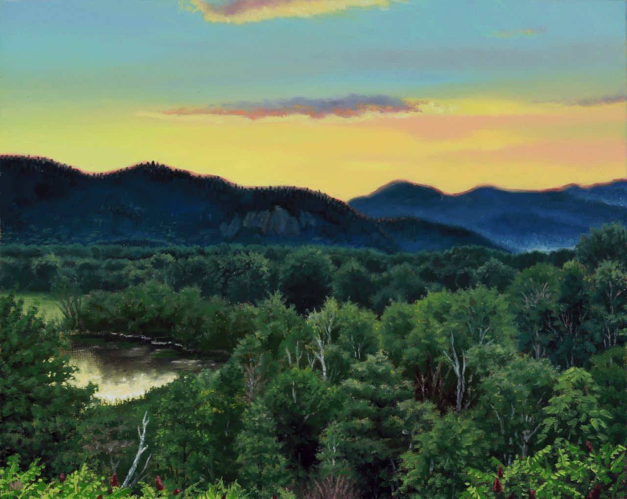
"Then, And Now" or "Then & Now" in the blog search feature, is an ongoing occasional series where themes of progression, time, and memory are explored. "White Mountains Sunset" / Oil on Canvas Panel / 8 x 10 inches / 2023 This painting has an interesting backstory, starting in 2015 when I took an amazing plein air landscape painting workshop in New Hampshire from Thomas Kegler, offered through the Grand Central Atelier. I was brand new to the genre of landscape after having done still life painting for years, and on this evening a sunset painting meetup with renowned landscape painter Erik Koeppel and others was scheduled, which would be my first time ever attempting the extreme challenge of capturing a live sunset in paint. I was thrilled to be painting alongside these legends of the genre and did my best to soak up any knowledge I could while absolutely speed-panic painting my way through a much too short sunset. It was a memorable experience for me and the artistic result was far less important than the practice and mental impressions made. "White Mountains Sunset" / Oil on Canvas Panel / 8 x 10 inches / 2015 As such, I was never happy with the results of my painting and it sat on my studio drying rack since that trip, offering a great memory and calling out faintly to be resolved into a product I can be more happy with. As fate would have it, and I won’t attempt to even speculate why, these past few months was when the random spark of an idea and inspiration finally came to me after 8 years, and I knew it was time to rework this thing. I focused on accuracy this time around, as it had been so long that I was resigned to using photo references from that evening rather than relying on memory, and I always hated how inaccurate the mountains turned out the first time. The rest of the original study was encouragingly accurate to the hazy color diffusion of those moments and the rest of the spatial proportions. I regret losing that hazy pastel color chord in my reworking, which ended up being based on a later stage of the sunset when the forest and mountains had become much darker and cooler, no longer bathed in amber glow. But despite changing its palette and color harmony, I believe it to be a better painting now overall, and feel a sense of closure that this at least won’t be haunting me from the studio wall anymore. Side note: improvement is guaranteed if you just show up and put in the time and effort consistently! So if you’ve been grinding, don’t be afraid to revisit old work when the time finally feels right. Finishing paintings, no matter how long after the fact, allows an artist to learn more lessons and ultimately improve more than abandoning unfinished projects for good.
Read →
September 9, 2023
Summer Plein Air: Chasing The Light
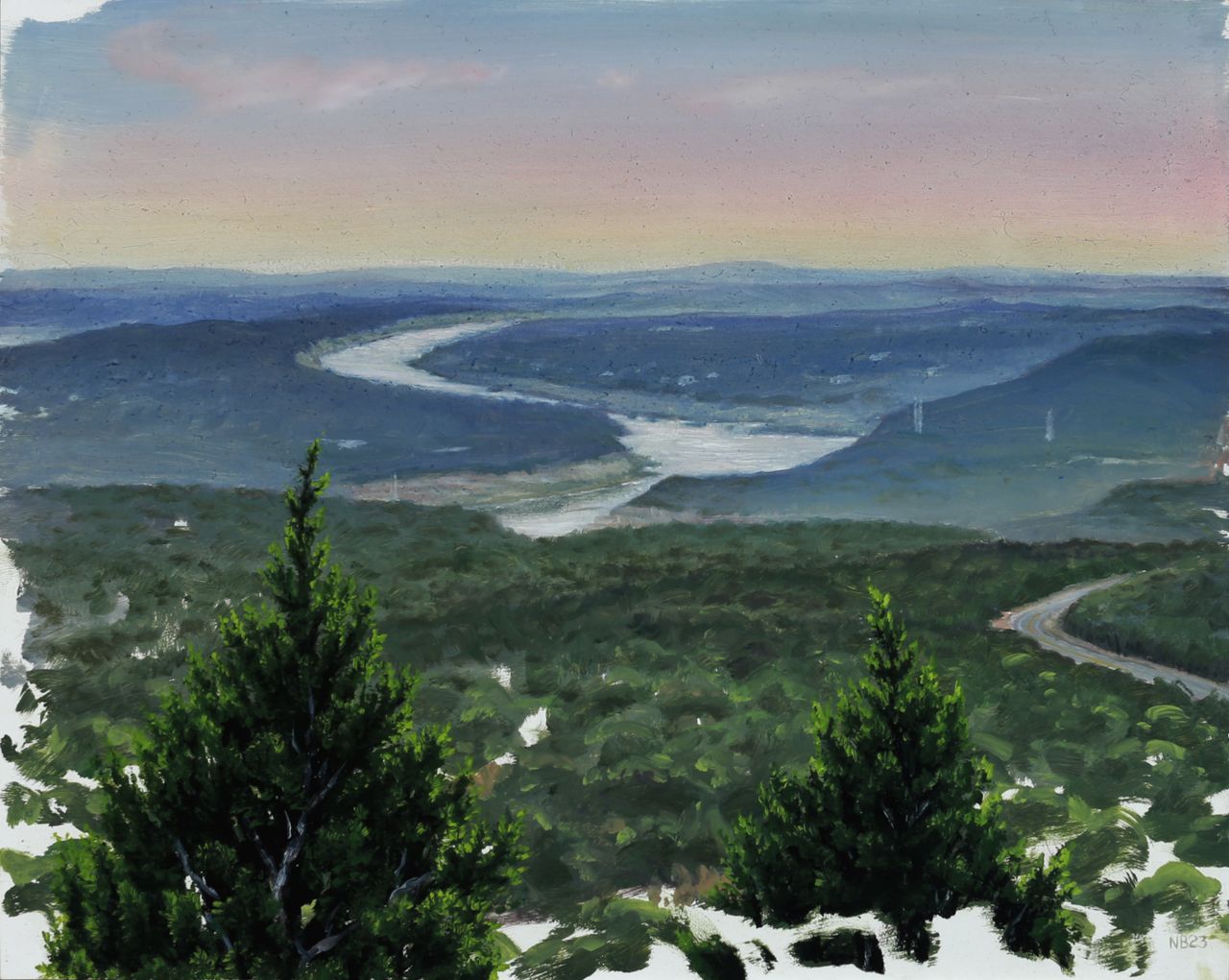
Summer in Texas, where I live and work, is never the best outdoor painting time. Extreme heat and incredibly harsh, searing daylight add degrees of difficulty to the plein air process, to speak nothing of the extra extreme summer of heat we've been having this year. But I did manage to get outdoors and paint a few times lately–thanks to some great friends providing an extra bit of motivation–for a much needed dose of artistic nature time. First was a quick sunset sprint at a local overlook, on a very hot and hazy evening. The air was so thick that the scene looked foggy, and this moisture in the air diffused the dusk light nicely into a wash of pastel hues. I blocked in the basics of the distant river bend for an hour on my 8 x 10 inch panel before the sun disappeared on us, disregarding the slower detailed areas of juniper trees in the extreme foreground. After letting the painting dry for a few days, these were then rendered in a 2 hour studio session along with some pastel glazes in the sky to saturate the sunset effect. "Dusk Over Lago Vista", oil on panel, 8 x 10 inches, 2023 During our next outing, shade was a requirement as it was late morning and the sun was already in full blast, warming up to another triple digit temperature day. We chose a lowland trail snaking alongside a dry creek bed under cover of thick live oak, juniper, hackberry, and pecan trees. Hoping for a small waterfall that feeds into the creek, we soon realized that with our region's severe drought status that was a pipedream, and settled for a little shaded clearing opening up to the dry creek bed next to the trail. The summer death rays of the sun puncturing the canopy created a perfect opportunity for some fun lighting effects–quite the opposite of the previous outing's diffused hazy ones. We painted for approximately 3 hours, in which time I got a thorough block-in of the detailed scene accomplished on another 8 x 10 inch panel, knowing that once again I would spend another 2 hours in the studio after it had dried, completing the effects of light and shadow, warm and cool, with a glaze layer. This level of realist subtlety in atmospheric affects simply is not possible with the alla prima technique of single-session plein air painting, as the optical combination of translucent color sitting on top of opaque color is what creates the more convincing illusion of depth that our eye perceives in a painting. "Dry Creek Bed, River Place", oil on canvas panel, 8 x 10 inches, 2023 When I’m scouting a painting location I’m always looking for a focal point, a primary feature of the environment or lighting that will interest a viewer more than a mere factual recording of a place and time. There are always time constraints imposed on an outdoor painting and sometimes you settle for a mundane scene (without a waterfall...) that needs to be made more interesting by focusing on what the light is doing, emphasizing color or atmosphere beyond what is observed but still within the bounds of convincing realism. That’s what happened here. The serpentine tree shapes were interesting but beyond that, the white hot dappled light on shaded rocks was going to be the real star of the show, with a little coaxing. P.S.– Here's a bonus miniature 5 x 7 inch wave study from a trip to Miami Beach earlier in the summer, completed in the same 2-session manner as the aforementioned pieces. Oil on Panel, 5 x 7 inches, 2023
Read →
March 12, 2020
Recent Painting Progressions
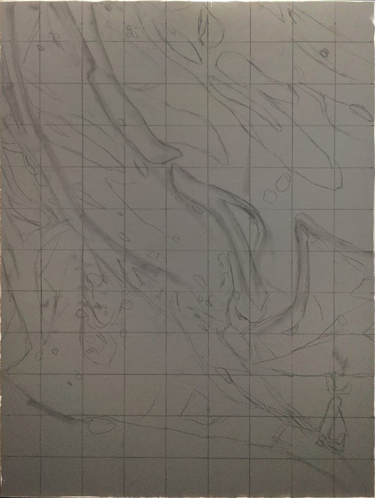
I love process in art–seeing it, knowing how things are made, reverse engineering them, speculatively forward-engineering them, reflecting on my own process and learning from that reflection… so enjoy these progressions of 2 recent paintings. 1. “Vernal Fugue”, oil on panel, 18 x 24, 2019 “Vernal Fugue”, oil on panel, 18 x 24 inches, 2019 “Vernal Fugue” (details) 2. “Civilization”, oil on panel, 36 x 48 inches, 2019-2020 “Civilization”, oil on panel, 36 x 48 inches, 2019-2020
Read →
November 1, 2019
On The Benefits of Drawing
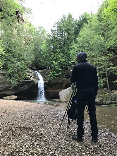
About 10 years ago I leveled up my artistic practice in all areas after discovering the classical atelier system of art education. Before that time I had been piecing together my own slow, winding learning trajectory in the realism painting genre, unintentionally slowing my progression with an over-reliance on photographic reference. In contrast, the atelier system is based on working directly from life, whether it be a live model, a still life, or a landscape. Painting from life in Ohio, 2017 In short, observing directly with one’s own eyes forces the brain and the artist’s hand to convert the 3 dimensions of real life into the 2 dimensions of a flat canvas. Over time our eyes-brain-hand feedback loop becomes seamless, and we learn how to reproduce exactly what we see. The real-time, real life mental calculations of angles, lines, curves, planes, perspective, light and shadow, and millions of color possibilities have a measurable result: if the drawing or painting looks indistinguishable from what we’re observing, then those myriad calculations are overwhelmingly correct. Of course, eventually, an artist needs to learn how, when, and where to diverge from absolute accuracy in order to create a work of art that transcends the mere replication of reality…but the learning process that we submit to in order to reach that point is surprisingly valuable in its own right. “Lower Falls at Old Man’s Cave”, 8x 10 inches, oil on panel, 2017 Arguably the single most important artistic discipline or skill, simple life drawing is actually a fairly complex amalgam of skills, requiring at least a rudimentary working knowledge of geometry, physics, optics, and the ability to plan sequentially. True life drawing begins as little more than primitive map making–the plotting of coordinates in space–and ends ideally with an incredibly nuanced understanding of the physics of form, mass, and light. This great article I stumbled across got me thinking about drawing; what it forces our brains to do, and how it benefits our brains. While intended for the non-artist reader, it makes great cross-disciplinary connections and serves as a nice reminder and motivator for anyone who is an actual practicing artist, of just how valuable drawing is to our art. https://qz.com/quartzy/1381916/drawing-is-the-best-way-to-learn-even-if-youre-no-leonardo-da-vinci/ “Form & Emptiness”, graphite on paper, 2012 Form & Emptiness (detail), graphite on paper, 2012
Read →
May 7, 2017
Blood Rituals: Redux
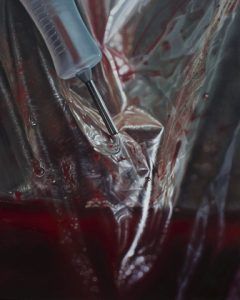
Photoshoots for last year’s Blood Rituals series of still life paintings yielded several interesting macros which did not fit the aesthetic of classical still life that evolved out of my initial brainstorming sessions. I extracted four compositions from these photos, and after perfecting them in the digital darkroom, recreated them as hyperrealist oil paintings. This miniseries pursues a different avenue of exploration of the same subject matter, presenting another aspect of my artistic vision and skill set as a painter. These claustrophobic and intimate closeups border on the abstract, as the complex color patterns of wrinkled plastic bags and condensation covered glass lose their original context of setting and scenery. Within this unfamiliar space, the jarring appearance of blood is a beautiful, rich and vibrant color that makes these compositions pop, while providing symbolic depth. The narrative of what’s happening and why is largely absent from these images–intentionally–as they strive for a disorienting sense of wonder by honoring the genre of true photorealism. Uncanny likeness to the “real” provides an illusion that in turn may open up new ways of perceiving the ordinary, mundane objects of the world around us. Our physical reality contains infinite detail, but to help us move efficiently through the world, our brains eliminate much of what our eyes are capable of perceiving. When given an up close, sustained glimpse of the material complexity we inhabit, the result is often overwhelming, surreal, and disorienting, as our simplified view explodes with new detail. This is the point at which assumptions and certainties are compelled to crumble, opening the intellectual space for new truths to be realized and deeper understanding to form. BLOOD RITUALS: REDUX (untitled), oil on linen panel, 8 x 10 inches, 2016 (untitled), oil on linen panel, 8 x 10 inches, 2016 (untitled), oil on linen panel, 8 x 10 inches, 2016 (untitled), oil on linen panel, 8 x 10 inches, 2017
Read →
January 27, 2017
In The Studio 5: Reworking Plein Air Landscapes
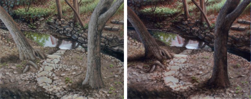
Something I’ve never been a fan of doing is revisiting older paintings after some time has passed. The process of reconstructing or even merely re-approaching the original mindstate, inspiration, and vision for the painting feels spiritually regurgitative in some unclean way. Like digging up a dead issue in a relationship with your partner. I’ve never been one to want to dwell in the past, favoring the pursuit of new goals and the exploration of new territory over the retread of old ground. But since embarking on a landscape painting journey over the past few years I’ve seen some of the masters of the genre doing just this–picking up old plein air studies to breath new life into them, perhaps making them more presentable as a truly finished piece to a buying audience–and had stared at some of my early plein air studies long enough to realize how I too could push the sense of drama or atmosphere in them. View From The Studio, before (L) and after glaze layer. Not to mention, more hours logged in the practice of landscape painting, more hours logged studying weather and outdoor light with more intention and discernment, has had the natural and inevitable effect of expanding my critique ability of what I’ve previously done as well as eased some of my fears about ruining those original results. This shift is the tangible, or at least quantitative, proof that learning is happening–awesome! So in a brief fit of discontented boredom lately I pulled a few early landscapes off the wall and put my glazing knowledge learned from many hours of studio still life painting to use on some formerly alla-prima studies that looked a little flat. Oil glazing truly does replicate the phenomenon of translucent–but not completely transparent–atmosphere that we live in and see through every time we gaze into the distance. Which makes it a perfect tool in the landscape painter’s skillset. For advanced stages of realism in any genre I find it to be absolutely indispensable, and enjoyed the practice of applying it to my new pursuit of landscape painting mastery. A little 4 x 6 inch study of my former backyard bridge, given a more dramatic late afternoon shadow treatment.
Read →
December 26, 2016
Blood Rituals Review, Part 2
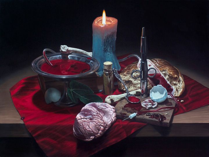
After completing the review of my recent gallery show that I mentioned in my last blog post, staff writer at tattoodo.com Ross Howerton sent me some more in depth questions to learn more about the origins of the series. This interview made it into another stellar review of the exhibit on tattoodo.com, which you can read at the following link: “These insanely realistic still lifes at Sacred Tattoo tap into mankind’s deepest veins.” Source: Nick Baxter Draws Inspiration from His Own Blood | Tattoodo Banquet Of Suffering, oil on panel, 18 x 24 inches, 2016 For even more in-depth commentary that didn’t make it into the article, here is the complete interview: RH: How does working in different mediums, like tattooing and painting, affect you artistically? NB: Each medium feeds off of and informs the other, in a cycle of experimentation and learning that results in a more well-rounded skillset. RH: What is your favorite medium to work in? NB: For pure, unfiltered expression with deep symbolism I prefer painting, but for more illustrative or graphic work, and especially for the collaborative creative process between client and artist, tattoos are a perfect outlet for other aspects of my creativity. RH: As far as painting goes, you seem to have a preference for working in realism; why is that? NB: I love form—the way light illuminates the world we perceive—and I love seeing the illusion of a reality that’s so convincing it can transport your mind into the world of the painting. There’s a subtler aspect of realism that I also enjoy, which occurs with the most convincing pictorial illusions: that brief moment of disorienting wonder, a tiny temporary crack in the veneer of mundane certainty when the viewer who thought they were looking at a photograph realizes that’s not at all what it is. I’ve heard that moment described as the point where “emotional certainties waver, and taste loses its bearings.” I like trying to access that vulnerable place with what I do, I think an artwork can be impactful there. RH: How and why did you first become inspired to use your own blood as a reference point for your oil paintings in Blood Rituals MMXVI? NB: For as long as I can remember I’ve been fascinated by the human body, the medical sciences, and all that’s hidden within us that makes us what we are. Blood in particular is such a powerful and universal symbol of life, and ironically, of death as well. I wrote in my artist statement for the exhibit at Sacred Gallery in New York City that blood “is the liquid life force that feeds our physical vessel, the container of our soul. Its hidden presence sustains us; the breach beyond its borders horrifies us. It plays an ever-present and meaningful role in the human lexicon, as a symbol of love and sacrifice, of familial bond and battle alike, its deep scarlet hue representative of passion and our most powerful, primal urges.” I’ve had my share of exposure to it through routine bloodletting procedures I must undergo for a condition of iron overloading in my blood called Hemochromatosis. Over the years I’ve compiled quite a nice collection of reference material from these sessions, which of course set the creative gears in motion over what to make with it, and eventually the idea of the Blood Rituals series was sparked. Luckily I had the help of my dear phlebotomist friend through this process, and her arm appears in the exhibit’s large centerpiece painting as the only bit of a human figure depicted in the entire series. But one of my primary goals, or hopes, with this series is to use blood imagery and symbolism in a way that doesn’t evoke the shock value of gore or the campiness of the horror genre, and I’m not trying to comment on a specific medical condition or treatment. So I wanted to surround it with unlikely juxtapositions and temper its visual power with an understated classical sensibility. My use of blood-related subject matter has several layers of symbolism, from personal struggle and loss to the brutality inherent in all human civilizations, ancient and modern. I hope these images cut through any immediate reactions of fright or repulsion to access the vulnerable state of emotional freshness or tenderness that lies at the core of all our psyches. The fact that it intersects with my personal life makes blood more powerful for me as subject matter, and I hope some of that translates to the viewer. RH: What was it like doing such an intensive artistic study on your own blood? NB: I had a lot of fun with it. Blood is just fun to paint, because it’s a living liquid that does so many things. Of course it’s visceral and shiny and incredibly vibrant in color, but it also separates, clots, coagulates, dries and cracks, forms bubbles, changes color. It presents so many great artistic possibilities, to say nothing of its powerful symbolic potential. RH: Why did you choose to paint only still lifes for Blood Rituals MMXVI? NB: Still life is my original genre, the one I learned foremost in art school and have the most comfort and familiarity with. I love the other classical genres too though, so I included a small nod to landscapes and figurative work in the series’ large centerpiece mentioned above, called Pull Me Through Time. RH: Do you consider the paintings in Blood Rituals MMXVI as still lifes or self-portraits? NB: Primarily they’re still lifes, as most of the symbolism is impersonal enough to have universal meaning, and many of the arrangements are mysterious enough to invite multiple narratives or interpretations. However, they are all quite intimate to me, carrying personal narratives inspired by certain events and struggles in my life, featuring various objects I’ve collected over the years. And needless to say, the blood I used for reference is me, in a very literal and existential way. One of the paintings is actually intended to be a much more direct reference to the self-portrait, and it’s titled as such. The viewer is invited to interpret the objects as parts of me and the arrangement as representative of my existence. RH: How would you recommend that viewers try to interpret the profound oil paintings in Blood Rituals MMXVI? NB: I love when people viewing my work engage with it deeply enough, and are informed enough generally about visual art, to formulate their own ideas about it. Hearing these is always fascinating to me; they’re like a mirror, reflecting back to me the effects of my visual communication, the aspects of it or elements within it that spoke something to someone. As an artist and a maker of visual communication, I can always learn valuable insights from these. On the other hand, I created this series with a very specific artistic vision and a premeditated intention, and with that comes the desire for people to engage with the images from a certain mindset. There are layers of symbolism and art-historical references that some viewers probably wouldn’t know how to decode without some prompting, so I included the artist statement quoted above with the exhibition, for those curious to know where I’m coming from. Aside from the statement, when a viewer sees the gallery show, I’d feel like the works achieved their aim if that viewer felt a quiet somber darkness, and the existential sadness of loss, which is something all the paintings depict in one form or another. The blood is lost from the body, the weathered shelves and rusted metal have lost their former shine, the skulls and various bones, the wilted flowers, the tattered books—all have lost. But all still remain. I imagine viewers perhaps also piecing together a loose semblance of a story being told by the remnants of some mysterious recent event—the artifacts left behind in the form of a still life arrangement. But I don’t need them necessarily to feel what I feel, or anything in particular, I just hope that they feel something. RH: Just to give us a sense of the symbolism behind your still lifes, what meaning do you intend a piece like “Banquet of Suffering” to convey? NB: Speaking of stories, I wrote a short parable about that particular piece, as an accompaniment to a future publishing of the series in book form: “In a world much like ours, there was a race of conquerors who spread death far and wide to finance their empire. They drained all the land of its lifeblood to hoard it for themselves and hunted those who dared oppose, a once vibrant population now reduced to a grizzled band of vagabonds and scavengers. One autumn eve, as frost turned the last of the green to black and night descended, this race of false heirophants and infant gods and gluttons gathered for a feast to celebrate their conquest. Drunk with power, intoxicated by greed, they gorged themselves deep into the night. Grown soft in their decadence, gloating in their spoils, they grew accustomed to the dark–indeed, foolishly thought their revelry would never end. But eventually the morning did come, as it always does. In the cool dawn, scavengers found the remnants of depraved merriment: a candle still burning, blood still fresh in silver bowls, chunks of bread and flesh as if frozen in mid-bite. They ate from the scraps and sipped cautiously, weary and watching for their vanished oppressors. As the rising sun revealed the murky depths of the banquet hall, they saw the bloated corpses, and realized with sudden relief that they were safe: the conquerors had gorged themselves to death.” RH: Do you have a favorite painting from Blood Rituals MMXVI and why? NB: I don’t have a favorite. I think some are more successful on an artistic level than others, in terms of vision and execution, but this is just a technical self-critique. Each piece carries its own particular meaning for me, and the process of developing each into its final form contains a series of memories, problem solving, and minor struggles, so they are all important and meaningful to me in unique ways. RH: What draws you to painting landscapes? NB: I’ve always been a nature lover, plain and simple, with an explorer’s urge instilled in me by my father, to adventure in the lesser-traveled and wild places of this planet. I’ve been determined lately to combine this with my artistic passion, so painting landscapes is a natural fusion of two important parts of myself. I especially enjoy the raw directness of plein air painting, which is an old term meaning on location, out in the elements. It’s a great counterpart to my controlled finesse process of studio painting. RH: As a painter and tattooist, who and what are some of your greatest influences? NB: Classical realism painters from antiquity and modern times, photorealism and its various offshoots beginning in the 60’s and 70’s, and too many other genres, periods, muses, artists, and amazing tattooers to name. I’m lucky to call some of them friends and colleagues. RH: Do you have any other art projects currently in progress and, if so, what? NB: For now, I’m just continuing to paint a few more related still life ideas that couldn’t make the gallery show deadline, as well as attempting some more complex and larger scale landscapes. Additionally, I ended up culling a few pieces from the Blood Rituals series in order to keep the desired aesthetic and narrative intact, as a few of them veered into pure photorealism and lost touch with classical still life. In the future those outcasts will form their own offshoot series, since I love photorealism just as much as I love classical realism, and they turned out just as good as the ones that made it into the series.
Read →
June 16, 2016
Anatomical Study from Cadavers
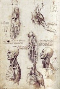
One major artistic discipline for which I have the least formal study is anatomy. I find the human figure and its underlying structures infinitely challenging in all of the complex shapes, sizes and movements they’re capable of. I’ve logged many hours of figure drawing practice from live models as well as a few painting sessions but never have had the opportunity for long term, in-depth study, starting from the inside out. Which is why I jump at the chance for any opportunity to briefly work on this artistic area, and recently was given a rare and unique invitation to observe and paint a cadaver dissection at a local training facility for medical school and EMS students. Knowing about the rich artistic tradition of anatomical study from cadavers, which began in earnest during the Renaissance in Europe, I was thrilled to uphold and carry forward this practice as a contemporary artist. In recent times the tradition has mostly faded, and I relish the privilege I was given for a day to revive it and link my artistic practice to that of the old masters and forefathers of modern Western art, like Da Vinci, Michelangelo, and Titian, among others. Leonardo Da Vinci, Studies of the Shoulder and Neck, c. 1509-1510 Which isn’t to say that I regard myself to be in their rarified company in any way whatsoever, especially artistically. My accomplishments and artwork are quite meager in comparison with their mastery and all they left us with. What I mean is that, they started and passed on a beautiful tradition of deep artistic study melded with science–a tradition that I, in some small way, have been able to carry on, by practicing in a similar manner. This day of training, although completely fascinating and enthralling, was not easy. We were set up in an examination room kept around the temperature of a refrigerator, due to, of course, the presence of a draped cadaver in the center of the room. Needless to say, these temperatures are difficult to be in for long periods of time without a lot of physical activity to keep one’s blood flowing and core temperature at a comfortable level. So after a while, painting with cold stiff fingers and shivering chest became the biggest challenge…and amusingly, allowed me to relate in a strange way to the severed and dissected arm of the cadaver perched on a crumpled medical drape in front of me, cold and stiff in its own way. After observing the technician peel back the layers of skin and fascia on the forearm, all the while listening intently to his explanations of the detailed anatomy and its functioning, my friend James and I then watched in amazement as the arm was severed at the shoulder joint (quite easily) from its cadaver, and placed before us for further study. I gloved up and made a pleasing arrangement with it, and then got to work for a short hour and a half oil sketching session. Here’s the final result of an amazing day of learning and painting: Study of an Arm, oil on panel, 9 x 12 inches, 2016
Read →
March 3, 2016
Notes & Advice 11
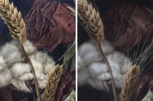
The popular text message shorthand TMI, as most of us growing up in the cell phone era know, means “too much information.” Normally not a good thing–except when it comes to my realism oil painting strategy. To be specific, I find it useful to paint as much information as possible in the beginning stages and opaque layers of my photorealist paintings, so that I can pick and choose where to obscure it during the final (semi-transparent) glazing layers. There’s perhaps a bit of inefficiency involved in this approach, but it allows for a more organic development process overall, and a greater degree of control during the final artistic choices of what to emphasize or subordinate into shadow. “Dying In America” (detail). Before and after the final shadow glazes. Note the subtle loss of detail/information in the rose petals. The human eye is capable of seeing every detail of any given view, but the brain, our computer processor of sorts, is wired for efficiency and baseline survival, and as such is instinctively tuned to only allow us to focus on what is most important in any given view. Details and countless bits and pieces of any scene get stitched together from memory, assumption, and expectation, while a vast majority of the remaining minutiae are simply discarded as inessential to whatever task is at hand. Some of my favorite realism artists were masters of this concept, knowing exactly what to emphasize or subdue in order to pull the viewers attention towards their focus and tug at their heartstrings with an effective narrative or use of symbolism. Notice in John Singer Sargent’s portraits how little attention was paid to large areas of dress, allowing inessential areas to become black or brown silhouettes with no detail. He created a hierarchy of importance within the picture that mimics the way our brains naturally function, using the aforementioned technique to subordinate certain areas. John Singer Sargent. “Madame X (Madame Pierre Gautreau),” 1884, oil. The dress and background, which comprise nearly all of the painting, are almost entirely flat areas of dark valu Andrew Wyath used the technique of reserve just as brilliantly towards the goal of depicting scenic vistas and landscapes with a completely lifelike–yet surprisingly graphic and simplistic–appearance, setting the often somber and peaceful mood with just enough detail to draw us in and keep us looking. Andrew Wyeth. “Sea Boots,” 1976, tempera. Details in the boots and foreground tempered with the geometric simplicity of everything in the top half of the composition. Andrew Wyeth. “Barracoon,” 1976, tempera. Just enough accurate rendering in the figure and folds in the fabric, juxtaposed with large open fields of color and diffused texture. And so I too try to keep the artistic concepts of hierarchy, subordination, and reserve in mind while envisioning my final result, with the goal of creating a visually appealing image, rather than chaotic overload containing a factually truthful amount of information, yet lacking cohesion and harmony. I think these concepts become especially important when painting anything approaching the photorealism genre. Micro details are common and often necessary to complete the desired illusion in this style of painting, and yet conversely, a closed-minded and strict devotion to every detail of one’s photo reference or still life arrangement can result in a less aesthetically pleasing work of art. “Dying In America” (detail). Visual information, as with most things in life, can in fact become too much of a good thing. To make sure I hit my desired sweet spot on the information spectrum, I’m not afraid to paint more detail than will ultimately be needed, only to lose it in deep, rich, believable shadows. The most effective of these shadows will still contain the faintest traces of the details underneath, yet not so much detail as to clutter and distract from my desired focal point. “Dying In America,” 2015, oil on linen panel.
Read →
April 26, 2015
Singularity
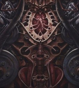
Singularity, oil on canvas, 18 x 20 inches, 2014-15 Here’s the recently completed work mentioned in my last blog post. Mankind’s increasingly intimate yet perilous relationship with technology and machines is the idea I’m working with here, and would like to explore further… Realized with influence from creative sources such as Ray Kurzweil Michel Foucault (“biopower”) Neill Blomkamp Guy DeBord H.R. Giger Terminator © franchise Metal and Industrial music Postmodern alienation Medical-industrial complex That’s all for now, but more soon!
Read →
February 24, 2015
In The Studio 4
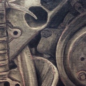
After an awkward and disconcerting hiatus from regular painting while my new studio space was being built and furnished, I’ve been fortunate enough to spend the past month back at the easel on a regular basis. I’ve been working on a half-finished painting that was begun after its original spark of inspiration occurred during the early summer months of 2014. It was then picked at sporadically through the fall and left dormant in winter, until finally undergoing the last push toward completion in the past few weeks. Occasional and intermittent work on a serious and challenging painting is one of my least favorite phenomena. On the contrary, steady and regular progress on a painting keeps the spindly and often ephemeral thread of inspiration intact long enough to keep the nipping dogs of self-doubt and overquestioning at bay. So now I have uncertainties about some of the choices made in the progression of this painting, but done is done. I’d love to carry on the themes and subject matter of this one into future related works, though. We’ll see how that pans out. So many ideas and images in my head…so little of it turns into a physical object in this shared reality. Here are some progress shots from last year and this month. The completed piece will be unveiled soon, after I hopefully think of a title. Grisaille. Color block-in. Applying splatter texture to the block-in. Building up rust textures. Adding fine details and highlights before the final shadow glazes are applied.
Read →
July 15, 2014
Notes & Advice 9
“If you wish to make certain your painting will succeed, a minimum of three things must come from you–and only you. The first thing is knowing why you want to paint your subject, the second is an analytical grasp of what you see, and the third is the skill to control the process of painting.” – Richard Schmid This quote I recently came across, written by a wise and very accomplished alla prima realism painter, got me thinking about the underlying structure that comprises the task of creating art. Schmid divides this structure nicely into 3 primary, foundational elements. This striking simplicity belies the complexity inherent in most forms of art, especially realism, and that simplicity bodes well for artists and laypersons alike–the so-called “uncreative” types, those who mistakenly regard themselves as “not having an artistic bone in my body.” Here’s my interpretation of Richard Schmid’s quote, expounding on his 3 main tenets and how they (encouragingly) apply to everyone: “Knowing why you want to paint your subject” refers to concept and theory. In other words, the philosophical side of the craft, the ideas and meaning the artist is working with or wishes to communicate through their work (I’ve written a lot about this here and here, with a future post coming as well). This relates to the study of your own mind, to “knowing thyself” and formulating ideas about life and the world around you. I believe that everyone has ideas about themselves and the world around them, because our living brains naturally and instinctively generate thoughts, and we can always translate those thoughts into words and images. “An analytical grasp of what you see” refers to active observation: true “seeing” rather than merely “looking.” Seeing is active analyzation of visual information, whereas looking is passive receiving of visual stimuli. And of course, all but the visually impaired can train their minds and eyes to work in concert, to more deeply understand the structures and lighting of the physical world, in order to convincingly reproduce them on paper or canvas. “The skill to control the process of painting” refers to technique, achieved through practice and repetition, like army boot camp or working out at the gym. Skill and control in painting depend on hand-eye coordination and mastery of materials, i.e. knowing which pigments are transparent or opaque, which mediums to thin your paint with in order to make it do a specific thing, which brushes produce certain effects when combined with specific hand motions, etc. Anyone can train their physical body to remember certain tasks and movements like those involved in painting, even those who don’t consider themselves to be artists. It just depends on one’s level of motivation and available time.
Read →
February 11, 2014
Shenpa II
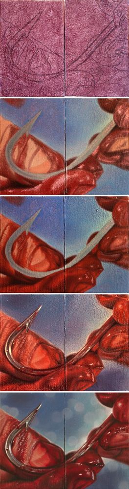
Here’s a process sequence for a tiny diptych painting I did a few months ago related to the recurring theme in my work of healing wounds. Tinted panel with drawing, color block-in, building detail, adding final glazes and highlights, and finished painting. This tiny little pair will be included in the forthcoming art catalogue Pint Size Paintings Volume 2, which compiles these small paintings completed by members of the worldwide tattoo community, and features them in a traveling art show. Shenpa II (Toward Healing), oil on panels, 4 x 3 inches (diptych), 2013 I wrote about the Tibetan Buddhist symbolism surrounding my use of the hook symbol last year, after completing Shenpa I (which now resides in the collection of the amazing and prolific figurative painter Shawn Barber!). Shenpa (Toward Healing), oil on panel, 11 x 14 inches, 2013
Read →
December 26, 2013
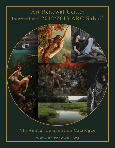
9th International 2012-2013 ARC Salon Catalog
I’m very honored to be featured for the second straight year in the Art Renewal Center’s annual juried catalog! This year’s book features my painting “Anointing” on page 61, selected for the figurative category. Regarding the annual Salon, the ARC website states: “With an approximate 2000 entries this year by over 850 artists, the competition was steeper then ever. Even with an additional category, and expanding our finalist cut up to the top 600 entries, the finalists only include the top 30% of works submitted.” One of the best and largest surveys of contemporary realism art executed in the traditional mediums, this year’s salon catalog is now available for sale here. Anointing, oil on panel, 24 x 24 inches, 2012
Read →
November 14, 2013
Notes & Advice 6
I came across this quote today by a plein air pastel artist, and found it to be a perfect description for the process of realism painting. In my own work, time and again, I find I need to come back to basics in order to accurately portray the form and mass of an object or the atmosphere of a scene–to see things simply, before choosing to add complexity and detail. The ongoing challenge that all of us who undertake the realist genre have is depicting the true, unmistakable essence of an object or scene without being a slave to reference or the infinite detail of reality. When we manage to accomplish this tightrope walk, we create an illusion that ironically seems more real than reality, in turn creating a sense of awe and wonder in the viewer. Simplify the Scene by Richard McKinley “Because light changes, it’s important to work with efficiency and power when you’re working en plein air. Detail is not an artist’s friend; it’s easy to believe it holds the answers, but in fact it becomes the diversion. Simplifying what you see is a necessity. Remember, it isn’t individual blades of grass that make the field rise and fall across the landscape. “Without light, we see nothing, so light falling on form is the key to communicating what we see. It’s by arranging shapes and creating the form that you represent the scene to the viewer. Your goal isn’t to create a painting that’s polished and finessed, but rather to capture the essence of the light and the magic that captured your attention in the first place. “Ever since the arrival of photography, artists have had to fight the urge to see it as the master of what is real. There’s no doubt that photography, used carefully, is a valuable tool. What limits its usefulness is the belief that it can’t tell a lie. That can prejudice your thoughts more than you realize. Try to imagine what artists thought the world looked like two hundred years ago. It’s difficult to do when you’ve never known a time without the printed picture as a part of your consciousness. “When you take photos back to the studio to use as reference, be sure to ask yourself: What is it that the camera won’t capture? That’s what you want to infuse into the painting.”
Read →

August 13, 2013
IGOR at 1261
I just shipped out my painting “Dying In America” to Gallery 1261 in Denver, for the 11th annual International Guild of Realism juried exhibition, mentioned in my last blog post. My painting is for sale and available through the gallery for the duration of the exhibit, so please contact them with inquiries. I had a chance to check out the online preview of the entire show and WOW, it’s full of nothing but mesmerizing realism in representational art. It is a stunning representation of classical painting and drawing technique, that as you will see here, is still very much alive and well today. I am honored and humbled to be included. I won’t be able to attend the opening reception or see the show in person but if you’re in that area of the country, do yourself a favor and have a look. Digital and printed reproductions of this genre of art, and especially the oil painting medium in particular, do absolutely zero justice to the live experience of the paint’s luminosity and depth. “Dying In America,” 5 x 14 inches, 2015, oil on linen panel. Also, check out my recent technique blog post about this painting.
Read →
August 1, 2013
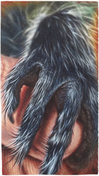
Invocation Of Trust
Invocation Of Trust, oil on panel, 4.5 x 8 inches, 2013 Here’s a recent piece I completed for submission to an upcoming charity art exhibit at The Egan Gallery in Fullerton, California, curated by friend and fellow artist Cody Raiza who is a passionate animal welfare activist. This tiny painting was inspired by events this summer at my house in Austin Texas involving the rescue of 2 baby raccoons from a rain catchment bin in my backyard by my partner and I. These two little fuzzballs, normally capable of being quite ferocious, were reduced to feeble, trembling snugglebugs by their traumatic night spent flailing and trying not to drown. They instantly grasped and climbed my extended arms seeking warmth and comfort, and stole our animal-loving hearts in the short time before we entrusted them to the care of an area wildlife rehabilitation center. Of course, never one to miss any artistic photo-op, I snapped away with my iPhone camera and ended up with some gorgeous, heartwarming shots, which after the usual in-phone editing, made their way first to Instagram *, and then to the easel when I realized they were perfectly suited to the theme of this upcoming art show. Edited reference photo from my Instagram account. Here’s the evolution of this image, which just as the title declares, was intended as an invocation of trust in my life, to overcome barriers of fear and isolation, and to elicit sacred tender moments of unity between humans, other beings, all life. Pencil transfer drawing and Grisaille, followed by color block-in and 2-3 layers of color adjustment and glazing. (*This is the first time I’ve painted an image originally intended solely for my Instagram gallery…not sure how I feel about that. I routinely attempt to post content there which is reminiscent of my paintings, and certainly aligned closely with my overall artistic aesthetic, often self-critiquing them afterwards as if they were paintings…but I really despise the over-saturation and cultural-race-to-the-bottom of social media, despite my own degree of participation in it. I’m curious to see how the Ig creative outlet will affect my art in general. To be continued…)
Read →
May 5, 2013
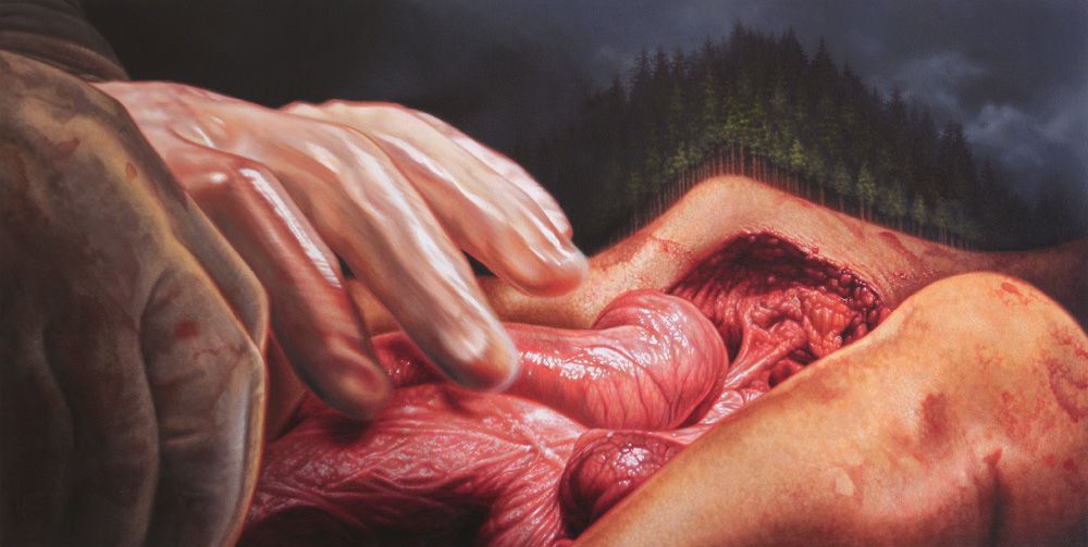
Transfiguration
Here’s my newest painting in The Apostasy series, in progress since early March and finally completed this week: Transfiguration, oil on panel, 48 x 24 in, 2013 The Transhumanist agenda: Raze the wilderness, extract and exploit, leave nature gutted, concentrate populations in urban cages, destroy their mind and body sovereignty, keep them atomized, drugged, distracted and entertained, parade the false hope of technological salvation, take absolutely everything, repeat, repeat, repeat… Here are some detail shots: Stay tuned for another post soon with process photos spanning start to finish.
Read →
May 1, 2013
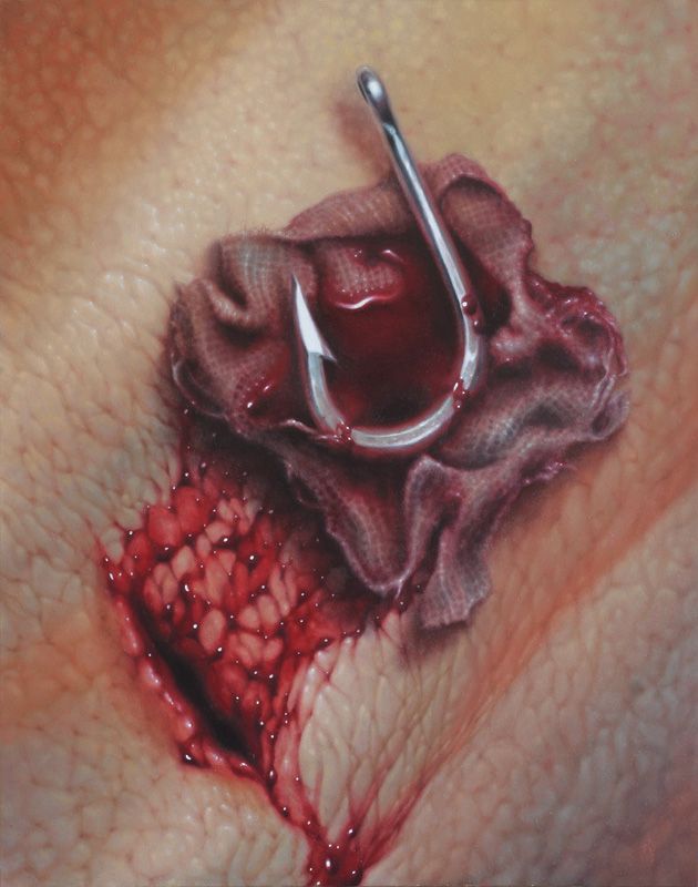
Shenpa (Towards Healing)
My newest completed painting originated out of the photo shoots I conducted for my 2010 series Rebuilding. The image of extracted hook with bloody gauze rag was leftover reference from that time, a powerful symbol I had always wanted to paint but ran out of time before the exhibition was to occur at Last Rites Gallery in February of 2010. Searching for an idea to paint before embarking on a recent trip to New Mexico, I came across this reference photo and decided the time was finally right to complete the artistic thought. New Mexico feels like a healing place to me; its nickname “the land of enchantment” rings true in the way my mind and emotions feel whenever I visit. Happily, it turned out to be the perfect place to manifest this painting based on an ancient Tibetan teaching related to emotional and spiritual healing (especially having the good fortune of working on it while staying in my dream home! ). One of my favorite writers Pema Chodron has studied this teaching extensively, offering a very clear modern interpretation: The usual translation of the word shenpa is attachment. If you were to look it up in a Tibetan dictionary, you would find that the definition was attachment. But the word “attachment” absolutely doesn’t get at what it is. Dzigar Kongtrul said not to use that translation because it’s incomplete, and it doesn’t touch the magnitude of shenpa and the effect that it has on us. If I were translating shenpa it would be very hard to find a word, but I’m going to give you a few. One word might be hooked. How we get hooked. Here is an everyday example of shenpa. Somebody says a mean word to you and then something in you tightens— that’s the shenpa. Then it starts to spiral into low self-esteem, or blaming them, or anger at them, denigrating yourself. And maybe if you have strong addictions, you just go right for your addiction to cover over the bad feeling that arose when that person said that mean word to you. This is a mean word that gets you, hooks you. Another mean word may not affect you but we’re talking about where it touches that sore place— that’s a shenpa. Someone criticizes you—they criticize your work, they criticize your appearance, they criticize your child— and, shenpa: almost co-arising. That’s why I think this shenpa is really such a helpful teaching. It’s the tightening, it’s the urge… it’s this drive, too. This drive. It really shows you that you have lots of addictions, that we all have addictions. There’s this background static of slight unease, or maybe fidgetiness, or restlessness, or boredom. And so, we begin to use things to try to get some kind of relief from that unease. Something like food, or alcohol, or drugs, or sex, or working, or shopping, or whatever we do, which, perhaps in moderation would be very delightful—like eating, enjoying your food. In fact, in moderation there’s this deep appreciation of the taste, of the good fortune to have this in your life. But these things become imbued with an addictive quality because we empower them with the idea that they will bring us comfort. They will remove this unease. We never get at the root…. The root in this case is that we have to really experience unease. We have to experience the itch. We have to experience the shenpa and then not act it out. [Chodron, Pema. “The Shenpa Syndrome: Learning To Stay.” Shambhala.org. Shambhala International, Sept. 2002. Web. 1 May 2013.] Shenpa (Towards Healing), oil on panel, 11 x 14 in, 2013 Shenpa (Towards Healing), detail I managed to photograph the major developmental stages, though not always in the best light while traveling. Painting in the inspirational interior of an Earthship. One Comment Shenpa II | TAM Blog says: February 12, 2014 at 3:06 pm […] I wrote about the Tibetan Buddhist symbolism surrounding my use of the hook symbol last year, after completing Shenpa I (which now resides in the collection of the amazing and prolific figurative painter Shawn Barber!). […]
Read →
December 31, 2012
Glorification
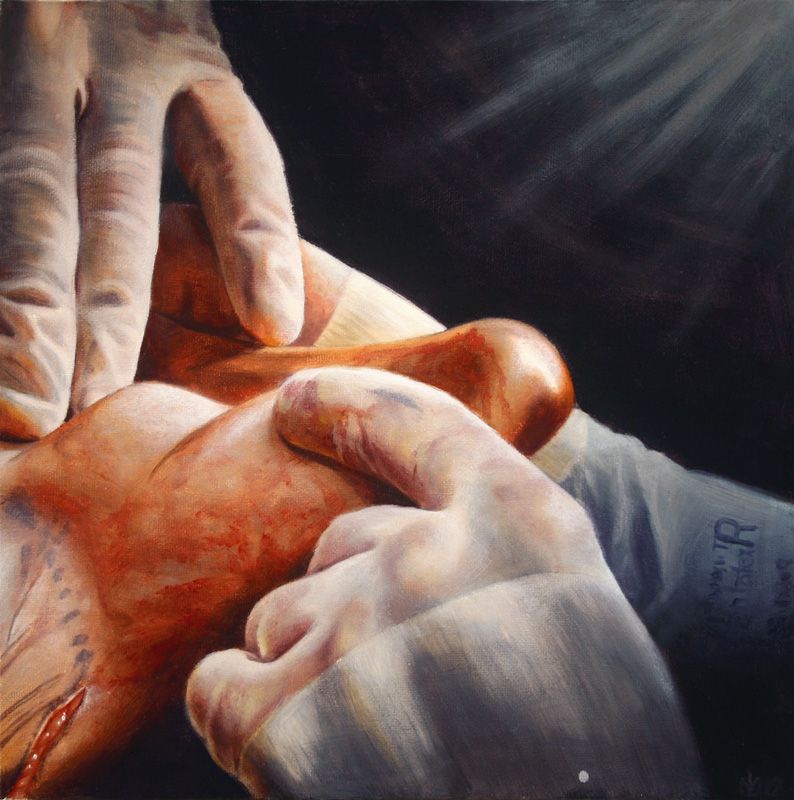
My latest installment in The Apostasy series, and the last for 2012, is now complete. Four times as big as the next smallest piece in the series, and by far the largest painting I’ve attempted in oil at 48 inches square, this was a grueling endeavor. Quite frankly, I’m just relieved it’s over, but on the positive side, I feel much more prepared and able to take on the next (and second to last!) piece in the series, which will be in the same large size range. Here is a visual walk through the process of making this painting, which for now I’ve tentatively titled Glorification: Glorification (study), oil on canvas board, 12in x 12in, 2012 Glorification, oil on panel, 48in x 48in, 2012 Happy new year everyone! May we all enjoy success in our continuing endeavors, and a progression in awareness, happiness, and health from an individual level to a global scale.
Read →
December 21, 2012
Notes & Advice 4: Clear Seeing and Accurate Drawing
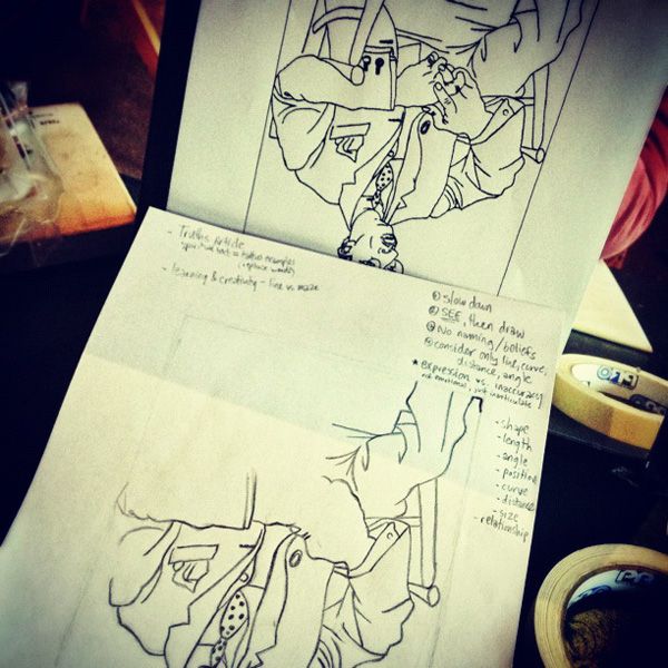
Earlier this month I attended a 3 day intensive drawing course hosted by an artistic mentor of mine, Edward Povey. This course started from the absolute foundations of drawing–clear and simple seeing, lines, and shapes–and progressed by the third day, after a brief foray into tone and value, into a full-fledged classical still life. While I had taken a similar foundations of drawing course around a decade ago (wow, that sounds like I’m old…and an “adult.” Wierd.) in art college, I wanted to revisit these incredibly important disciplines in order to sharpen up my artistic skills. Edward taught the course with a combination of classic drawing exercises, and insightful personal anecdotes about the nature of seeing. His philosophy emphasized the faithful recording what we see, in the tradition of “the humble craftsman.” Exercise: reproduce the Picasso drawing upside down, without regard to subject matter. Simply observe line, shapes, and proportions. Many of the exercises were taken directly from the popular book by Betty Edwards Drawing On the Right Side of The Brain ( which I personally have never read, but can now vouch for after this experience), such as the Vase/Face exercise which you can see here. One of the most demonstrative exercises consisted of trying to reproduce a complex line shape in exact precision while simultaneously counting aloud, from 50 to zero. I won’t spoil the amusing results of conducting such an experiment by describing them in detail here, in case you should decide to try it yourself. But let’s just say, it puts the two sides of your brain into a major state of conflict. All drawing consists of, is working with one’s own mind. The most poignant lesson that was reinforced for me over the 3 days was the emphasis on clear, simple seeing. Much like a meditation practice, this places emphasis on simply seeing the physical reality before us in all of its detailed truthfulness, without the confusion nor illusion of belief. For example, our mind knows and believes that a human arm may be approximately 3 feet long, but when seen in sharp perspective, the appearance of the arm becomes far shorter (aka ‘foreshortened’), and we must account for this when drawing it on a 2-dimensional surface. This cognitive dissonance between our belief about the arm and the reality of how it appears on our retinas (and therefore must appear on the paper) is the reason why drawing complex forms with complete accuracy is incredibly difficult. Therefore an artist must learn to disconnect from certain areas of thought in their brain, and tune into the unembellished truth of reality, breaking it down into simple criteria of line, shape, and negative space (the areas or shapes between/around featured subject matter). Extreme precision in this task can be achieved with measuring techniques and devices, but it is not impossible to do so completely with one’s own eyes and mind. It takes patience, practice, and a willingness to let go of our ego and all of its beliefs. Words of wisdom. As a painter of realism, this practice is indispensable for me. All of my aesthetic illusions must be grounded in, must stem from, the fundamental truth of how objects or spaces look in reality, or else their believability will be compromised. Not to mention, the strength of all representational art in the first place, regardless of chosen specialty or chosen illusions, lies in the accurate reproduction of 3D forms onto a 2D surface. Subjecting oneself to the rigors of classical drawing training is the most efficient way to stay sharp, no matter how advanced or practiced one is. It’s the same concept as strengthening muscles by going to the gym. After a while, certain drawing exercises are likely to make less of an impact as they become more familiar/easier, and just as with physical strength, the artist can increase the artistic challenge by adding time limits or more complex subject matter. I strongly encourage all artists to revisit the simple disciplines of drawing as a way to “work out” their skills of observation and their representational accuracy. Here’s my completed drawing from the final day of the class: Form & Emptiness, Graphite on Paper, 2012, 12in x 9in Form & Emptiness (detail). The title of this piece is a reference to the Buddhist teachings on the nature of reality, as represented by the dominating dark form in the center of the composition bearing my reflection, and of course by the empty glass and mug. This title is also a reference to the similarities between the clear seeing techniques used for drawing, and the awareness cultivated in meditation practice.
Read →
December 16, 2012
8th International 2011-2012 ARC Salon Catalogue Now Available
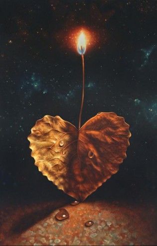
Earlier in the year I announced that I was chosen as a finalist in the Art Renewal Center’s annual juried competition, in the still life category, for my painting “What Love Is.” Though I was not selected for any of the grand prizes, my status as finalist means that my painting is published in the print catalog that the organization produces each year to commemorate the contest. What Love Is, oil on panel, 2011, 16in x 24in That catalog for last year’s competition is finally out, and available through the Art Renewal Center’s website. If you order one, look for my piece on page 92! The quality of realist and representational art in the catalog is astounding and truly inspirational for anyone who appreciates skill, technique, and humble craftsmanship in the visual arts. Bucking the postmodern trend of concept over quality, the ARC gives hope that classical knowledge and disciplines are still alive, even when subject matter evolves to incorporate modern elements and motifs (as my own work does). Being recognized by a group like ARC is an honor for me, as my own work attempts in part to honor the traditions of realism in representational art. In fact, my over-arching artistic goal is to achieve the combination of masterful old world skill with cutting edge commentary on the world I presently inhabit, and where we are headed as a species: the pinnacle of past, present and future. “The 2011/2012 ARC Salon was our largest turnout yet with over 2,100 entries and over 800 artists participating. There were a large number of high quality works that did not make it into the finals. This was true even after extending the original 300+ expected finalist pieces to over 500. All 500 plus finalists are shown in this catalogue. To have become a finalist and be showcased in this catalogue is even more difficult than before and is a huge accomplishment.”
Read →
November 18, 2012
Secret Knowledge
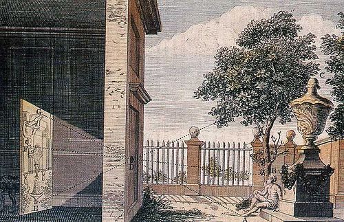
BBC World Presents: David Hockney’s Secret Knowledge Yesterday I was shown a fascinating and intriguing exposé documentary on the origins of the “camera obscura,” which is the first known use of optics in the creation of art. For those who don’t dispute the evidence of its existence, this primitive lens system (utilized several centuries before the invention of the modern camera) marked the birthplace of realism painting in 1420. After about 15 minutes of the video, the phenomenal significance of this research dawned on me. Because although I’d previously known about the camera obscura, I had never investigated the full story in any depth–and never realized the profound implications it has on the placement of my and all other realist painters’ art, in the canon of art history. Thanks to this video, I’ve had a very encouraging revelation about the tradition I am participating in, and I’m honored to be carrying on a nearly 600-year-old lineage into the future, adding my drop of life’s work into this magnificent bucket. Thankfully, some kind soul has uploaded the entire video on YouTube. If you’re a nerd, an artist, or both you’ll surely enjoy:
Read →
October 13, 2012
Notes & Advice 3: Photographs vs. Paintings
The appropriate and effective use of reference material–notably, where and how to deviate from it to actually heighten illusions, ironically–has been an ongoing commentary of mine on this blog, being mentioned in a few past entries. I consider this issue a central concern for any painter working in the realist genre, or who depends upon “fool the eye” illusions for the success of their images. I’m always trying to increase my knowledge and refine my skill in this area, as well as find succinct and poignant ways of explaining it to others. Austin-based, British-born artist Edward Povey, whom I’ve recieved valuable instruction and mentoring from over the past few years, had an interesting take on this concept in a recent email newsletter: Artists and photographers are really both image-makers. The camera truly sees, and the artists could learn from its honesty. The photographers could learn from the artists’ profound sense of composition, knowledge of color, tonal value constructions, and expressiveness–relying less on the cleverness of the modern camera. I believe that the wisest artists will be intimately aware of this dichotomy, and will strategically use the best of each world for the overall success of their images.
Read →
September 19, 2012
Notes & Advice 2: Darker/Grayer
There are certain tricks or techniques an artist can use to enhance the illusion of 3d form in their work. Picking any number of these tools from the mental drawer can drastically improve a painting, and they prove especially helpful in realism when an artist develops the intuition to deviate from the reference where necessary, in order to make a more successful painting (as opposed to a more successful reproduction). One such tool is knowing where and how to reduce the chroma (or intensity) of an object’s local color as it recedes into shadow. In the words of classically-trained figurative painter Shane Wolf: It’s crucial that the lighter value mixture be slightly higher chroma than the next darker mixture as this is how form works in nature. “Lighter brighter; darker grayer” is an old academic saying that explains that if an object is in light, it’s brighter; as it turns away from light into halftone, it gets darker and grayer. (Wolf, Shane. “Alla Prima, Three Hour Sketch.” The Artist’s Magazine. November 2012: 38-39) We all know that shadows make colors darker, but what we often forget–myself included–is that to complete the illusion in a painting, it may also be necessary to dial back the brightness/chroma/intensity of local colors to avoid shadows that compete for depth-space with foreground surfaces or objects, to the detriment of the overall image.
Read →
September 3, 2012
Notes & Advice 1: Stepping Back
Words of wisdom, from the astoundingly skilled, 26-year-old, San Fransisco-based painter Hsin-Yao Tseng: “It’s important to squint your eyes while studying your subject and to stand back from your painting frequently. Squinting simplifies the details so you can see the big shapes and value patterns of the subject. Also, you get a sense of the lost-and-found edges. Standing back from your painting lets you evaluate the unity of the piece. Seeing the unity prevents you from overworking detailed areas or making unnecessary brushstrokes.” (Seidner, Rosemary Barrett. “Born To Paint.” The Artist’s Magazine. October 2012: 44-51) Great advice for perfectionist, detail-obsessed realism painters. Although aware of this advice long before reading Tseng’s feature this week, I too often forget to practice it. It was a timely reminder, as I was just about to put the finishing touches on a new experimental painting. The more experimental or unfamiliar the territory that an artist is navigating, the more important it is to have his trusty fundamentals and basic skills by his side, like a compass, should he suddenly realize how lost he is. So, Inspired by this painter wise beyond his years, I spent a recent afternoon in the studio focusing on this teaching. Being mindful to step back and gaze loosely at the overall image every 30 minutes or so, I found it a very refreshing practice. Note to self: do more of this.
Read →
August 26, 2012
Realism Techniques 7
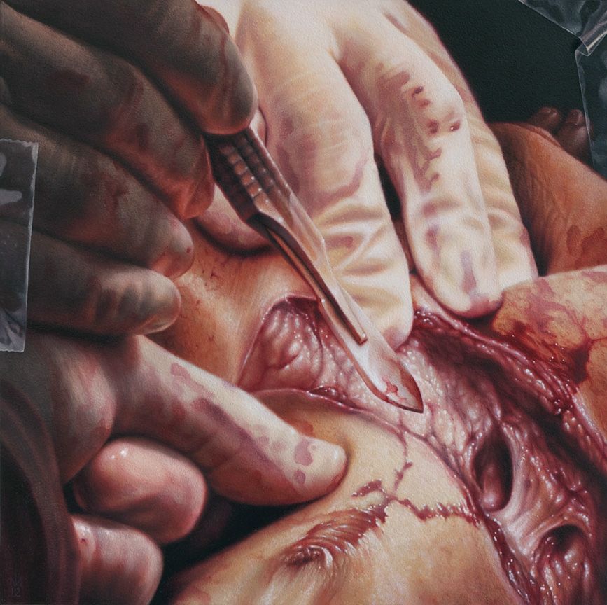
I finished painting #12 in the Apostasy series, now tentatively titled Sacrificial, a few days before my recent galavant to Galapagos. Didn’t get a chance to post anything about it before I left, but let me just say: That trip was crazy. So crazy that re-entering the studio upon my return was like landing in a time warp to a long ago era. Like a cat in a new home I sniffed out the place to make sure it was still real, still my life(?), in this current place and time, and then gratefully got the fuck to work on some prints for an upcoming group show (more coming soon on that). Good to get outta here for an adventure, but good to be back in the creative womb with some new entries in that cluttered/overflowing filing cabinet called mind. So, to get myself caught up, here’s the now foreign-seeming latest: “Sacrificial”, oil on panel, 12 x 12in, 2012 Mini-Layers For anyone actually reading this blog on the regular, the technique of layering to achieve high levels of realism should be at least somewhat familiar by now. Yet, within this broader process of applying paint in separate layers lies the specific technique of applying paint in small amounts, during the progression of a single painting session, or layer. In other words, a wet-into-wet paint application which mimics classic Alla Prima techniques, yet occurs within the quite contradictory process of indirect (or layered) painting. For example, the basic form and colors of the gloved fingers shown below had been established after one opaque paint layer (which I usually call the block-in). After that first layer of opaque paint was dry, subtlety and detail were added in the subsequent layer shown, but this increasing complexity, not surprisingly, requires increasing care during application. Towards this end, paint is added sparingly, in thin amounts, and blended down to join it seamlessly with the dried block-in. I move through an area, micromanaging approximately 1 inch square sections of the painting, each receiving the same apply/blend treatment. I use Galkyd Slow-Dry medium with all of my paint mixtures, and pay close attention to the viscosity of the paint when mixing on my palette, since overly fluid or thick consistencies can make this stage of the painting process incredibly difficult. Finally, where mini-layers come into play is when the application and blending process is repeated during the same painting session. I revisit many of the 1 inch square areas while the paint is still wet, and re-apply another thin layer of color, blending that out very carefully so as not to destroy the first application. …And so on, until these wet mini-layers have accumulated thick enough that I deem the layer no longer workable. At this point, the session is finished and I wait for that layer of paint to dry before revisiting the same area again. The sequence below shows some of these steps. If you look carefully, you can see tiny areas of paint being applied and then smoothed out. These same areas were worked over once more in the same fashion, with certain areas receiving a third pass during that same day’s work. Look at the purple shadow area first, then the off-white knuckle wrinkles, then the orange and deep red under-lighted areas. And lastly, a studio shot of my reference for the piece, which was perhaps the most complex and densely detailed of the series thus far: The scalpel was a final addition to the already heavily-Photoshopped reference image, replacing a much more modern cauterizing scalpel, whose unsatisfactory look of a Lego toy betrayed its badassness.
Read →

July 21, 2012
Realism Techniques 6
After a few experimental forays I returned to the studio recently to continue work on The Apostasy series, which has been my major ongoing project for the past year. Due to time and size constraints, only the first 10 paintings in this series debuted at Last Rites Gallery for my solo show in May and June. I’m still very inspired by the themes and subject matter of these images, so it was great fun diving back in–I felt like I picked up right where I’d left off before my show. The most recent painting I completed was a perfect example of the realism artist’s need to deviate from a strict reproduction of the reference material in order to maximize the intended symbolism or desired aesthetic qualities. Using Reference Effectively In this case, my reference image, which in itself had been highly manipulated from its original photographic state with Photoshop, featured a metallic instrument rather starkly silhouetted against a harshly lit background of tender skin. I was faced with the artist’s “executive decision”: to ride the simple, graphic power of the flat black silhouette, or to increase the nuances of its surface texture in order to emphasize the effects of the hard light behind it. Either choice works just as effectively within the overall composition, but caters ever so slightly to a different level of meaning within the piece. Power of steel instrument to manipulate the fleshly realm, or power of the light of truth usurping man and all his manipulative tools? I chose the latter. So, this involved the invention of some extreme lighting effects on the surface of the instrument. These I hoped would more fully express the metallic nuances and form of this foreground object, as hard backlighting bends around it, creating a bit of a warm flare. In general, I thought this increased action would add some more life to the piece. You can compare these deviation attempts in the provided sequence of photos, which starts with the specific area of my reference image, and ends with the corresponding section of the completed painting. (Image of the full painting coming soon…) Intentionally painting the instrument too light at first allowed more control in creating subtle variations of lighting on the object. Ultimately this entire issue is of minimal impact to the outcome of the entire image, and for those unfamiliar with the quirks of extreme realist painting, may seem like an exhaustingly trivial matter. However, I enjoy it as yet another example of the myriad opportunities for creativity in a genre often mistakenly deemed uncreative. Often, the creativity in ultra realistic styles simply operates at an unexpected and far subtler level than most viewers are trained to recognize. Far from a mere copy-machine, the experienced realism painter works often with fully premeditated intention on every minuscule aspect of the painting, making a countless number of creative decisions and unique departures rarely noticed by the undiscerning eye. In fact, if the artist’ technical skill is strong enough, there’s no way that these aspects can be noticed. Like a magician, full acceptance by the audience signifies completion of the ultimate illusion.
Read →
July 6, 2012
Realism Techniques 5
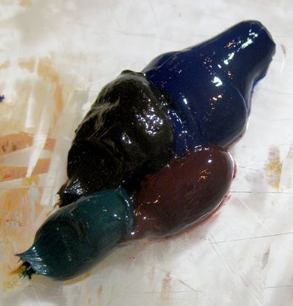
My Black Sauce In order to add richness, subtlety and depth to the darkest areas of my paitnings, I avoid the use of the color black entirely (i.e. Ivory Black, Lamp Black, etc.), opting instead for my own dark color blend. I’ve found through my experience that the mixture of several dark colors creates a new color approaching the solidity of true black when applied in enough thick layers, yet yielding enough translucency in thinner applications to open up a much wider range of subtle color variation. This flexibility and translucency in turn creates the possibility of much more realistic shadows and a truly convincing “absence of light” that the viewer can still see into. Mixing up my special black sauce at the start of a new painting. This recipe consisted of Ultramarine, Burnt Umber, Veridian, and Alizarin. I use a simple demonstration during my instructional seminars to prove the necessity of what I call “translucent shadows.” I find a well-lit patch of space in the room and hold an opaque object in front of my outstretched arm, casting a prominent shadow across it. I then invite the audience to answer the following rhetorical questions: Did the colors of my arm magically change into the colors of the shadow, like a chameleon’s skin changing to match its surroundings? Assuming not, did the colors of my arm therefore stay the same as they were before being cast in shadow? Similarly, were you able to still see the shadowed area of my arm, or was it completely swallowed up by an opaque, black, absence of light? Assuming it was visible, would you conclude that there was still a percentage of indirect light still present within the darkened shadow area? What this demonstration makes obvious is the need for mimicking the processes of physics and light in the natural world within our paintings, as a method of making them accurately replicate that world. This means painting objects or spaces close to their fully lit appearance and then obscuring them by using translucent shadow glazes, to the proper degree, and with the necessary color hues. Of course, with experience, shortcuts can be taken on this process and this rule of sorts can be effectively broken for even further nuanced results. In my own work, I don’t paint every single object or space in its fully lit colors before glazing it into shadow–instead I often aim for a middle point, knowing that after one or more glaze layers it will have the same appearance as if I hadn’t taken the shortcut. This saves time and effort, while maintaining the high level of control necessary for realistic illusions. Logically, it also follows that if you take too big of a shortcut by matching a shadowed object’s final color during your underpainting, then glaze a translucent shadow over it to create the convincing, full-bodied richness of a realistic shadow, the cumulative effect will obviously make it darker than you had originally intended. Simple trial and error yields the correct steps, shortcuts, and glazing formulas to achieve the exact results you had intended. Translucent shadows place the objects within the murky depths of the space without completely obscuring them. Immense amounts of time and sanity were saved by glazing over whole areas of completed forms (“indirect” painting) rather than precisely matching every shadow color contained within each object through “direct” or opaque painting methods.
Read →
May 3, 2012
Art & Life 2: Artistic Karma
(The following is an excerpt from a longer text I wrote a few years ago, posted here in order to explain in detail–with helpful hints–the concept of Artistic Karma mentioned in my previous post.) Finishing What You’ve Started: Your “Artistic Karma” One all too common obstacle for artists, especially beginners in a particular medium, is abandoning projects before they’re completed. We’ve all done it from time to time, but some more than others, and it can become a hindrance to our artistic progress. What commonly happens is that the painter’s vision exceeds their technical skills at that time. Whether they’ve set their expectations too high, attempted something too difficult and got stuck with a technique problem they couldn’t solve, or improve so fast that they dislike what they’ve previously done to the piece, the end result is often frustration and discouragement. This type of failure is unnecessary, and it pains me to see talented artists hold themselves back with lack of follow-through. I call this “artistic karma.” Unfinished paintings and abandoned projects accumulate bad artistic karma; they’re like a book with a bunch of incomplete sentences. Imagine trying to read that book and learn something from it—it’d be so much harder with the author withholding all that information from you, just teasing with partial thoughts and no conclusions. With our art, we are that author, and we’re constantly reading our own book—our completed work—in order to learn via hindsight and grow as artists. We need to have finished paintings, no matter how unsatisfactory the end result, to be able to critique (and have others critique), so that the lessons of where we need to improve can fully sink in. Direct experience is the quickest and most profound way to learn something, because we live that lesson firsthand. By abandoning paintings and losing sight of the ultimate goal, one can only learn the artistic lessons of that attempt conceptually, through the incomplete means of “woulda, coulda, shoulda.” The knowledge and insight of where to go next don’t sink in as far this way. The classic example to illustrate my point is the child told not to touch the hot stove who remains skeptical, versus the child who actually touches it and learns the lesson directly and beyond a doubt. So having the discipline, patience, and work ethic to put our minds and abilities to the task of making the best of a painting that we hate, will help us much more in the long run. We can ensure our growth and progression by “finishing the thought,” completing the piece at hand in order to give ourselves a necessary sense of accomplishment and closure, a building block to the next artistic step. By keeping a few concepts in mind, this kind of laziness and resulting discouragement, frustration, and hindrance to progress can be largely avoided. The most important thing to remember is to pace yourself. It’s crucial for your long term success not to take on more than you can handle when just starting out. We all want to paint the next great masterpiece, but we have to remember to be patient—achieving greatness takes time! Learn to set yourself attainable goals for each session, each day, each week, or each painting. Similarly, it’s often wise not to have more than one painting in progress at a time, especially if you’re tattooing full time or have some other kind of day job. After taking care of all the other tasks of your life, you can be more effective with the time and energy you have left if you concentrate more intensely on a single goal rather than spreading yourself too thin. Being able to make changes on the fly during the course of a painting, based on what your progress is presenting to you, is a skill you will develop with experience. Each and every painting is an experiment, even more so as a beginner. Sometimes when things don’t go according to plan it’s necessary to re-evaluate and come up with a new plan, or two. Constant critique combined with a goal-oriented mentality will serve an artist well in addressing problems that arise, and in never giving up. If all else fails and a project becomes too frustrating or bewildering, instead of abandoning it, put it aside temporarily. Do so for a long enough time to get a fresh perspective on what you need to do, but not long enough to lose interest and motivation. For paintings that may take weeks to complete, keeping your momentum is crucial. To ensure this happens, keep it displayed in a place you’ll have to see it every day. Walking by it and glancing at it briefly may yield an unexpected, spontaneous flash of inspiration. Sitting in front of a painting for hours on end, staring at it from up close, and working logically and deliberately the way sharp focus realism often demands, causes our thought process to tighten up and dulls the immediacy of our creative urges and artistic intuition. So it can really help with any piece of art, to literally take a step back, look at it from 5 or 10 feet away, and “see the forest for the trees” once more. Another way to loosen up and regain your focus on “the bigger picture” during this break is to have some fun messing around with a different medium, or just fling some paint around on a different canvas or board and see what happens. “Happy accidents” may occur that give you new insights, ideas, and fresh energy to get back to completing the original task at hand. Although this bit of advice contradicts the “one painting at a time” guideline, it may still be appropriate and productive at times, so use your best judgment. Some people do great with multitasking on several paintings at once, while others get hopelessly distracted and might maintain their focus better with the other suggestions. What often works for me during a longer painting session, is to take a break to do something active like a short bike ride, walk, basketball in the driveway, or something similar. This brief activity releases endorphins, shakes out the tension from sitting or standing still for hours, clears my mind, and allows me to come back to painting with a fresh focus. At this time I often re-critique the piece and figure out whether to stick to my original plan for the session or layer of paint, or make some adjustments and set a new goal. It’s worth repeating that you need to be self-motivated in order to succeed in the arts, and of course with demanding mediums such as painting realism. If you’re not capable of being your own drill sergeant at times then all of these tips for sticking with a painting will be for naught. Having a community of artists you’re involved in helps with this, but sometimes you just have to push yourself if you want to have any hope of being an artist whose work really stands out.
Read →
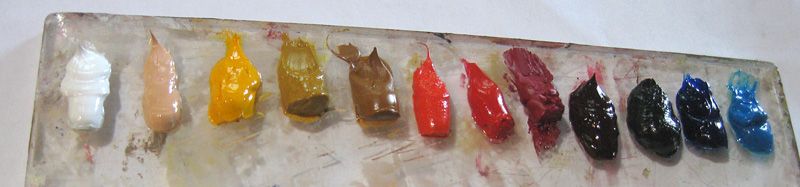
April 1, 2012
My Palette
There’s this thing that happens when I’m preparing my palette at the beginning of any project, when fresh paint hits freshly-scraped, pristine plexiglas. It’s a moment of reverie and deep satisfaction sprinkled with a faint crackle of nervous anticipation. Arranging the colors in just the correct sequence is the code that opens the gate. The familiar smell of Linseed Oil is the painter’s incense, an invitation do dive right in. Sometimes, though, the untouched cleanliness of the whole setup is religious like an altar and I’m afraid to touch it, to muddle the perfection. So, recently I decided to preserve the moment. My usual palette, for the last 10 or so years. I’ve arrived at the following palette through a natural distillation of my working process over the last 15 years of making paintings: Titanium White Flesh Tone (Gamblin)/Buff Titanium/Naples Yellow Cadmium Yellow Medium Yellow Ochre Raw Sienna/Burnt Sienna/English Red Cadmium Red Light Napthol Red/Grumbacher Red Cadmium Red Deep Alizarin Permanent Burnt Umber Ultramarine Blue/Viridian green Cerulean Blue Although highly refined and realistic images may potentially be achieved with a much smaller palette, each color listed above fills a unique void in the spectrum according to which I see and use color, for my particular style or version of high-realism painting. This is especially true with the 4 reds I use. The bulk of my preferred subject matter is dependent on a wide range of subtle variation in the red area of the color spectrum. Highly specific combinations of these reds are a crucial part of my technique on most paintings. There’s a formula for the most convincing fresh blood that must be followed. As indicated above, in three areas of my palette’s color spectrum are alternates of a similar hue that may be rotated in, according to the particular needs of a piece. And of course, there is no true Black included. “Black” in all its subtle variation is achieved from several combinations of the darkest colors, which is a method that’s more conducive to a highly realistic result. Furthermore, teaching oneself to recognize the subtle nuances in such a strong color as black is an important step in being able to create lifelike and convincing illusions. An aftermath.
Read →