Journal
Practice & process notes
Occasional writing on my art practice, techniques, process, and the ideas behind the work.
25 articles on process
August 31, 2026
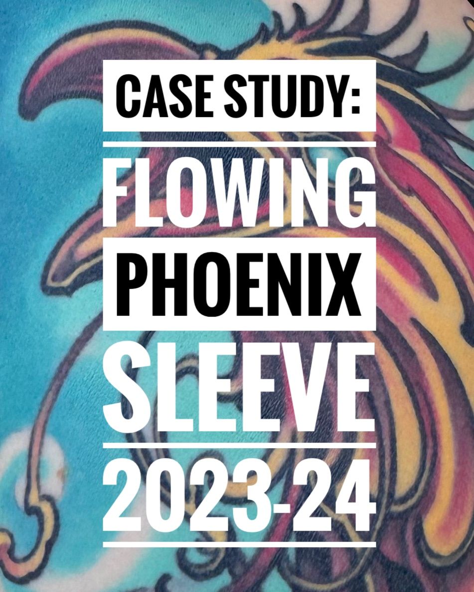
Tattoo Case Study 1: Flowing Phoenix Sleeve, 2023-24
Tattoo case study covering the process of how a full arm sleeve was completed, how it is aging in the skin after 3 years, strategy used to design a long lasting tattoo, and how it is projected to age in the future.
Read →
September 9, 2023
Summer Plein Air: Chasing The Light
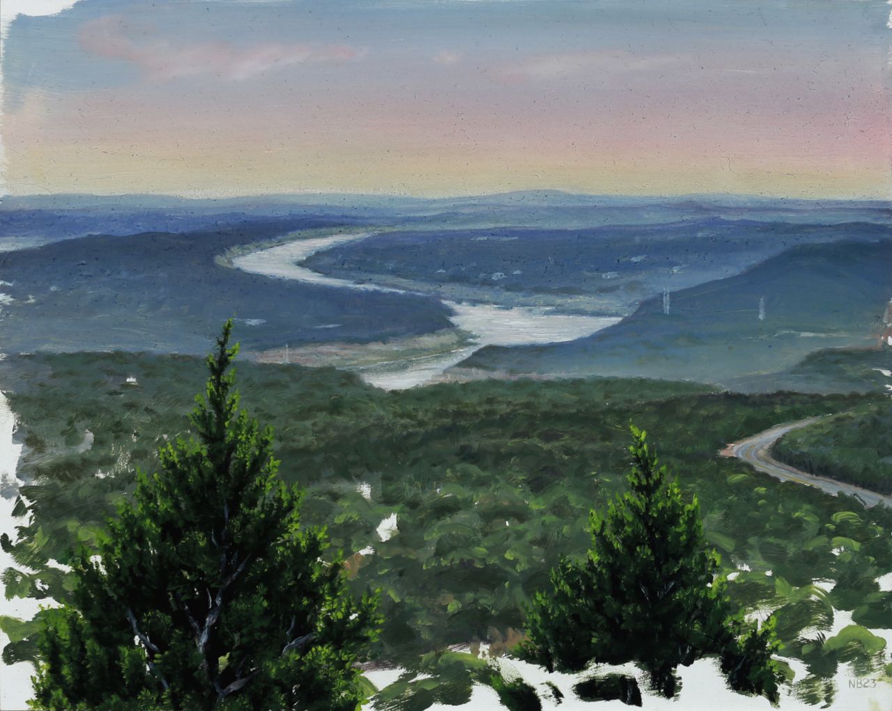
Summer in Texas, where I live and work, is never the best outdoor painting time. Extreme heat and incredibly harsh, searing daylight add degrees of difficulty to the plein air process, to speak nothing of the extra extreme summer of heat we've been having this year. But I did manage to get outdoors and paint a few times lately–thanks to some great friends providing an extra bit of motivation–for a much needed dose of artistic nature time. First was a quick sunset sprint at a local overlook, on a very hot and hazy evening. The air was so thick that the scene looked foggy, and this moisture in the air diffused the dusk light nicely into a wash of pastel hues. I blocked in the basics of the distant river bend for an hour on my 8 x 10 inch panel before the sun disappeared on us, disregarding the slower detailed areas of juniper trees in the extreme foreground. After letting the painting dry for a few days, these were then rendered in a 2 hour studio session along with some pastel glazes in the sky to saturate the sunset effect. "Dusk Over Lago Vista", oil on panel, 8 x 10 inches, 2023 During our next outing, shade was a requirement as it was late morning and the sun was already in full blast, warming up to another triple digit temperature day. We chose a lowland trail snaking alongside a dry creek bed under cover of thick live oak, juniper, hackberry, and pecan trees. Hoping for a small waterfall that feeds into the creek, we soon realized that with our region's severe drought status that was a pipedream, and settled for a little shaded clearing opening up to the dry creek bed next to the trail. The summer death rays of the sun puncturing the canopy created a perfect opportunity for some fun lighting effects–quite the opposite of the previous outing's diffused hazy ones. We painted for approximately 3 hours, in which time I got a thorough block-in of the detailed scene accomplished on another 8 x 10 inch panel, knowing that once again I would spend another 2 hours in the studio after it had dried, completing the effects of light and shadow, warm and cool, with a glaze layer. This level of realist subtlety in atmospheric affects simply is not possible with the alla prima technique of single-session plein air painting, as the optical combination of translucent color sitting on top of opaque color is what creates the more convincing illusion of depth that our eye perceives in a painting. "Dry Creek Bed, River Place", oil on canvas panel, 8 x 10 inches, 2023 When I’m scouting a painting location I’m always looking for a focal point, a primary feature of the environment or lighting that will interest a viewer more than a mere factual recording of a place and time. There are always time constraints imposed on an outdoor painting and sometimes you settle for a mundane scene (without a waterfall...) that needs to be made more interesting by focusing on what the light is doing, emphasizing color or atmosphere beyond what is observed but still within the bounds of convincing realism. That’s what happened here. The serpentine tree shapes were interesting but beyond that, the white hot dappled light on shaded rocks was going to be the real star of the show, with a little coaxing. P.S.– Here's a bonus miniature 5 x 7 inch wave study from a trip to Miami Beach earlier in the summer, completed in the same 2-session manner as the aforementioned pieces. Oil on Panel, 5 x 7 inches, 2023
Read →
April 5, 2020
Notes & Advice 12: What To Consider When Setting Up A Still Life
Discussing some of the subtler points of still life setup with Jake Meeks of Fireside Tattoo Network and Podcast. Part of my alla prima still life painting workshop for sale on the fireside website in video module format.
Read →
March 12, 2020
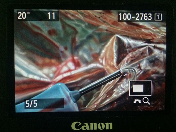
My 20-Step Program for Perfect Art Reproductions
If you’re a painter or visual artist working in any traditional media, capturing digital images of your work is practically a requirement nowadays, and has been for a while. I don’t know any artist who could survive without getting images of their work onto the internet, submitted to publications, made into prints, or a variety of other applications that require a quality reproduction. And quality is the key word here: representing yourself with a poor version of your work will hurt your chances of success. You wouldn’t think that capturing quality images of a completely still, flat object in a controlled indoor setting would be one of the most challenging photography jobs, but it is. I’ve actually paid pro photographers to shoot images of my paintings, and gotten a disc full of yellow-tinted garbage and flat-out unusable files, because those photographers weren’t well versed in the highly specific nuances of this photography application. (untitled), oil on linen panel, 8 x 10 inches, 2016 The details matter here, and skipping any of the major or sometimes even minor steps will usually compromise the end result, to varying degrees. With so many factors that can go wrong, it’s wise when possible to devote an area of your studio to this, with dedicated lighting, equipment, and pre-measured distances and angles. Depending on the level of compromise or imprecision in your studio setup, the more editing of your raw files you’ll need to do on your computer. But even the best photography results will still require basic cropping and picky stuff like smoothing over a blown pixel from your camera’s sensor, or eliminating a small cat hair that somehow floated and stuck to the painting (cats are thoughtful like that, always trying to help…). So here’s the equipment you’ll need (with what I currently use in parentheses), followed by the process, which was taught to me by the talented and wonderfully kind British painter Edward Povey and his wife Donna Tolar. I’ve added some of my own Adobe Photoshop expertise to their process for correcting photography shortcomings, and that’s included as well, but you’ll need a fairly good understanding of the program to follow my brief notes (or else this would be book length, not blog post length, sorry). Equipment Camera: full-frame sensor DSLR (Canon EOS 5D Mark III) Lens: anything in the 50mm range, without a zoom (Canon EF 50mm 1:1.2 L) Tripod: sturdy, with fully adjustable ball joint mount (Manfrotto 290 and 496RC2) Remote shutter cord (Canon RS-80N3) Circular Polarizer Filter to fit lens (Promaster) 2 adjustable freestanding studio lights with daylight balanced bulbs 2 Polarizer filters for the studio lights (Visual Pursuits Glare-Stop 8M Filter) Easel or flat wall space for mounting artwork 90º perpendicular to floor. Tape measure and/or ruler Level (the straight/flat tool with the little air bubble vials) White, neutral gray, or black sheet or walls Enclosed, light-proof studio space (for best results, it should be on par with a film processing darkroom, or shoot at night with all curtains/blinds drawn) Computer (Imac, 4.2 GHz Intel Core i7, Radeon Pro 580 8 GB) Photoshop CS4 or newer (CC 2019) Process Set up photo area with everything at right angles where necessary, and parallel where necessary. 90º angles and parallel planes are crucial for minimizing lens distortion. Your artwork needs to be perpendicular to the floor, as does your camera lens. The front glass edge of the lens needs to be parallel to the artwork. Use your level to check artwork angle and other things, and use the level sensor on your camera to make sure it is both vertically and horizontally balanced, and pointed precisely to the exact center of the painting. Use a tape measure to calculate any measurements needed or to check straight alignments. Set up 2 studio lights at 45º angles to your artwork, halfway between your camera and the artwork. Each light should point towards the opposite vertical edge of the artwork, at the halfway point of the artwork’s vertical measurement. Set up a black, gray, or white sheet behind your artwork, if your studio wall isn’t already white, gray, or black. The background that your camera sees around the artwork will influence how it processes color and adjusts its white balance. For really dark artworks, I like a black background, and for really light ones, a white background. Attach polarizing filters to the front of each studio light, as flush as possible to the light hood without touching the bulb (which could melt the filter gel). I rigged my own attachment system for the lights I have out of wire and masking tape. Adjust camera speed to 100 ISO, and match its white balance to the type of bulbs you’re using in your studio lights (if tungsten, choose tungsten setting, etc) Set image quality to the highest setting (camera RAW) Set lens to whatever its midpoint aperture is, usually F8-11 for your typical F16 or F22 capable lens. Attach remote switch, and use screen view instead of eyepiece viewing so that you don’t risk bumping or shaking your camera. With all overhead and ambient lights off, and only the two filtered 45º angle studio lights on, spin the circular polarizer filter on your lens until all glare highlights on the artwork disappear (when viewed through the camera lens). If some glare or highlights remain, you may need to rotate the 2 filters on the lights a bit. There should be no other light entering the room or hitting the artwork. Focus the lens as tightly as you can on the artwork. Adjust camera shutter speed according to these final calibrations. For me it’s usually in the 20-30 seconds range. With such a long exposure there can be absolutely no movement or shaking of the artwork, the camera setup, the floor, or the room you’re in, or else you’ll get a slightly blurry or hazy image. Bracket your shot, meaning find what appears to be the most accurate shutter speed as indicated by the camera sensor, then also shoot one or two speeds slower and faster than that, just to ensure you have the proper exposure. Cameras can be fooled by paintings with a high degree of contrast between their lightest light areas and darkest dark areas. You can use the compensation settings on your camera to help with this as well. On your computer, make sure your monitor is calibrated and you’re working with the proper display brightness. Make sure the lighting in your computer area is balanced daylight bulbs or natural daylight from windows. Place the artwork next to or near the computer monitor, in the same balanced/neutral lighting. Open your raw files in Photoshop and select the most accurate exposure by comparing to the original artwork. Edit as needed to crop, straighten, or correct lens distortion. Just about all lenses will distort or warp the picture plane as it gets closer to the edges of the lens’s viewing area. If your artwork is a perfect rectangle but is no longer geometrically perfect in the photo, drag horizontal and vertical guidelines onto the image and use EDIT > TRANSFORM > DISTORT and/or WARP functions to correct the artwork’s shape. Edit any inaccuracies in color with adjustment layers and layer masks as needed, comparing against the actual artwork next to your hopefully decently calibrated monitor, in the same balanced lighting. The most effective adjustment layers for these minor tweaks are HUE/SATURATION, COLOR BALANCE, LEVELS, and SELECTIVE COLOR. Since my studio setups at the various places I’ve lived over the years have almost never been ideal, I usually need a combination of all of these adjustment layers on every image to get it 95-100% accurate. In rare cases I’ve used multiple of each, with parts of each erased in order to let parts of the other layers show, to match what was happening in each area of the painting. As noted above, these last 2 steps can get very technical and require a good working knowledge of Photoshop, which can be gained by tutorials or books of course, or simply from hours of controlled experimenting on a sample image. Edit any blown pixels, dust, hairs, or other minor imperfections with CLONE STAMP tool. If you plan to turn the digital file into a physical print, you’ll likely have a second round of color editing to do on the file, once you see a proof from whatever printer you’re using. Printer ink on paper is a much different process and effect than a backlit digital screen, and every print format is a little bit different in how it needs to be prepped. Wow, being a professional artist is a lot of work. This isn’t really a step, I just wanted an even 20 steps because it looks better and makes me feel good. So that’s it! Just a really quick and simple process (just kidding) for getting guaranteed amazing, coffee table book, professional-ass website, or giclee print quality artwork reproductions every time. Enjoy!
Read →
March 12, 2020
Recent Painting Progressions
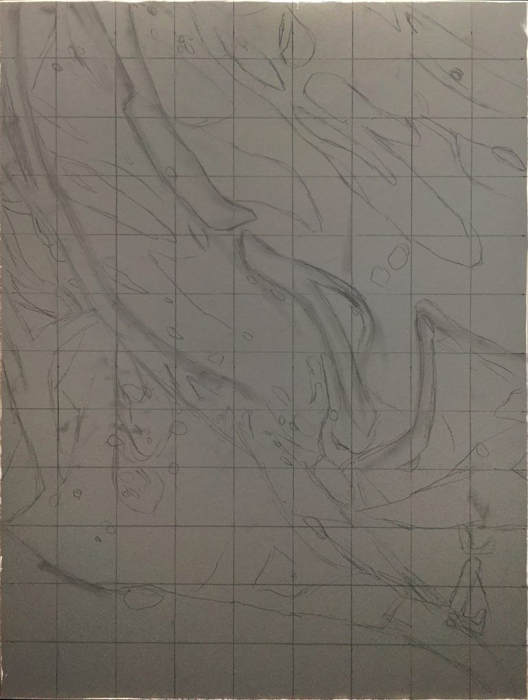
I love process in art–seeing it, knowing how things are made, reverse engineering them, speculatively forward-engineering them, reflecting on my own process and learning from that reflection… so enjoy these progressions of 2 recent paintings. 1. “Vernal Fugue”, oil on panel, 18 x 24, 2019 “Vernal Fugue”, oil on panel, 18 x 24 inches, 2019 “Vernal Fugue” (details) 2. “Civilization”, oil on panel, 36 x 48 inches, 2019-2020 “Civilization”, oil on panel, 36 x 48 inches, 2019-2020
Read →
November 1, 2019
On The Benefits of Drawing
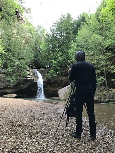
About 10 years ago I leveled up my artistic practice in all areas after discovering the classical atelier system of art education. Before that time I had been piecing together my own slow, winding learning trajectory in the realism painting genre, unintentionally slowing my progression with an over-reliance on photographic reference. In contrast, the atelier system is based on working directly from life, whether it be a live model, a still life, or a landscape. Painting from life in Ohio, 2017 In short, observing directly with one’s own eyes forces the brain and the artist’s hand to convert the 3 dimensions of real life into the 2 dimensions of a flat canvas. Over time our eyes-brain-hand feedback loop becomes seamless, and we learn how to reproduce exactly what we see. The real-time, real life mental calculations of angles, lines, curves, planes, perspective, light and shadow, and millions of color possibilities have a measurable result: if the drawing or painting looks indistinguishable from what we’re observing, then those myriad calculations are overwhelmingly correct. Of course, eventually, an artist needs to learn how, when, and where to diverge from absolute accuracy in order to create a work of art that transcends the mere replication of reality…but the learning process that we submit to in order to reach that point is surprisingly valuable in its own right. “Lower Falls at Old Man’s Cave”, 8x 10 inches, oil on panel, 2017 Arguably the single most important artistic discipline or skill, simple life drawing is actually a fairly complex amalgam of skills, requiring at least a rudimentary working knowledge of geometry, physics, optics, and the ability to plan sequentially. True life drawing begins as little more than primitive map making–the plotting of coordinates in space–and ends ideally with an incredibly nuanced understanding of the physics of form, mass, and light. This great article I stumbled across got me thinking about drawing; what it forces our brains to do, and how it benefits our brains. While intended for the non-artist reader, it makes great cross-disciplinary connections and serves as a nice reminder and motivator for anyone who is an actual practicing artist, of just how valuable drawing is to our art. https://qz.com/quartzy/1381916/drawing-is-the-best-way-to-learn-even-if-youre-no-leonardo-da-vinci/ “Form & Emptiness”, graphite on paper, 2012 Form & Emptiness (detail), graphite on paper, 2012
Read →
May 7, 2017
Blood Rituals: Redux
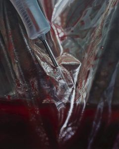
Photoshoots for last year’s Blood Rituals series of still life paintings yielded several interesting macros which did not fit the aesthetic of classical still life that evolved out of my initial brainstorming sessions. I extracted four compositions from these photos, and after perfecting them in the digital darkroom, recreated them as hyperrealist oil paintings. This miniseries pursues a different avenue of exploration of the same subject matter, presenting another aspect of my artistic vision and skill set as a painter. These claustrophobic and intimate closeups border on the abstract, as the complex color patterns of wrinkled plastic bags and condensation covered glass lose their original context of setting and scenery. Within this unfamiliar space, the jarring appearance of blood is a beautiful, rich and vibrant color that makes these compositions pop, while providing symbolic depth. The narrative of what’s happening and why is largely absent from these images–intentionally–as they strive for a disorienting sense of wonder by honoring the genre of true photorealism. Uncanny likeness to the “real” provides an illusion that in turn may open up new ways of perceiving the ordinary, mundane objects of the world around us. Our physical reality contains infinite detail, but to help us move efficiently through the world, our brains eliminate much of what our eyes are capable of perceiving. When given an up close, sustained glimpse of the material complexity we inhabit, the result is often overwhelming, surreal, and disorienting, as our simplified view explodes with new detail. This is the point at which assumptions and certainties are compelled to crumble, opening the intellectual space for new truths to be realized and deeper understanding to form. BLOOD RITUALS: REDUX (untitled), oil on linen panel, 8 x 10 inches, 2016 (untitled), oil on linen panel, 8 x 10 inches, 2016 (untitled), oil on linen panel, 8 x 10 inches, 2016 (untitled), oil on linen panel, 8 x 10 inches, 2017
Read →
January 27, 2017
In The Studio 5: Reworking Plein Air Landscapes
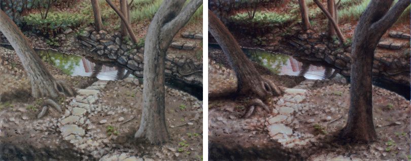
Something I’ve never been a fan of doing is revisiting older paintings after some time has passed. The process of reconstructing or even merely re-approaching the original mindstate, inspiration, and vision for the painting feels spiritually regurgitative in some unclean way. Like digging up a dead issue in a relationship with your partner. I’ve never been one to want to dwell in the past, favoring the pursuit of new goals and the exploration of new territory over the retread of old ground. But since embarking on a landscape painting journey over the past few years I’ve seen some of the masters of the genre doing just this–picking up old plein air studies to breath new life into them, perhaps making them more presentable as a truly finished piece to a buying audience–and had stared at some of my early plein air studies long enough to realize how I too could push the sense of drama or atmosphere in them. View From The Studio, before (L) and after glaze layer. Not to mention, more hours logged in the practice of landscape painting, more hours logged studying weather and outdoor light with more intention and discernment, has had the natural and inevitable effect of expanding my critique ability of what I’ve previously done as well as eased some of my fears about ruining those original results. This shift is the tangible, or at least quantitative, proof that learning is happening–awesome! So in a brief fit of discontented boredom lately I pulled a few early landscapes off the wall and put my glazing knowledge learned from many hours of studio still life painting to use on some formerly alla-prima studies that looked a little flat. Oil glazing truly does replicate the phenomenon of translucent–but not completely transparent–atmosphere that we live in and see through every time we gaze into the distance. Which makes it a perfect tool in the landscape painter’s skillset. For advanced stages of realism in any genre I find it to be absolutely indispensable, and enjoyed the practice of applying it to my new pursuit of landscape painting mastery. A little 4 x 6 inch study of my former backyard bridge, given a more dramatic late afternoon shadow treatment.
Read →
March 3, 2016
Notes & Advice 11
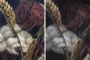
The popular text message shorthand TMI, as most of us growing up in the cell phone era know, means “too much information.” Normally not a good thing–except when it comes to my realism oil painting strategy. To be specific, I find it useful to paint as much information as possible in the beginning stages and opaque layers of my photorealist paintings, so that I can pick and choose where to obscure it during the final (semi-transparent) glazing layers. There’s perhaps a bit of inefficiency involved in this approach, but it allows for a more organic development process overall, and a greater degree of control during the final artistic choices of what to emphasize or subordinate into shadow. “Dying In America” (detail). Before and after the final shadow glazes. Note the subtle loss of detail/information in the rose petals. The human eye is capable of seeing every detail of any given view, but the brain, our computer processor of sorts, is wired for efficiency and baseline survival, and as such is instinctively tuned to only allow us to focus on what is most important in any given view. Details and countless bits and pieces of any scene get stitched together from memory, assumption, and expectation, while a vast majority of the remaining minutiae are simply discarded as inessential to whatever task is at hand. Some of my favorite realism artists were masters of this concept, knowing exactly what to emphasize or subdue in order to pull the viewers attention towards their focus and tug at their heartstrings with an effective narrative or use of symbolism. Notice in John Singer Sargent’s portraits how little attention was paid to large areas of dress, allowing inessential areas to become black or brown silhouettes with no detail. He created a hierarchy of importance within the picture that mimics the way our brains naturally function, using the aforementioned technique to subordinate certain areas. John Singer Sargent. “Madame X (Madame Pierre Gautreau),” 1884, oil. The dress and background, which comprise nearly all of the painting, are almost entirely flat areas of dark valu Andrew Wyath used the technique of reserve just as brilliantly towards the goal of depicting scenic vistas and landscapes with a completely lifelike–yet surprisingly graphic and simplistic–appearance, setting the often somber and peaceful mood with just enough detail to draw us in and keep us looking. Andrew Wyeth. “Sea Boots,” 1976, tempera. Details in the boots and foreground tempered with the geometric simplicity of everything in the top half of the composition. Andrew Wyeth. “Barracoon,” 1976, tempera. Just enough accurate rendering in the figure and folds in the fabric, juxtaposed with large open fields of color and diffused texture. And so I too try to keep the artistic concepts of hierarchy, subordination, and reserve in mind while envisioning my final result, with the goal of creating a visually appealing image, rather than chaotic overload containing a factually truthful amount of information, yet lacking cohesion and harmony. I think these concepts become especially important when painting anything approaching the photorealism genre. Micro details are common and often necessary to complete the desired illusion in this style of painting, and yet conversely, a closed-minded and strict devotion to every detail of one’s photo reference or still life arrangement can result in a less aesthetically pleasing work of art. “Dying In America” (detail). Visual information, as with most things in life, can in fact become too much of a good thing. To make sure I hit my desired sweet spot on the information spectrum, I’m not afraid to paint more detail than will ultimately be needed, only to lose it in deep, rich, believable shadows. The most effective of these shadows will still contain the faintest traces of the details underneath, yet not so much detail as to clutter and distract from my desired focal point. “Dying In America,” 2015, oil on linen panel.
Read →
December 26, 2015
Soul
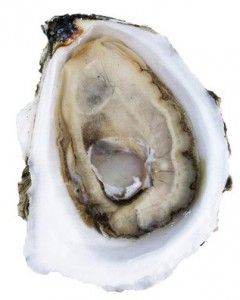
The inspiration for this painting came largely from oysters and their far more notorious contents: pearls. The pearl has been a symbol of magic and purity throughout antiquity and across many varied cultures, from Western religions like Christianity to Eastern spiritual traditions such as Buddhism. Soul thumbnail sketch, ink on paper. In this painting a pearlescent lump of vibrant, growing flesh represents the human “soul,” or the mysterious essence of life that animates the decaying physical body, and for which modern science still has no complete understanding or explanation. Quite ironically, the only representation of this lifeforce that we mortals seem able to discern with any reliability is its supposed opposite: the physical embodiment. Here, its life-giving energy is co-opted by the encasement of confining machinery, which can be seen as representing the limited human form, and in a broader sense, the inescapable yet corroded impositions of society and culture. Soul, 11 x 14 inches, oil on mounted linen panel, 2015 The contrast between the hard and soft elements of this picture illustrates the human struggle to find meaning and fulfillment in the precarious balancing of vulnerability and armament. The title Soul references the mystery of what it is that makes our atoms vibrate with life, and our consciousness self-aware.
Read →
February 24, 2015
In The Studio 4
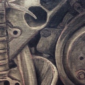
After an awkward and disconcerting hiatus from regular painting while my new studio space was being built and furnished, I’ve been fortunate enough to spend the past month back at the easel on a regular basis. I’ve been working on a half-finished painting that was begun after its original spark of inspiration occurred during the early summer months of 2014. It was then picked at sporadically through the fall and left dormant in winter, until finally undergoing the last push toward completion in the past few weeks. Occasional and intermittent work on a serious and challenging painting is one of my least favorite phenomena. On the contrary, steady and regular progress on a painting keeps the spindly and often ephemeral thread of inspiration intact long enough to keep the nipping dogs of self-doubt and overquestioning at bay. So now I have uncertainties about some of the choices made in the progression of this painting, but done is done. I’d love to carry on the themes and subject matter of this one into future related works, though. We’ll see how that pans out. So many ideas and images in my head…so little of it turns into a physical object in this shared reality. Here are some progress shots from last year and this month. The completed piece will be unveiled soon, after I hopefully think of a title. Grisaille. Color block-in. Applying splatter texture to the block-in. Building up rust textures. Adding fine details and highlights before the final shadow glazes are applied.
Read →
February 11, 2014
Shenpa II
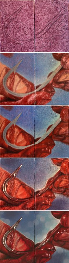
Here’s a process sequence for a tiny diptych painting I did a few months ago related to the recurring theme in my work of healing wounds. Tinted panel with drawing, color block-in, building detail, adding final glazes and highlights, and finished painting. This tiny little pair will be included in the forthcoming art catalogue Pint Size Paintings Volume 2, which compiles these small paintings completed by members of the worldwide tattoo community, and features them in a traveling art show. Shenpa II (Toward Healing), oil on panels, 4 x 3 inches (diptych), 2013 I wrote about the Tibetan Buddhist symbolism surrounding my use of the hook symbol last year, after completing Shenpa I (which now resides in the collection of the amazing and prolific figurative painter Shawn Barber!). Shenpa (Toward Healing), oil on panel, 11 x 14 inches, 2013
Read →
February 2, 2014
Painting Gallery Updates!
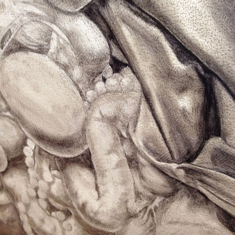
One of my smaller New Year’s resolutions was to update this website with all of the paintings I’ve done over the past two years. Well, I’m happy to say I can cross that task off the list, so please check out the new categories in the lefthand navigation column. The last time I’d added anything to the gallery pages was early in 2012 after finishing the first 10 paintings of my Apostasy series (exhibited at Last Rites Gallery that year). Since then I’ve been blogging steadily about newer completed works, enjoying this venue as an opportunity to share progress photos, technical instruction, and to dive into the thought process and symbolism behind my paintings. I’ve fallen a bit behind on writing about some of my newer pieces in the midst of some distracting life events, and I may write more here about these paintings later on, but for now they’re all posted under the new 2013 category. I also want to say THANK YOU to all the generous collectors who’ve bought paintings and prints over the past few months. I’ve had an extraordinary run of sales lately, selling out my aluminum print editions and parting ways with a handful of various smaller paintings completed in the last few years, placing them in collections here in America and around the world. I feel incredibly grateful for the financial support, and honored to have my creations appreciated by others…not to mention relieved to clear some much needed space on my crowded studio walls. Of course, many of the paintings just posted in the galleries are still available (as well as various pieces from my last few series that have been posted for a while, Reclaiming and the aforementioned Apostasy), and are noted as such in the image details. Feel free to inquire if interested. To end this on a more interesting note, here are some progress shots from a recently completed painting. I can’t post the finished piece in its entirety just yet, as it’s slated for exclusive release on a magazine cover later this year. But for now, enjoy this sneak peak into the process:
Read →
August 1, 2013
Invocation Of Trust
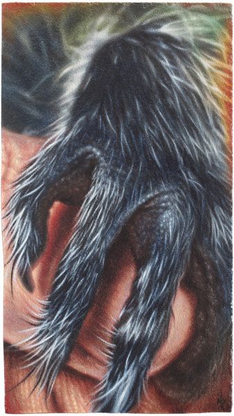
Invocation Of Trust, oil on panel, 4.5 x 8 inches, 2013 Here’s a recent piece I completed for submission to an upcoming charity art exhibit at The Egan Gallery in Fullerton, California, curated by friend and fellow artist Cody Raiza who is a passionate animal welfare activist. This tiny painting was inspired by events this summer at my house in Austin Texas involving the rescue of 2 baby raccoons from a rain catchment bin in my backyard by my partner and I. These two little fuzzballs, normally capable of being quite ferocious, were reduced to feeble, trembling snugglebugs by their traumatic night spent flailing and trying not to drown. They instantly grasped and climbed my extended arms seeking warmth and comfort, and stole our animal-loving hearts in the short time before we entrusted them to the care of an area wildlife rehabilitation center. Of course, never one to miss any artistic photo-op, I snapped away with my iPhone camera and ended up with some gorgeous, heartwarming shots, which after the usual in-phone editing, made their way first to Instagram *, and then to the easel when I realized they were perfectly suited to the theme of this upcoming art show. Edited reference photo from my Instagram account. Here’s the evolution of this image, which just as the title declares, was intended as an invocation of trust in my life, to overcome barriers of fear and isolation, and to elicit sacred tender moments of unity between humans, other beings, all life. Pencil transfer drawing and Grisaille, followed by color block-in and 2-3 layers of color adjustment and glazing. (*This is the first time I’ve painted an image originally intended solely for my Instagram gallery…not sure how I feel about that. I routinely attempt to post content there which is reminiscent of my paintings, and certainly aligned closely with my overall artistic aesthetic, often self-critiquing them afterwards as if they were paintings…but I really despise the over-saturation and cultural-race-to-the-bottom of social media, despite my own degree of participation in it. I’m curious to see how the Ig creative outlet will affect my art in general. To be continued…)
Read →
May 20, 2013
Transfiguration: Process
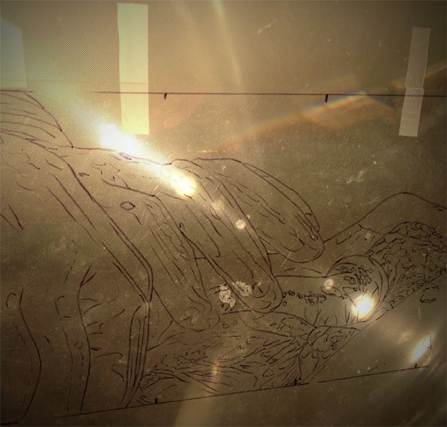
Here are some studio and process shots from the few months’ timespan of painting my latest large work in the Apostasy series: Tracing, on the projector and ready to begin. Starting the block-in of color, working from a small reference. Optical illusion: new painting in front of recent finished piece Glorification. Hands like spiders everywhere. Wound progression. Adding the final translucent white glaze to the gloves for that milky latex look. Applying the final shadow glaze. Working on the finishing touches… From projection tracing to completed painting.
Read →
January 9, 2013
Grasping
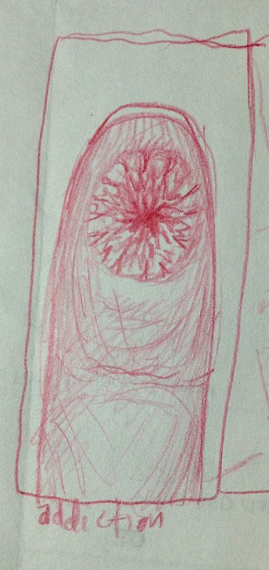
I unearthed this old thumbnail sketch recently while searching for some reference photos in an impossibly overstuffed manila folder, a visual treasure chest where all manner of computer printouts, random newspaper and magazine clippings, and sketches from the last 10+ years are stored. Grasping (thumbnail) This tiny drawing marks the genesis of my 2008 painting Grasping, which uses a visual metaphor to represent the human struggle with craving and addiction: Grasping, oil on panel, 10in x 20in, 2008 Many of my paintings start out this way, with the quick thumbnail sketch being the most efficient method to record a momentary flash of inspiration or percolating idea for later use, before it’s gone forever. (I mentioned thumbnail sketches briefly in this older post about what is quite often the next stage of the painter’s creative process.)
Read →
December 31, 2012
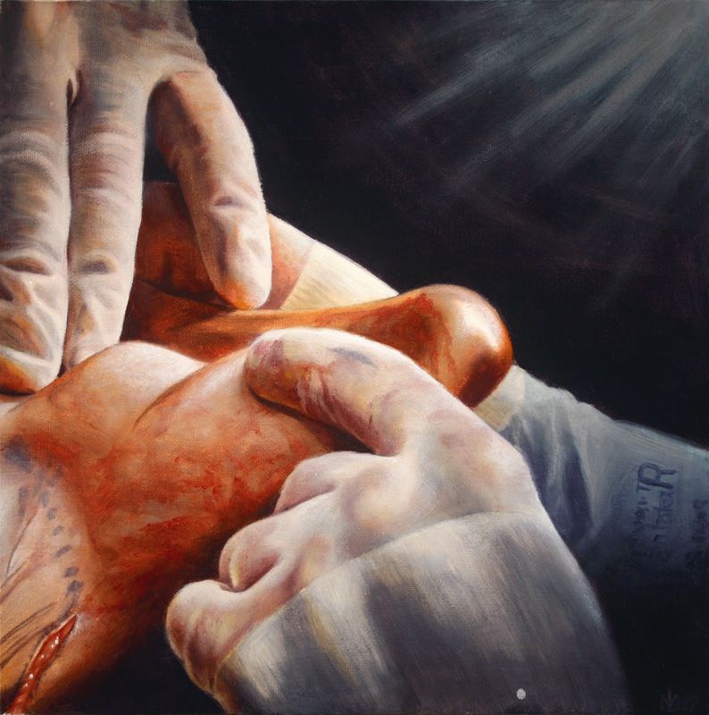
Glorification
My latest installment in The Apostasy series, and the last for 2012, is now complete. Four times as big as the next smallest piece in the series, and by far the largest painting I’ve attempted in oil at 48 inches square, this was a grueling endeavor. Quite frankly, I’m just relieved it’s over, but on the positive side, I feel much more prepared and able to take on the next (and second to last!) piece in the series, which will be in the same large size range. Here is a visual walk through the process of making this painting, which for now I’ve tentatively titled Glorification: Glorification (study), oil on canvas board, 12in x 12in, 2012 Glorification, oil on panel, 48in x 48in, 2012 Happy new year everyone! May we all enjoy success in our continuing endeavors, and a progression in awareness, happiness, and health from an individual level to a global scale.
Read →
November 15, 2012
In Review: Union of Art and Sport
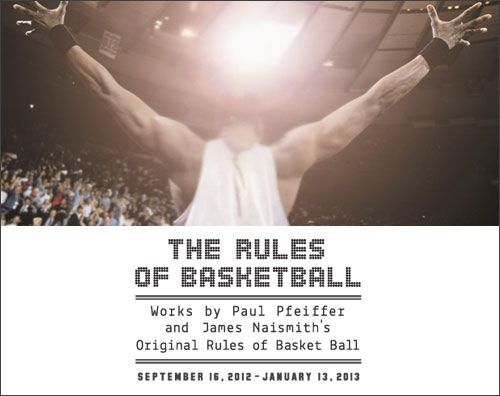
The Rules of Basketball: Works by Paul Pfeiffer and James Naismith’s “Original Rules of Basket Ball” September 16 – January 13, 2013 Blanton Museum of Art at The University of Texas at Austin In an unlikely combination of history and psychology, this exhibit pairs basketball inventor James Naismith’s 1891 document “Original Rules of Basket Ball” with contemporary artist Paul Pfeiffer’s basketball themed digital works. In hindsight, the Naismith material seems like it’d be merely a passing curiosity for most, and only significant for true sports geeks and devout basketball fans, as the real philosophical and entertaining meat of the exhibit is the collection of work by Paul Pfeiffer. This basketball-specific compilation of pieces is dominated by enormous C-prints of mostly vintage and notable game photographs whose removed logos, names, and team colors imbue them with the ghostly hollow silence of a haunted house. Interspersed among these are tiny viewing vessels affixed to the walls, where short-length video clips run in fast highlight-reel styled loops. Pfeiffer’s knack for selecting just the right 3 seconds of game footage to convey his symbolism is evident in the same unexpected walk-through-a-graveyard, eerie feeling they impart. Some of the images and video border on absurd, utilizing the unreal juxtaposition of blanked-out team jerseys with highly memorable sporting moments. Taking all of this in, I found myself suppressing alternating fits of amused, snickering laughter, chest-vibrating tension, and fond childhood sentimentality. Paul Pfeiffer Four Horsemen of the Apocalypse (08), 2005 Fujiflex digital C print, 60 x 48 in. Collection Glenn and Amanda Fuhrman NY, Courtesy The FLAG Art Foundation ©Paul Pfeiffer. Courtesy Paula Cooper Gallery, New York Like nearly all contemporary art, this work is primarily conceptual, deeply embedded within the theoretical realm of symbolism rather than in the organic lineage of traditional craftsmanship…what most tend to quickly appreciate as “skill.” As such, sadly, only the most informed viewers are likely to truly appreciate the full significance of what the artist has made (“Some photoshopped video clips–so what?”). And this, of course, embodies so much of what’s wrong with art in postmodern society, and isn’t necessarily the average viewer’s fault (but that debate gets complicated, and needs its own future blog post or 7). But, as guest curator for the Blanton exhibit Regine Basha insightfully describes, “Paul Pfeiffer frames media, spectacle, and masculinity [and, I’d add–race] in a way that sheds new light on the game of basketball.” His clever digital work “adopts today’s frenetic visual language in order to consider the role that mass media plays in shaping consciousness,” according to the exhibit’s press release. As such, Pfeiffer’s retouched photographs and manipulated video clips are sneakily at the epicenter of some of the most pressing and pivotal conflicts smoldering, unresolved, in the heart of our first-world empire of consumption and spectacle. In Germany in 2000 the Kunst-Werke Berlin e.V., Institute for Contemporary Art, presented the first comprehensive one-man-show of Paul Pfeiffer, offering a beautiful description of his symbolism and process: Pfeiffer’s digital videos are “moving still-lives,” challenging human perception as well as exploring long-standing issues of painting. Due to the accelerated repetition of short sequences, the essential codes of perception, such as the instant recognition of fore- and background, depth and surface, motion and unmoving, blur or cease to be of relevance. For example, in JOHN 3:16 Pfeiffer took found video footage of a basketball game and re-edited it in order to place the ball in the central foreground of the screen with the play swirling around it. The seeming fluidity of the image belies the painstaking nature of the production process: over 5000 individual video frames have been enlarged and repositioned to create the moving image of a ball in play. ( http://kw-berlin.com/deutsch/archiv/pfe/pfe.html ) As a lifelong sports fan, artist, and cultural deconstructionist I had three inherent and unlikely leverage points with which to appreciate this exhibit. Having long ago dissolved the barriers of the self-limiting, culturally-reinforced disparity between “jock” and “artist” stereotypes/archetypes within myself, I felt as though Pfeiffer’s work was made for–and was speaking intimately to– me. I was thrilled to stumble upon these eerily-altered iconic sports images on my recent museum trip, having planned my visit around the Blanton’s simultaneous exhibit of classic Western Americana paintings. Fragment of a Crucifixion (after Francis Bacon), 1999 (Filmstill) ©Paul Pfeiffer In one short video clip that’s both instantly terrifying and hilarious, digital editing and repetition turn the post-dunk celebratory scream of a basketball player into an unnerving, awkwardly aggressive expression of rage. What gives this art added significance to me–perhaps belying the original intent of the artist, who has purposefully removed any team, league, corporate or personal identifiers from the scene–is that I know the basketball player is former college and pro star Larry Johnson, who in Pfeiffer’s video was playing for the Charlotte Hornets, and whose promising career was disappointingly cut short due to injury. I used to watch him enact that primal ritual on live TV as a child, reveling in his athletic prowess, imitating it in my makeshift driveway basketball court, and collecting his basketball cards. It’s in this sentimentality that the work touches a deeper human chord within me, and I feel like a participant in Pfeiffer’s visions, embodying a small part of the very unresolved conflicts that his work calls forth.
Read →
September 24, 2012
Passion
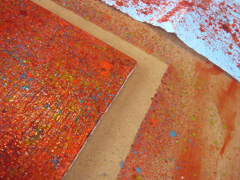
In between paintings of my ongoing surgical theme ( The Apostasy ), I’ve been searching for little sparks of inspiration for my next series of paintings. Attempting new subject matter and freeing myself from the confines of a very specific painting process are two strategies I often employ for a creative jumpstart. So, last month I finished another experimental painting involving a splatter process and a strange juxtaposition of subject matter. I wanted to revisit what I’d tried in my recent still life Denial Vanitas with that splatter technique, and get even looser with it. As the painting came together over a few weeks, it increasingly reminded me of an older piece completed in much the same way, and with a similar aesthetic, called Comfort. Layer 1: multi-colored splatter. “Passion” (detail) Layer 2: blocking in and establishing form. More of the final glaze layer during application. Adding the final shadow glazes. Block-in detail. “Passion”, oil on panel, 16in x 9in, 2012 Splatter detail.
Read →
August 26, 2012
Realism Techniques 7
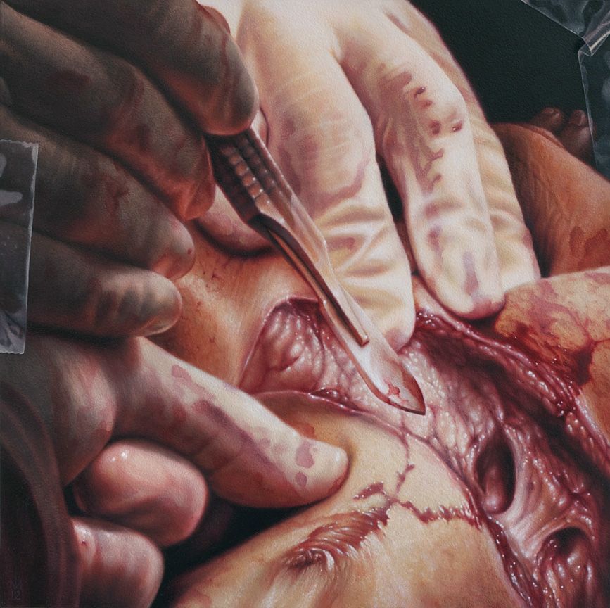
I finished painting #12 in the Apostasy series, now tentatively titled Sacrificial, a few days before my recent galavant to Galapagos. Didn’t get a chance to post anything about it before I left, but let me just say: That trip was crazy. So crazy that re-entering the studio upon my return was like landing in a time warp to a long ago era. Like a cat in a new home I sniffed out the place to make sure it was still real, still my life(?), in this current place and time, and then gratefully got the fuck to work on some prints for an upcoming group show (more coming soon on that). Good to get outta here for an adventure, but good to be back in the creative womb with some new entries in that cluttered/overflowing filing cabinet called mind. So, to get myself caught up, here’s the now foreign-seeming latest: “Sacrificial”, oil on panel, 12 x 12in, 2012 Mini-Layers For anyone actually reading this blog on the regular, the technique of layering to achieve high levels of realism should be at least somewhat familiar by now. Yet, within this broader process of applying paint in separate layers lies the specific technique of applying paint in small amounts, during the progression of a single painting session, or layer. In other words, a wet-into-wet paint application which mimics classic Alla Prima techniques, yet occurs within the quite contradictory process of indirect (or layered) painting. For example, the basic form and colors of the gloved fingers shown below had been established after one opaque paint layer (which I usually call the block-in). After that first layer of opaque paint was dry, subtlety and detail were added in the subsequent layer shown, but this increasing complexity, not surprisingly, requires increasing care during application. Towards this end, paint is added sparingly, in thin amounts, and blended down to join it seamlessly with the dried block-in. I move through an area, micromanaging approximately 1 inch square sections of the painting, each receiving the same apply/blend treatment. I use Galkyd Slow-Dry medium with all of my paint mixtures, and pay close attention to the viscosity of the paint when mixing on my palette, since overly fluid or thick consistencies can make this stage of the painting process incredibly difficult. Finally, where mini-layers come into play is when the application and blending process is repeated during the same painting session. I revisit many of the 1 inch square areas while the paint is still wet, and re-apply another thin layer of color, blending that out very carefully so as not to destroy the first application. …And so on, until these wet mini-layers have accumulated thick enough that I deem the layer no longer workable. At this point, the session is finished and I wait for that layer of paint to dry before revisiting the same area again. The sequence below shows some of these steps. If you look carefully, you can see tiny areas of paint being applied and then smoothed out. These same areas were worked over once more in the same fashion, with certain areas receiving a third pass during that same day’s work. Look at the purple shadow area first, then the off-white knuckle wrinkles, then the orange and deep red under-lighted areas. And lastly, a studio shot of my reference for the piece, which was perhaps the most complex and densely detailed of the series thus far: The scalpel was a final addition to the already heavily-Photoshopped reference image, replacing a much more modern cauterizing scalpel, whose unsatisfactory look of a Lego toy betrayed its badassness.
Read →

July 21, 2012
Realism Techniques 6
After a few experimental forays I returned to the studio recently to continue work on The Apostasy series, which has been my major ongoing project for the past year. Due to time and size constraints, only the first 10 paintings in this series debuted at Last Rites Gallery for my solo show in May and June. I’m still very inspired by the themes and subject matter of these images, so it was great fun diving back in–I felt like I picked up right where I’d left off before my show. The most recent painting I completed was a perfect example of the realism artist’s need to deviate from a strict reproduction of the reference material in order to maximize the intended symbolism or desired aesthetic qualities. Using Reference Effectively In this case, my reference image, which in itself had been highly manipulated from its original photographic state with Photoshop, featured a metallic instrument rather starkly silhouetted against a harshly lit background of tender skin. I was faced with the artist’s “executive decision”: to ride the simple, graphic power of the flat black silhouette, or to increase the nuances of its surface texture in order to emphasize the effects of the hard light behind it. Either choice works just as effectively within the overall composition, but caters ever so slightly to a different level of meaning within the piece. Power of steel instrument to manipulate the fleshly realm, or power of the light of truth usurping man and all his manipulative tools? I chose the latter. So, this involved the invention of some extreme lighting effects on the surface of the instrument. These I hoped would more fully express the metallic nuances and form of this foreground object, as hard backlighting bends around it, creating a bit of a warm flare. In general, I thought this increased action would add some more life to the piece. You can compare these deviation attempts in the provided sequence of photos, which starts with the specific area of my reference image, and ends with the corresponding section of the completed painting. (Image of the full painting coming soon…) Intentionally painting the instrument too light at first allowed more control in creating subtle variations of lighting on the object. Ultimately this entire issue is of minimal impact to the outcome of the entire image, and for those unfamiliar with the quirks of extreme realist painting, may seem like an exhaustingly trivial matter. However, I enjoy it as yet another example of the myriad opportunities for creativity in a genre often mistakenly deemed uncreative. Often, the creativity in ultra realistic styles simply operates at an unexpected and far subtler level than most viewers are trained to recognize. Far from a mere copy-machine, the experienced realism painter works often with fully premeditated intention on every minuscule aspect of the painting, making a countless number of creative decisions and unique departures rarely noticed by the undiscerning eye. In fact, if the artist’ technical skill is strong enough, there’s no way that these aspects can be noticed. Like a magician, full acceptance by the audience signifies completion of the ultimate illusion.
Read →

July 3, 2012
Realism Techniques 4.5
Here’s the followup and conclusion to my earlier post featuring a texture experiment with some new subject matter. The results are now in, and personally I feel that the styrofoam packing peanut texture attempt #1 was a success. Here’s a detail sequence of the major steps of the layering process. Descending into madness, otherwise known as, the building of styrofoam texture. This painting will debut at a Copro Gallery group show curated by renowned dark pop-surrealist Chet Zar, which promises to be an amazing display of the elite fine art talent in the tattooing scene–which has long been denied access to and credibility within the mainstream, or establishment art world. But, times are changing, and Chet is an impromptu ambassador of sorts, working on the forefront of this shift while treading the boundaries between several art scenes with his own career. Many thanks and much respect goes out to him for his efforts.
Read →
May 11, 2012
Realism Techniques 3
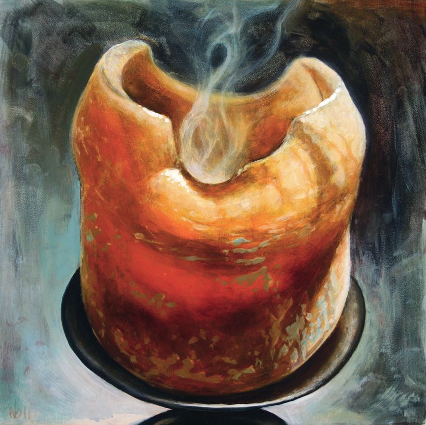
Working Smarter, Not Harder Here are two more quick paintings from my visit to Jeff Gogue’s studio last summer, which I’ve blogged about here and here. These paintings were executed (almost) entirely in Jeff’s very direct Alla Prima working process, with his stripped-down palette of Titanium White, Alizarin Crimson, Prussian Blue, and Transparent Orange. "Extinguished 1" Oil on Panel, 12 x 12 in, 2011 The goal during the several hours it took to paint each of these was, first and foremost, to let the spontaneity and expressiveness of each brushstroke remain apparent, to let the paint breathe in all of its wet, visceral uneven glory. In other words: not turning into a self-indulgent artist and over-brushing everything to death. Or, in other, other words: not using my normal sharp-focus realism techniques or process. "Extinguished 2" Oil on Panel, 12 x 12 in, 2011. These candles are a metaphor for the passing of time and worldly things, the aging of mind and body. The still-smoking wick represents the fundamental stillness of mind, accessible through meditation, which becomes clear once all thoughts, concepts and constructs have been extinguished. The half-melted candle represents the slow aging and decay of the body, our physical vessel. The theory behind this approach is that over-working the paint takes you out of the moment, masking the raw emotion that may be transferred from body to brush to canvas, that infuses a picture with a sense of life and mystery. Emphasis is placed on accurate and efficient reproduction of what you’re seeing: hold brush confidently, make your mark with discriminating force, leave it alone. As a realist, this exercise is a valuable lesson in efficiency, allowing you to access the ability to commit the most information with a single stroke. More accuracy with the least amount of physical brushwork or artistic manipulation. Its simplicity is quite beautiful, really, like Buddhist meditation practices. It’s also quite painful for the neurotic who wants everything to be smooth and perfect, everything resolved and solved so that the final illusion is primary while the physical surface of the painting melts into oblivion. The working process I’ve developed over the years is patterned after many of the Renaissance masters who used many layers and subtle glazes to achieve convincing illusions. These results are often dependent upon a process of highly refined brushwork, and arrived at through precise technique, planning, and strategy. So, needless to say, each of these candle still lifes were a monumental struggle from start to finish, as I forced myself to make marks and then leave them alone–moreover, to make “mistakes,” and then leave them alone. Ultimately, I’m pleased with the results as well as the experienced gained from the exercise. When I returned home and began painting again in my usual manner, I found myself able to loosen up my brushwork to achieve illusions more efficiently. Incorporating the ‘observe, make mark, move on’ attitude helps me, as a painter of realism, focus on committing only the necessary information, more accurately and more quickly. I see this as the next level of learning, after an artist learns simply how to work with paint. It’s the process of learning how to work smarter, not harder. To achieve greater results, in less time and with less struggle.
Read →
March 23, 2012
Realism Techniques 2
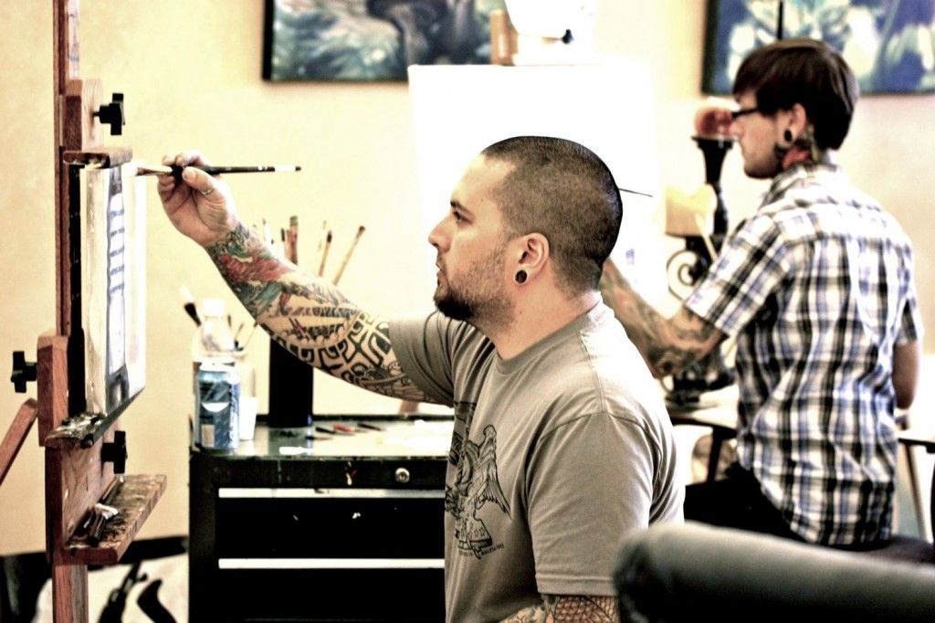
After recently finishing my newest series of paintings for my show in May/June at Last Rites Gallery, I had a chance to revisit an experimental painting I’d started this past summer while attending a workshop by my friend Jeff Gogue, a phenomenal painter and tattoo artist in Grant’s Pass, OR. To backtrack a bit: I convinced Jeff to lead a workshop for me in an attempt to break away from my well-worn habits and artistic routine. I find the intentional abandonment of familiarity and comfort to be a crucial element of any learning process, and knowing that Jeff has a drastically different technical approach than I do, I knew I could round out my own knowledge and expertise by absorbing some of his. Jeff and I in his studio. This proved to be quite challenging and downright frustrating (perfect! or in the words of comedian Will Arnett, “that’s how you know it’s workinnng!”), as I grappled with my ingrained artistic tendencies. (Side note/Cliffhanger #1: I’m preparing a thorough explanation of this concept for a future blog post). I started a simple painting that week, abandoning myself to Jeff’s process, with no clear vision of what my end result would look like nor how I would get there. My stay in Oregon ended before I could see this painting through to its conclusion, and I quickly forgot all about it for months while keeping busy with other projects. How it looked when I left oregon. Fast forward to March, and here I am with a unique challenge of revisiting what I’d learned at the workshop in order to finish what I’d started several months prior. I finally had a vision of where I wanted to take this piece, and I made the decision to adapt the foreign process I’d started the painting under, to my own familiar process for finishing pieces, creating an interesting synthesis of two peoples’ techniques and approaches. A mental collaboration, with only one person executing the plan. Here’s a step-by-step document of a portion of the painting, consisting of wafting tendrils of black smoke, being completed with my familiar glazing process. Glazing over previously dried layers is the only way to build up smooth transparencies of color–perfect for the illusion of smoke. I’ll post the entire completed painting once it’s been properly photographed. (Interesting side note/Cliffhanger #2: In deconstructing this process by studying the progress photos I’d taken, I realized a much more efficient method of layer buildup that I could have used, which I predict would also be conducive to even more realistic results. A compare and contrast to the 2 approaches will be the subject of a future Realism Techniques post.) The smoke was completed in 5 stages, each a transparent glaze layer, consisting of a high alkyd-to-pigment ratio, applied over paint that had been allowed to dry completely.
Read →
January 12, 2012
Realism Techniques 1
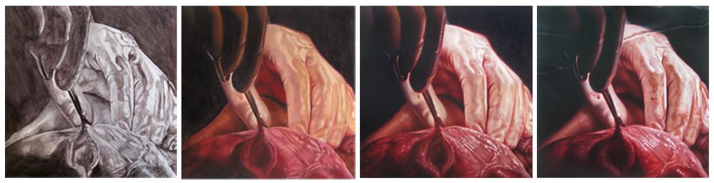
This is the start of an occasional ongoing series on this blog where I’ll be discussing the process and techniques of sharp-focus realism oil painting. Here’s the evolution of the painting I began at my parents’ house during a recent visit. The phases of development you see here represent approximate divisions into layers, i.e. major progress stages of the painting (click on the image below to make it larger). In actuality, there were a few more partial layers and back-and-forth adjustments made to various areas of the piece which are not shown here, as they didn’t constitute major turning points. Generally speaking, after the first two complete layers, it’s then possible to break off into intense development on one section of the piece if desired or needed, since at that point enough information has been recorded to establish a failsafe foundation upon which to build endless subtleties. I believe that the most convincing photorealist paintings cannot be achieved through anything other than this subtle progression of multiple layers. This piece is part of a new series nearing completion, which will debut officially on May 26th at Last Rites Gallery in N Value study, block-in, development of detail and form, final adjustments and refinement. YC. More details of that show will be available in the coming months.
Read →