Journal
Practice & process notes
Occasional writing on my art practice, techniques, process, and the ideas behind the work.
11 articles on learning
November 8, 2023
Then, And Now (Part 5)
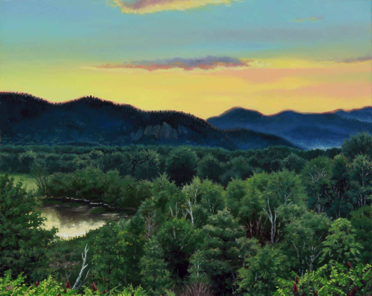
"Then, And Now" or "Then & Now" in the blog search feature, is an ongoing occasional series where themes of progression, time, and memory are explored. "White Mountains Sunset" / Oil on Canvas Panel / 8 x 10 inches / 2023 This painting has an interesting backstory, starting in 2015 when I took an amazing plein air landscape painting workshop in New Hampshire from Thomas Kegler, offered through the Grand Central Atelier. I was brand new to the genre of landscape after having done still life painting for years, and on this evening a sunset painting meetup with renowned landscape painter Erik Koeppel and others was scheduled, which would be my first time ever attempting the extreme challenge of capturing a live sunset in paint. I was thrilled to be painting alongside these legends of the genre and did my best to soak up any knowledge I could while absolutely speed-panic painting my way through a much too short sunset. It was a memorable experience for me and the artistic result was far less important than the practice and mental impressions made. "White Mountains Sunset" / Oil on Canvas Panel / 8 x 10 inches / 2015 As such, I was never happy with the results of my painting and it sat on my studio drying rack since that trip, offering a great memory and calling out faintly to be resolved into a product I can be more happy with. As fate would have it, and I won’t attempt to even speculate why, these past few months was when the random spark of an idea and inspiration finally came to me after 8 years, and I knew it was time to rework this thing. I focused on accuracy this time around, as it had been so long that I was resigned to using photo references from that evening rather than relying on memory, and I always hated how inaccurate the mountains turned out the first time. The rest of the original study was encouragingly accurate to the hazy color diffusion of those moments and the rest of the spatial proportions. I regret losing that hazy pastel color chord in my reworking, which ended up being based on a later stage of the sunset when the forest and mountains had become much darker and cooler, no longer bathed in amber glow. But despite changing its palette and color harmony, I believe it to be a better painting now overall, and feel a sense of closure that this at least won’t be haunting me from the studio wall anymore. Side note: improvement is guaranteed if you just show up and put in the time and effort consistently! So if you’ve been grinding, don’t be afraid to revisit old work when the time finally feels right. Finishing paintings, no matter how long after the fact, allows an artist to learn more lessons and ultimately improve more than abandoning unfinished projects for good.
Read →
April 5, 2020
Notes & Advice 12: What To Consider When Setting Up A Still Life
Discussing some of the subtler points of still life setup with Jake Meeks of Fireside Tattoo Network and Podcast. Part of my alla prima still life painting workshop for sale on the fireside website in video module format.
Read →
March 12, 2020
My 20-Step Program for Perfect Art Reproductions
If you’re a painter or visual artist working in any traditional media, capturing digital images of your work is practically a requirement nowadays, and has been for a while. I don’t know any artist who could survive without getting images of their work onto the internet, submitted to publications, made into prints, or a variety of other applications that require a quality reproduction. And quality is the key word here: representing yourself with a poor version of your work will hurt your chances of success. You wouldn’t think that capturing quality images of a completely still, flat object in a controlled indoor setting would be one of the most challenging photography jobs, but it is. I’ve actually paid pro photographers to shoot images of my paintings, and gotten a disc full of yellow-tinted garbage and flat-out unusable files, because those photographers weren’t well versed in the highly specific nuances of this photography application. (untitled), oil on linen panel, 8 x 10 inches, 2016 The details matter here, and skipping any of the major or sometimes even minor steps will usually compromise the end result, to varying degrees. With so many factors that can go wrong, it’s wise when possible to devote an area of your studio to this, with dedicated lighting, equipment, and pre-measured distances and angles. Depending on the level of compromise or imprecision in your studio setup, the more editing of your raw files you’ll need to do on your computer. But even the best photography results will still require basic cropping and picky stuff like smoothing over a blown pixel from your camera’s sensor, or eliminating a small cat hair that somehow floated and stuck to the painting (cats are thoughtful like that, always trying to help…). So here’s the equipment you’ll need (with what I currently use in parentheses), followed by the process, which was taught to me by the talented and wonderfully kind British painter Edward Povey and his wife Donna Tolar. I’ve added some of my own Adobe Photoshop expertise to their process for correcting photography shortcomings, and that’s included as well, but you’ll need a fairly good understanding of the program to follow my brief notes (or else this would be book length, not blog post length, sorry). Equipment Camera: full-frame sensor DSLR (Canon EOS 5D Mark III) Lens: anything in the 50mm range, without a zoom (Canon EF 50mm 1:1.2 L) Tripod: sturdy, with fully adjustable ball joint mount (Manfrotto 290 and 496RC2) Remote shutter cord (Canon RS-80N3) Circular Polarizer Filter to fit lens (Promaster) 2 adjustable freestanding studio lights with daylight balanced bulbs 2 Polarizer filters for the studio lights (Visual Pursuits Glare-Stop 8M Filter) Easel or flat wall space for mounting artwork 90º perpendicular to floor. Tape measure and/or ruler Level (the straight/flat tool with the little air bubble vials) White, neutral gray, or black sheet or walls Enclosed, light-proof studio space (for best results, it should be on par with a film processing darkroom, or shoot at night with all curtains/blinds drawn) Computer (Imac, 4.2 GHz Intel Core i7, Radeon Pro 580 8 GB) Photoshop CS4 or newer (CC 2019) Process Set up photo area with everything at right angles where necessary, and parallel where necessary. 90º angles and parallel planes are crucial for minimizing lens distortion. Your artwork needs to be perpendicular to the floor, as does your camera lens. The front glass edge of the lens needs to be parallel to the artwork. Use your level to check artwork angle and other things, and use the level sensor on your camera to make sure it is both vertically and horizontally balanced, and pointed precisely to the exact center of the painting. Use a tape measure to calculate any measurements needed or to check straight alignments. Set up 2 studio lights at 45º angles to your artwork, halfway between your camera and the artwork. Each light should point towards the opposite vertical edge of the artwork, at the halfway point of the artwork’s vertical measurement. Set up a black, gray, or white sheet behind your artwork, if your studio wall isn’t already white, gray, or black. The background that your camera sees around the artwork will influence how it processes color and adjusts its white balance. For really dark artworks, I like a black background, and for really light ones, a white background. Attach polarizing filters to the front of each studio light, as flush as possible to the light hood without touching the bulb (which could melt the filter gel). I rigged my own attachment system for the lights I have out of wire and masking tape. Adjust camera speed to 100 ISO, and match its white balance to the type of bulbs you’re using in your studio lights (if tungsten, choose tungsten setting, etc) Set image quality to the highest setting (camera RAW) Set lens to whatever its midpoint aperture is, usually F8-11 for your typical F16 or F22 capable lens. Attach remote switch, and use screen view instead of eyepiece viewing so that you don’t risk bumping or shaking your camera. With all overhead and ambient lights off, and only the two filtered 45º angle studio lights on, spin the circular polarizer filter on your lens until all glare highlights on the artwork disappear (when viewed through the camera lens). If some glare or highlights remain, you may need to rotate the 2 filters on the lights a bit. There should be no other light entering the room or hitting the artwork. Focus the lens as tightly as you can on the artwork. Adjust camera shutter speed according to these final calibrations. For me it’s usually in the 20-30 seconds range. With such a long exposure there can be absolutely no movement or shaking of the artwork, the camera setup, the floor, or the room you’re in, or else you’ll get a slightly blurry or hazy image. Bracket your shot, meaning find what appears to be the most accurate shutter speed as indicated by the camera sensor, then also shoot one or two speeds slower and faster than that, just to ensure you have the proper exposure. Cameras can be fooled by paintings with a high degree of contrast between their lightest light areas and darkest dark areas. You can use the compensation settings on your camera to help with this as well. On your computer, make sure your monitor is calibrated and you’re working with the proper display brightness. Make sure the lighting in your computer area is balanced daylight bulbs or natural daylight from windows. Place the artwork next to or near the computer monitor, in the same balanced/neutral lighting. Open your raw files in Photoshop and select the most accurate exposure by comparing to the original artwork. Edit as needed to crop, straighten, or correct lens distortion. Just about all lenses will distort or warp the picture plane as it gets closer to the edges of the lens’s viewing area. If your artwork is a perfect rectangle but is no longer geometrically perfect in the photo, drag horizontal and vertical guidelines onto the image and use EDIT > TRANSFORM > DISTORT and/or WARP functions to correct the artwork’s shape. Edit any inaccuracies in color with adjustment layers and layer masks as needed, comparing against the actual artwork next to your hopefully decently calibrated monitor, in the same balanced lighting. The most effective adjustment layers for these minor tweaks are HUE/SATURATION, COLOR BALANCE, LEVELS, and SELECTIVE COLOR. Since my studio setups at the various places I’ve lived over the years have almost never been ideal, I usually need a combination of all of these adjustment layers on every image to get it 95-100% accurate. In rare cases I’ve used multiple of each, with parts of each erased in order to let parts of the other layers show, to match what was happening in each area of the painting. As noted above, these last 2 steps can get very technical and require a good working knowledge of Photoshop, which can be gained by tutorials or books of course, or simply from hours of controlled experimenting on a sample image. Edit any blown pixels, dust, hairs, or other minor imperfections with CLONE STAMP tool. If you plan to turn the digital file into a physical print, you’ll likely have a second round of color editing to do on the file, once you see a proof from whatever printer you’re using. Printer ink on paper is a much different process and effect than a backlit digital screen, and every print format is a little bit different in how it needs to be prepped. Wow, being a professional artist is a lot of work. This isn’t really a step, I just wanted an even 20 steps because it looks better and makes me feel good. So that’s it! Just a really quick and simple process (just kidding) for getting guaranteed amazing, coffee table book, professional-ass website, or giclee print quality artwork reproductions every time. Enjoy!
Read →
November 1, 2019
On The Benefits of Drawing
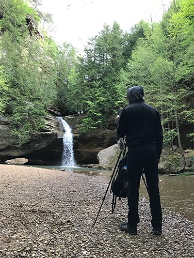
About 10 years ago I leveled up my artistic practice in all areas after discovering the classical atelier system of art education. Before that time I had been piecing together my own slow, winding learning trajectory in the realism painting genre, unintentionally slowing my progression with an over-reliance on photographic reference. In contrast, the atelier system is based on working directly from life, whether it be a live model, a still life, or a landscape. Painting from life in Ohio, 2017 In short, observing directly with one’s own eyes forces the brain and the artist’s hand to convert the 3 dimensions of real life into the 2 dimensions of a flat canvas. Over time our eyes-brain-hand feedback loop becomes seamless, and we learn how to reproduce exactly what we see. The real-time, real life mental calculations of angles, lines, curves, planes, perspective, light and shadow, and millions of color possibilities have a measurable result: if the drawing or painting looks indistinguishable from what we’re observing, then those myriad calculations are overwhelmingly correct. Of course, eventually, an artist needs to learn how, when, and where to diverge from absolute accuracy in order to create a work of art that transcends the mere replication of reality…but the learning process that we submit to in order to reach that point is surprisingly valuable in its own right. “Lower Falls at Old Man’s Cave”, 8x 10 inches, oil on panel, 2017 Arguably the single most important artistic discipline or skill, simple life drawing is actually a fairly complex amalgam of skills, requiring at least a rudimentary working knowledge of geometry, physics, optics, and the ability to plan sequentially. True life drawing begins as little more than primitive map making–the plotting of coordinates in space–and ends ideally with an incredibly nuanced understanding of the physics of form, mass, and light. This great article I stumbled across got me thinking about drawing; what it forces our brains to do, and how it benefits our brains. While intended for the non-artist reader, it makes great cross-disciplinary connections and serves as a nice reminder and motivator for anyone who is an actual practicing artist, of just how valuable drawing is to our art. https://qz.com/quartzy/1381916/drawing-is-the-best-way-to-learn-even-if-youre-no-leonardo-da-vinci/ “Form & Emptiness”, graphite on paper, 2012 Form & Emptiness (detail), graphite on paper, 2012
Read →
January 27, 2017
In The Studio 5: Reworking Plein Air Landscapes
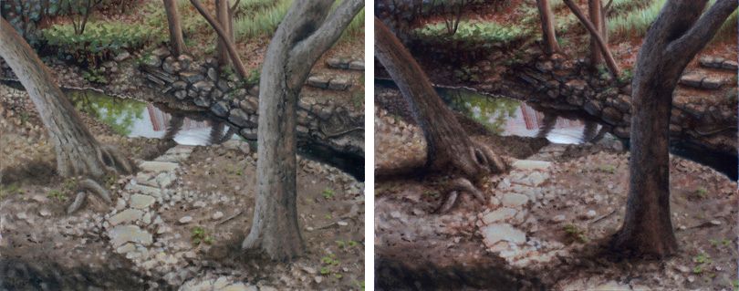
Something I’ve never been a fan of doing is revisiting older paintings after some time has passed. The process of reconstructing or even merely re-approaching the original mindstate, inspiration, and vision for the painting feels spiritually regurgitative in some unclean way. Like digging up a dead issue in a relationship with your partner. I’ve never been one to want to dwell in the past, favoring the pursuit of new goals and the exploration of new territory over the retread of old ground. But since embarking on a landscape painting journey over the past few years I’ve seen some of the masters of the genre doing just this–picking up old plein air studies to breath new life into them, perhaps making them more presentable as a truly finished piece to a buying audience–and had stared at some of my early plein air studies long enough to realize how I too could push the sense of drama or atmosphere in them. View From The Studio, before (L) and after glaze layer. Not to mention, more hours logged in the practice of landscape painting, more hours logged studying weather and outdoor light with more intention and discernment, has had the natural and inevitable effect of expanding my critique ability of what I’ve previously done as well as eased some of my fears about ruining those original results. This shift is the tangible, or at least quantitative, proof that learning is happening–awesome! So in a brief fit of discontented boredom lately I pulled a few early landscapes off the wall and put my glazing knowledge learned from many hours of studio still life painting to use on some formerly alla-prima studies that looked a little flat. Oil glazing truly does replicate the phenomenon of translucent–but not completely transparent–atmosphere that we live in and see through every time we gaze into the distance. Which makes it a perfect tool in the landscape painter’s skillset. For advanced stages of realism in any genre I find it to be absolutely indispensable, and enjoyed the practice of applying it to my new pursuit of landscape painting mastery. A little 4 x 6 inch study of my former backyard bridge, given a more dramatic late afternoon shadow treatment.
Read →

June 16, 2016
Anatomical Study from Cadavers
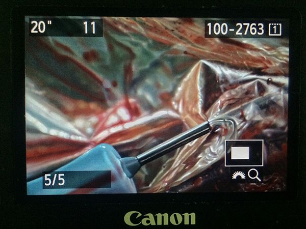
One major artistic discipline for which I have the least formal study is anatomy. I find the human figure and its underlying structures infinitely challenging in all of the complex shapes, sizes and movements they’re capable of. I’ve logged many hours of figure drawing practice from live models as well as a few painting sessions but never have had the opportunity for long term, in-depth study, starting from the inside out. Which is why I jump at the chance for any opportunity to briefly work on this artistic area, and recently was given a rare and unique invitation to observe and paint a cadaver dissection at a local training facility for medical school and EMS students. Knowing about the rich artistic tradition of anatomical study from cadavers, which began in earnest during the Renaissance in Europe, I was thrilled to uphold and carry forward this practice as a contemporary artist. In recent times the tradition has mostly faded, and I relish the privilege I was given for a day to revive it and link my artistic practice to that of the old masters and forefathers of modern Western art, like Da Vinci, Michelangelo, and Titian, among others. Leonardo Da Vinci, Studies of the Shoulder and Neck, c. 1509-1510 Which isn’t to say that I regard myself to be in their rarified company in any way whatsoever, especially artistically. My accomplishments and artwork are quite meager in comparison with their mastery and all they left us with. What I mean is that, they started and passed on a beautiful tradition of deep artistic study melded with science–a tradition that I, in some small way, have been able to carry on, by practicing in a similar manner. This day of training, although completely fascinating and enthralling, was not easy. We were set up in an examination room kept around the temperature of a refrigerator, due to, of course, the presence of a draped cadaver in the center of the room. Needless to say, these temperatures are difficult to be in for long periods of time without a lot of physical activity to keep one’s blood flowing and core temperature at a comfortable level. So after a while, painting with cold stiff fingers and shivering chest became the biggest challenge…and amusingly, allowed me to relate in a strange way to the severed and dissected arm of the cadaver perched on a crumpled medical drape in front of me, cold and stiff in its own way. After observing the technician peel back the layers of skin and fascia on the forearm, all the while listening intently to his explanations of the detailed anatomy and its functioning, my friend James and I then watched in amazement as the arm was severed at the shoulder joint (quite easily) from its cadaver, and placed before us for further study. I gloved up and made a pleasing arrangement with it, and then got to work for a short hour and a half oil sketching session. Here’s the final result of an amazing day of learning and painting: Study of an Arm, oil on panel, 9 x 12 inches, 2016
Read →
March 3, 2016
Notes & Advice 11
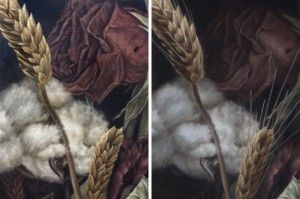
The popular text message shorthand TMI, as most of us growing up in the cell phone era know, means “too much information.” Normally not a good thing–except when it comes to my realism oil painting strategy. To be specific, I find it useful to paint as much information as possible in the beginning stages and opaque layers of my photorealist paintings, so that I can pick and choose where to obscure it during the final (semi-transparent) glazing layers. There’s perhaps a bit of inefficiency involved in this approach, but it allows for a more organic development process overall, and a greater degree of control during the final artistic choices of what to emphasize or subordinate into shadow. “Dying In America” (detail). Before and after the final shadow glazes. Note the subtle loss of detail/information in the rose petals. The human eye is capable of seeing every detail of any given view, but the brain, our computer processor of sorts, is wired for efficiency and baseline survival, and as such is instinctively tuned to only allow us to focus on what is most important in any given view. Details and countless bits and pieces of any scene get stitched together from memory, assumption, and expectation, while a vast majority of the remaining minutiae are simply discarded as inessential to whatever task is at hand. Some of my favorite realism artists were masters of this concept, knowing exactly what to emphasize or subdue in order to pull the viewers attention towards their focus and tug at their heartstrings with an effective narrative or use of symbolism. Notice in John Singer Sargent’s portraits how little attention was paid to large areas of dress, allowing inessential areas to become black or brown silhouettes with no detail. He created a hierarchy of importance within the picture that mimics the way our brains naturally function, using the aforementioned technique to subordinate certain areas. John Singer Sargent. “Madame X (Madame Pierre Gautreau),” 1884, oil. The dress and background, which comprise nearly all of the painting, are almost entirely flat areas of dark valu Andrew Wyath used the technique of reserve just as brilliantly towards the goal of depicting scenic vistas and landscapes with a completely lifelike–yet surprisingly graphic and simplistic–appearance, setting the often somber and peaceful mood with just enough detail to draw us in and keep us looking. Andrew Wyeth. “Sea Boots,” 1976, tempera. Details in the boots and foreground tempered with the geometric simplicity of everything in the top half of the composition. Andrew Wyeth. “Barracoon,” 1976, tempera. Just enough accurate rendering in the figure and folds in the fabric, juxtaposed with large open fields of color and diffused texture. And so I too try to keep the artistic concepts of hierarchy, subordination, and reserve in mind while envisioning my final result, with the goal of creating a visually appealing image, rather than chaotic overload containing a factually truthful amount of information, yet lacking cohesion and harmony. I think these concepts become especially important when painting anything approaching the photorealism genre. Micro details are common and often necessary to complete the desired illusion in this style of painting, and yet conversely, a closed-minded and strict devotion to every detail of one’s photo reference or still life arrangement can result in a less aesthetically pleasing work of art. “Dying In America” (detail). Visual information, as with most things in life, can in fact become too much of a good thing. To make sure I hit my desired sweet spot on the information spectrum, I’m not afraid to paint more detail than will ultimately be needed, only to lose it in deep, rich, believable shadows. The most effective of these shadows will still contain the faintest traces of the details underneath, yet not so much detail as to clutter and distract from my desired focal point. “Dying In America,” 2015, oil on linen panel.
Read →
July 15, 2014
Notes & Advice 9
“If you wish to make certain your painting will succeed, a minimum of three things must come from you–and only you. The first thing is knowing why you want to paint your subject, the second is an analytical grasp of what you see, and the third is the skill to control the process of painting.” – Richard Schmid This quote I recently came across, written by a wise and very accomplished alla prima realism painter, got me thinking about the underlying structure that comprises the task of creating art. Schmid divides this structure nicely into 3 primary, foundational elements. This striking simplicity belies the complexity inherent in most forms of art, especially realism, and that simplicity bodes well for artists and laypersons alike–the so-called “uncreative” types, those who mistakenly regard themselves as “not having an artistic bone in my body.” Here’s my interpretation of Richard Schmid’s quote, expounding on his 3 main tenets and how they (encouragingly) apply to everyone: “Knowing why you want to paint your subject” refers to concept and theory. In other words, the philosophical side of the craft, the ideas and meaning the artist is working with or wishes to communicate through their work (I’ve written a lot about this here and here, with a future post coming as well). This relates to the study of your own mind, to “knowing thyself” and formulating ideas about life and the world around you. I believe that everyone has ideas about themselves and the world around them, because our living brains naturally and instinctively generate thoughts, and we can always translate those thoughts into words and images. “An analytical grasp of what you see” refers to active observation: true “seeing” rather than merely “looking.” Seeing is active analyzation of visual information, whereas looking is passive receiving of visual stimuli. And of course, all but the visually impaired can train their minds and eyes to work in concert, to more deeply understand the structures and lighting of the physical world, in order to convincingly reproduce them on paper or canvas. “The skill to control the process of painting” refers to technique, achieved through practice and repetition, like army boot camp or working out at the gym. Skill and control in painting depend on hand-eye coordination and mastery of materials, i.e. knowing which pigments are transparent or opaque, which mediums to thin your paint with in order to make it do a specific thing, which brushes produce certain effects when combined with specific hand motions, etc. Anyone can train their physical body to remember certain tasks and movements like those involved in painting, even those who don’t consider themselves to be artists. It just depends on one’s level of motivation and available time.
Read →
July 27, 2013
What Is Art? (Part 1.5): An Integral Approach
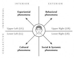
In a delightful twist of fate last week, an email appeared on my computer screen (via my subscription to the Core Integral newsletter) that advanced and expanded the concepts I attempted to shed light on with my last blog post, about what art is and how to use it as an effective communication. So, in an impromptu Part 1.5 of my ongoing inquiry, here is the text of that newsletter with a link to the lecture it refers to, followed by a brief review of its major concepts. “Think of a piece of art that you are particularly struck by. It doesn’t matter what it is. It could be a painting, a piece of music, a film, or any other expression of beauty that you find yourself impressed with or inspired by. Visualize the piece in your mind’s eye—or, if you like, open a new tab in your web browser and Google it, so it’s right in front of you. As you admire your preferred object of beauty, ask yourself a simple question: how can I tell what this means? How do you answer? a) The meaning can be found in the original intent of the artist. If I want to know what a piece of art means, I should simply ask the artist. b) The meaning can be found in the artwork itself. The artwork is a whole unto itself, and everything I need to understand it is fully present in the actual piece of art. c) The meaning can be found in the response of the viewer, which means that a single piece of art can have multiple meanings, depending on who happens to be observing it. d) The meaning can be found in all the social circumstances surrounding the artist, since no artwork is created in a vacuum. If you want to know what a piece of art means, you need to consider where and when it was made, its historic and techno-economic influences, etc. e) All of the above. If you answered “all of the above” there’s a very good chance this talk is for you. But here’s the weird thing: people don’t always know that’s even an option. In fact, it’s still overlooked most of the time. Most artists, philosophers, and critics have devoted their entire lives and careers to just one of the first four choices, while passionately trying to negate the others. Listen as Ken describes each of these major schools of interpretation, how they originated, and how they all fit together into a more cohesive vision of art and aesthetics.” (An audio file of Ken’s talk can be streamed here. ) In this hour lecture, leading Integral philosopher Ken Wilber talks about the various schools of artistic interpretation that have arisen in the past few hundred years, and how each used in isolation is inadequate as a means of reaching the deepest or most comprehensive appreciation of visual art. He gives the historical and cultural context surrounding such movements as Formalism (too dismissive of an artist’s intention), Romanticism (too dismissive of external social forces), and other useful but incomplete -isms that have made major contributions to the art world. Ken argues that one must integrate as many of these schools of thought as possible, in order to build a more complete framework for understanding (or creating) art that accesses knowledge from each of the “4 Quadrants” that comprise reality (interior, exterior, individual, and collective). Ken Wilber’s theory states that all art is created by a combination of all 4 quadrants of reality, and therefore can only be fully understood with knowledge derived from all 4 quadrants. He refers to the concept of artistic intention quite a bit, which I was thrilled to hear from a non-artist, since increasing the level of intentionality that I paint with has been one of my areas of focus for the past few years (which I mentioned as part of my internal dialogue in Part 1: Self Inquiry ). What intention requires, as Ken eludes to, is knowledge and context: a framework of understanding broad enough to shed light on all the different choices an artist can make. The opposite of intention is what I’ve experienced as “the manifestation of indecision,” a state of ignorance or naiveté in which the art-making process resorts to blind instinct and shot-in-the-dark crapshoots that one merely hopes will look good or manage to communicate something in the end. What Ken doesn’t mention is that understanding all of this, of course, requires a level of motivation (to spend time learning) that perhaps only the most dedicated artists or enthusiasts would possess. So while I thoroughly appreciate his critique and advice, I feel it’s a bit of wishful thinking–if not a bit patronizing as well–and in being “over the heads” of many laypersons, it therefore still won’t solve the great debate for most. But if you’re an ultra art nerd like I am, and have a quiet hour to devote to a dry intellectual oration, you will love the complex yet logical perspective Ken offers as his answer to the questions “What is art?” and “How do we make sense of it?” “You really need to have a comprehensive philosophy of reality if you’re going to [effectively] interpret the meaning of art, because all of these dimensions impact an artwork, and therefore are part of the art’s meaning. And if you’re going to unfold that meaning, then you have to have a really rich, comprehensive philosophy of contexts.” –Ken Wilber
Read →
February 9, 2013
Notes & Advice 5
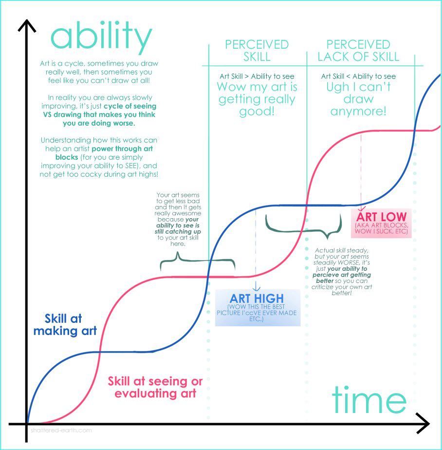
The Artistic Learning Curve The internet can sometimes be productive…usually when you least expect or want it to be. On a recent pointless time-wasting session I accidentally stumbled into two gems of knowledge that I thought profound enough to share: I don’t know a single artist who can’t relate to the learning curve graphic, it’s just so unerringly true. If you know, you know. For the life of me I can’t track down the original URL in order to give proper credit, but I found it too accurate and insightful to withhold. This other graphic is from an unrelated source, but perfectly appropriate, and a great context through which to interpret the previous one:
Read →
March 23, 2012
Realism Techniques 2
After recently finishing my newest series of paintings for my show in May/June at Last Rites Gallery, I had a chance to revisit an experimental painting I’d started this past summer while attending a workshop by my friend Jeff Gogue, a phenomenal painter and tattoo artist in Grant’s Pass, OR. To backtrack a bit: I convinced Jeff to lead a workshop for me in an attempt to break away from my well-worn habits and artistic routine. I find the intentional abandonment of familiarity and comfort to be a crucial element of any learning process, and knowing that Jeff has a drastically different technical approach than I do, I knew I could round out my own knowledge and expertise by absorbing some of his. Jeff and I in his studio. This proved to be quite challenging and downright frustrating (perfect! or in the words of comedian Will Arnett, “that’s how you know it’s workinnng!”), as I grappled with my ingrained artistic tendencies. (Side note/Cliffhanger #1: I’m preparing a thorough explanation of this concept for a future blog post). I started a simple painting that week, abandoning myself to Jeff’s process, with no clear vision of what my end result would look like nor how I would get there. My stay in Oregon ended before I could see this painting through to its conclusion, and I quickly forgot all about it for months while keeping busy with other projects. How it looked when I left oregon. Fast forward to March, and here I am with a unique challenge of revisiting what I’d learned at the workshop in order to finish what I’d started several months prior. I finally had a vision of where I wanted to take this piece, and I made the decision to adapt the foreign process I’d started the painting under, to my own familiar process for finishing pieces, creating an interesting synthesis of two peoples’ techniques and approaches. A mental collaboration, with only one person executing the plan. Here’s a step-by-step document of a portion of the painting, consisting of wafting tendrils of black smoke, being completed with my familiar glazing process. Glazing over previously dried layers is the only way to build up smooth transparencies of color–perfect for the illusion of smoke. I’ll post the entire completed painting once it’s been properly photographed. (Interesting side note/Cliffhanger #2: In deconstructing this process by studying the progress photos I’d taken, I realized a much more efficient method of layer buildup that I could have used, which I predict would also be conducive to even more realistic results. A compare and contrast to the 2 approaches will be the subject of a future Realism Techniques post.) The smoke was completed in 5 stages, each a transparent glaze layer, consisting of a high alkyd-to-pigment ratio, applied over paint that had been allowed to dry completely.
Read →