Journal
Practice & process notes
Occasional writing on my art practice, techniques, process, and the ideas behind the work.
12 articles on layers
September 9, 2023
Summer Plein Air: Chasing The Light
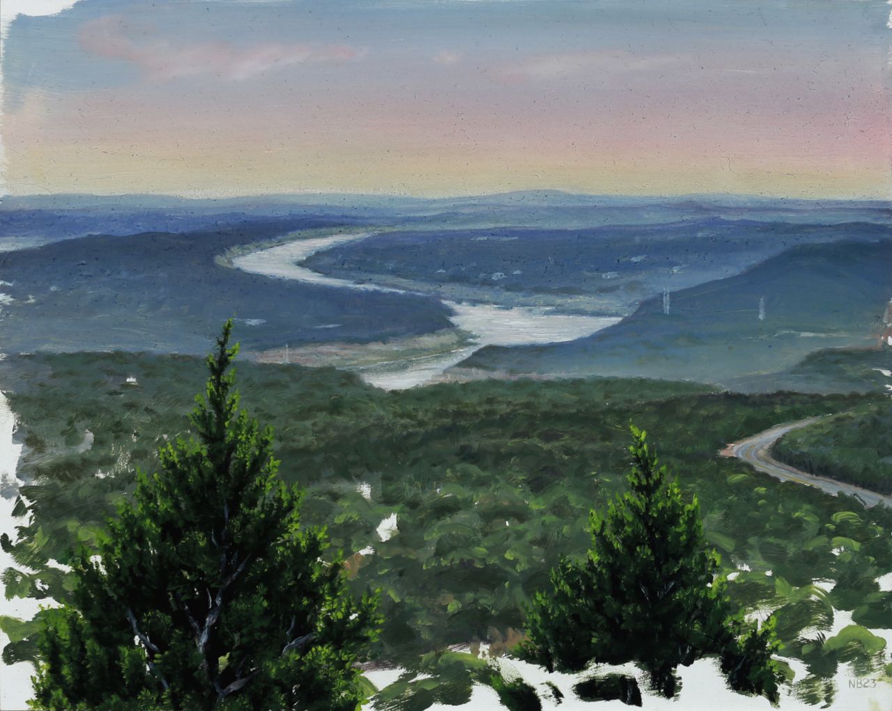
Summer in Texas, where I live and work, is never the best outdoor painting time. Extreme heat and incredibly harsh, searing daylight add degrees of difficulty to the plein air process, to speak nothing of the extra extreme summer of heat we've been having this year. But I did manage to get outdoors and paint a few times lately–thanks to some great friends providing an extra bit of motivation–for a much needed dose of artistic nature time. First was a quick sunset sprint at a local overlook, on a very hot and hazy evening. The air was so thick that the scene looked foggy, and this moisture in the air diffused the dusk light nicely into a wash of pastel hues. I blocked in the basics of the distant river bend for an hour on my 8 x 10 inch panel before the sun disappeared on us, disregarding the slower detailed areas of juniper trees in the extreme foreground. After letting the painting dry for a few days, these were then rendered in a 2 hour studio session along with some pastel glazes in the sky to saturate the sunset effect. "Dusk Over Lago Vista", oil on panel, 8 x 10 inches, 2023 During our next outing, shade was a requirement as it was late morning and the sun was already in full blast, warming up to another triple digit temperature day. We chose a lowland trail snaking alongside a dry creek bed under cover of thick live oak, juniper, hackberry, and pecan trees. Hoping for a small waterfall that feeds into the creek, we soon realized that with our region's severe drought status that was a pipedream, and settled for a little shaded clearing opening up to the dry creek bed next to the trail. The summer death rays of the sun puncturing the canopy created a perfect opportunity for some fun lighting effects–quite the opposite of the previous outing's diffused hazy ones. We painted for approximately 3 hours, in which time I got a thorough block-in of the detailed scene accomplished on another 8 x 10 inch panel, knowing that once again I would spend another 2 hours in the studio after it had dried, completing the effects of light and shadow, warm and cool, with a glaze layer. This level of realist subtlety in atmospheric affects simply is not possible with the alla prima technique of single-session plein air painting, as the optical combination of translucent color sitting on top of opaque color is what creates the more convincing illusion of depth that our eye perceives in a painting. "Dry Creek Bed, River Place", oil on canvas panel, 8 x 10 inches, 2023 When I’m scouting a painting location I’m always looking for a focal point, a primary feature of the environment or lighting that will interest a viewer more than a mere factual recording of a place and time. There are always time constraints imposed on an outdoor painting and sometimes you settle for a mundane scene (without a waterfall...) that needs to be made more interesting by focusing on what the light is doing, emphasizing color or atmosphere beyond what is observed but still within the bounds of convincing realism. That’s what happened here. The serpentine tree shapes were interesting but beyond that, the white hot dappled light on shaded rocks was going to be the real star of the show, with a little coaxing. P.S.– Here's a bonus miniature 5 x 7 inch wave study from a trip to Miami Beach earlier in the summer, completed in the same 2-session manner as the aforementioned pieces. Oil on Panel, 5 x 7 inches, 2023
Read →
March 12, 2020
Recent Painting Progressions
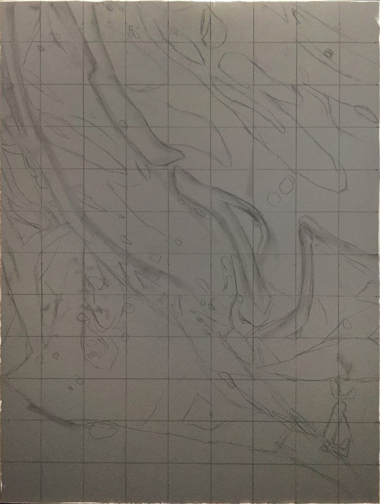
I love process in art–seeing it, knowing how things are made, reverse engineering them, speculatively forward-engineering them, reflecting on my own process and learning from that reflection… so enjoy these progressions of 2 recent paintings. 1. “Vernal Fugue”, oil on panel, 18 x 24, 2019 “Vernal Fugue”, oil on panel, 18 x 24 inches, 2019 “Vernal Fugue” (details) 2. “Civilization”, oil on panel, 36 x 48 inches, 2019-2020 “Civilization”, oil on panel, 36 x 48 inches, 2019-2020
Read →
October 25, 2016
BLOOD RITUALS MMXVI: Progress Montage
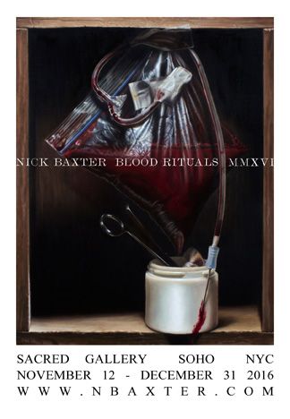
Here’s another video featuring work from my forthcoming series of new paintings “Blood Rituals,” debuting at Sacred Gallery in NYC November 12th. Shown in this video are the paintings “Quantum Of Sustenance” (oil on linen, 12 x 16 inches), “Banquet Of Suffering” (oil on linen, 18 x 24 inches), and “Pull Me Through Time” (oil on linen, 26 x 40 inches), along with various progress shots of my layering and glazing processes.
Read →
March 3, 2016
Notes & Advice 11
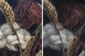
The popular text message shorthand TMI, as most of us growing up in the cell phone era know, means “too much information.” Normally not a good thing–except when it comes to my realism oil painting strategy. To be specific, I find it useful to paint as much information as possible in the beginning stages and opaque layers of my photorealist paintings, so that I can pick and choose where to obscure it during the final (semi-transparent) glazing layers. There’s perhaps a bit of inefficiency involved in this approach, but it allows for a more organic development process overall, and a greater degree of control during the final artistic choices of what to emphasize or subordinate into shadow. “Dying In America” (detail). Before and after the final shadow glazes. Note the subtle loss of detail/information in the rose petals. The human eye is capable of seeing every detail of any given view, but the brain, our computer processor of sorts, is wired for efficiency and baseline survival, and as such is instinctively tuned to only allow us to focus on what is most important in any given view. Details and countless bits and pieces of any scene get stitched together from memory, assumption, and expectation, while a vast majority of the remaining minutiae are simply discarded as inessential to whatever task is at hand. Some of my favorite realism artists were masters of this concept, knowing exactly what to emphasize or subdue in order to pull the viewers attention towards their focus and tug at their heartstrings with an effective narrative or use of symbolism. Notice in John Singer Sargent’s portraits how little attention was paid to large areas of dress, allowing inessential areas to become black or brown silhouettes with no detail. He created a hierarchy of importance within the picture that mimics the way our brains naturally function, using the aforementioned technique to subordinate certain areas. John Singer Sargent. “Madame X (Madame Pierre Gautreau),” 1884, oil. The dress and background, which comprise nearly all of the painting, are almost entirely flat areas of dark valu Andrew Wyath used the technique of reserve just as brilliantly towards the goal of depicting scenic vistas and landscapes with a completely lifelike–yet surprisingly graphic and simplistic–appearance, setting the often somber and peaceful mood with just enough detail to draw us in and keep us looking. Andrew Wyeth. “Sea Boots,” 1976, tempera. Details in the boots and foreground tempered with the geometric simplicity of everything in the top half of the composition. Andrew Wyeth. “Barracoon,” 1976, tempera. Just enough accurate rendering in the figure and folds in the fabric, juxtaposed with large open fields of color and diffused texture. And so I too try to keep the artistic concepts of hierarchy, subordination, and reserve in mind while envisioning my final result, with the goal of creating a visually appealing image, rather than chaotic overload containing a factually truthful amount of information, yet lacking cohesion and harmony. I think these concepts become especially important when painting anything approaching the photorealism genre. Micro details are common and often necessary to complete the desired illusion in this style of painting, and yet conversely, a closed-minded and strict devotion to every detail of one’s photo reference or still life arrangement can result in a less aesthetically pleasing work of art. “Dying In America” (detail). Visual information, as with most things in life, can in fact become too much of a good thing. To make sure I hit my desired sweet spot on the information spectrum, I’m not afraid to paint more detail than will ultimately be needed, only to lose it in deep, rich, believable shadows. The most effective of these shadows will still contain the faintest traces of the details underneath, yet not so much detail as to clutter and distract from my desired focal point. “Dying In America,” 2015, oil on linen panel.
Read →
February 11, 2014
Shenpa II
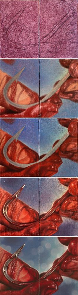
Here’s a process sequence for a tiny diptych painting I did a few months ago related to the recurring theme in my work of healing wounds. Tinted panel with drawing, color block-in, building detail, adding final glazes and highlights, and finished painting. This tiny little pair will be included in the forthcoming art catalogue Pint Size Paintings Volume 2, which compiles these small paintings completed by members of the worldwide tattoo community, and features them in a traveling art show. Shenpa II (Toward Healing), oil on panels, 4 x 3 inches (diptych), 2013 I wrote about the Tibetan Buddhist symbolism surrounding my use of the hook symbol last year, after completing Shenpa I (which now resides in the collection of the amazing and prolific figurative painter Shawn Barber!). Shenpa (Toward Healing), oil on panel, 11 x 14 inches, 2013
Read →
May 20, 2013
Transfiguration: Process
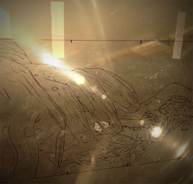
Here are some studio and process shots from the few months’ timespan of painting my latest large work in the Apostasy series: Tracing, on the projector and ready to begin. Starting the block-in of color, working from a small reference. Optical illusion: new painting in front of recent finished piece Glorification. Hands like spiders everywhere. Wound progression. Adding the final translucent white glaze to the gloves for that milky latex look. Applying the final shadow glaze. Working on the finishing touches… From projection tracing to completed painting.
Read →
December 31, 2012
Glorification
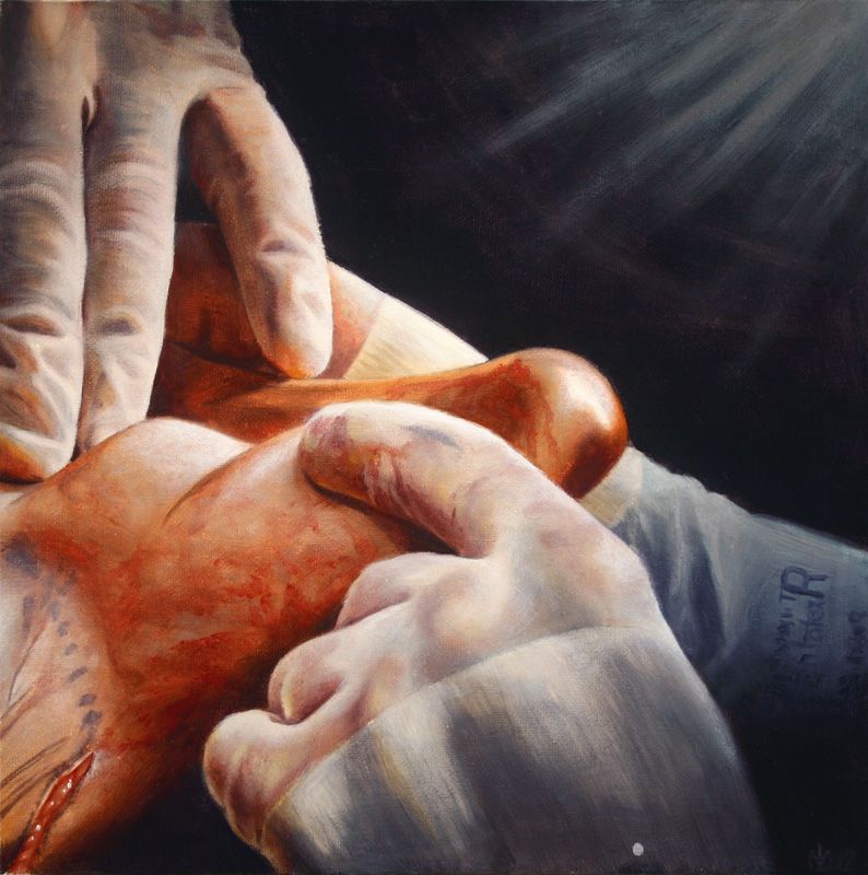
My latest installment in The Apostasy series, and the last for 2012, is now complete. Four times as big as the next smallest piece in the series, and by far the largest painting I’ve attempted in oil at 48 inches square, this was a grueling endeavor. Quite frankly, I’m just relieved it’s over, but on the positive side, I feel much more prepared and able to take on the next (and second to last!) piece in the series, which will be in the same large size range. Here is a visual walk through the process of making this painting, which for now I’ve tentatively titled Glorification: Glorification (study), oil on canvas board, 12in x 12in, 2012 Glorification, oil on panel, 48in x 48in, 2012 Happy new year everyone! May we all enjoy success in our continuing endeavors, and a progression in awareness, happiness, and health from an individual level to a global scale.
Read →
August 26, 2012
Realism Techniques 7
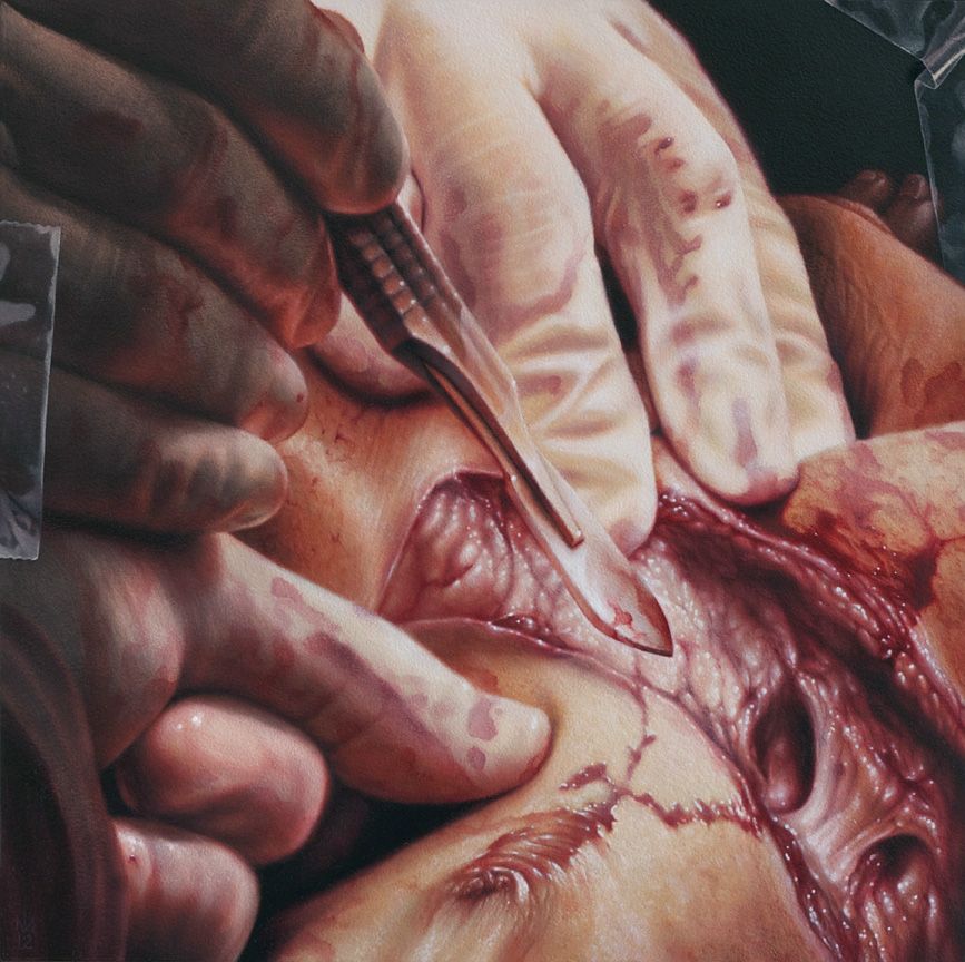
I finished painting #12 in the Apostasy series, now tentatively titled Sacrificial, a few days before my recent galavant to Galapagos. Didn’t get a chance to post anything about it before I left, but let me just say: That trip was crazy. So crazy that re-entering the studio upon my return was like landing in a time warp to a long ago era. Like a cat in a new home I sniffed out the place to make sure it was still real, still my life(?), in this current place and time, and then gratefully got the fuck to work on some prints for an upcoming group show (more coming soon on that). Good to get outta here for an adventure, but good to be back in the creative womb with some new entries in that cluttered/overflowing filing cabinet called mind. So, to get myself caught up, here’s the now foreign-seeming latest: “Sacrificial”, oil on panel, 12 x 12in, 2012 Mini-Layers For anyone actually reading this blog on the regular, the technique of layering to achieve high levels of realism should be at least somewhat familiar by now. Yet, within this broader process of applying paint in separate layers lies the specific technique of applying paint in small amounts, during the progression of a single painting session, or layer. In other words, a wet-into-wet paint application which mimics classic Alla Prima techniques, yet occurs within the quite contradictory process of indirect (or layered) painting. For example, the basic form and colors of the gloved fingers shown below had been established after one opaque paint layer (which I usually call the block-in). After that first layer of opaque paint was dry, subtlety and detail were added in the subsequent layer shown, but this increasing complexity, not surprisingly, requires increasing care during application. Towards this end, paint is added sparingly, in thin amounts, and blended down to join it seamlessly with the dried block-in. I move through an area, micromanaging approximately 1 inch square sections of the painting, each receiving the same apply/blend treatment. I use Galkyd Slow-Dry medium with all of my paint mixtures, and pay close attention to the viscosity of the paint when mixing on my palette, since overly fluid or thick consistencies can make this stage of the painting process incredibly difficult. Finally, where mini-layers come into play is when the application and blending process is repeated during the same painting session. I revisit many of the 1 inch square areas while the paint is still wet, and re-apply another thin layer of color, blending that out very carefully so as not to destroy the first application. …And so on, until these wet mini-layers have accumulated thick enough that I deem the layer no longer workable. At this point, the session is finished and I wait for that layer of paint to dry before revisiting the same area again. The sequence below shows some of these steps. If you look carefully, you can see tiny areas of paint being applied and then smoothed out. These same areas were worked over once more in the same fashion, with certain areas receiving a third pass during that same day’s work. Look at the purple shadow area first, then the off-white knuckle wrinkles, then the orange and deep red under-lighted areas. And lastly, a studio shot of my reference for the piece, which was perhaps the most complex and densely detailed of the series thus far: The scalpel was a final addition to the already heavily-Photoshopped reference image, replacing a much more modern cauterizing scalpel, whose unsatisfactory look of a Lego toy betrayed its badassness.
Read →
July 6, 2012
Realism Techniques 5
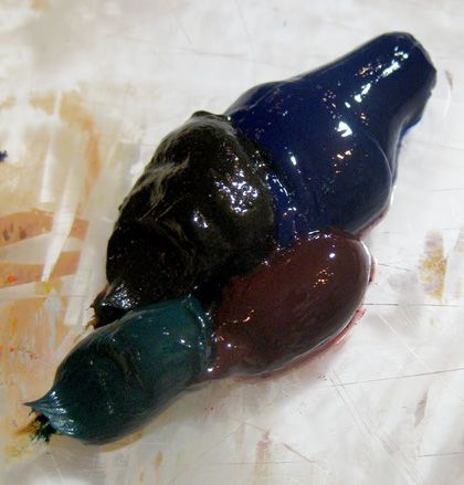
My Black Sauce In order to add richness, subtlety and depth to the darkest areas of my paitnings, I avoid the use of the color black entirely (i.e. Ivory Black, Lamp Black, etc.), opting instead for my own dark color blend. I’ve found through my experience that the mixture of several dark colors creates a new color approaching the solidity of true black when applied in enough thick layers, yet yielding enough translucency in thinner applications to open up a much wider range of subtle color variation. This flexibility and translucency in turn creates the possibility of much more realistic shadows and a truly convincing “absence of light” that the viewer can still see into. Mixing up my special black sauce at the start of a new painting. This recipe consisted of Ultramarine, Burnt Umber, Veridian, and Alizarin. I use a simple demonstration during my instructional seminars to prove the necessity of what I call “translucent shadows.” I find a well-lit patch of space in the room and hold an opaque object in front of my outstretched arm, casting a prominent shadow across it. I then invite the audience to answer the following rhetorical questions: Did the colors of my arm magically change into the colors of the shadow, like a chameleon’s skin changing to match its surroundings? Assuming not, did the colors of my arm therefore stay the same as they were before being cast in shadow? Similarly, were you able to still see the shadowed area of my arm, or was it completely swallowed up by an opaque, black, absence of light? Assuming it was visible, would you conclude that there was still a percentage of indirect light still present within the darkened shadow area? What this demonstration makes obvious is the need for mimicking the processes of physics and light in the natural world within our paintings, as a method of making them accurately replicate that world. This means painting objects or spaces close to their fully lit appearance and then obscuring them by using translucent shadow glazes, to the proper degree, and with the necessary color hues. Of course, with experience, shortcuts can be taken on this process and this rule of sorts can be effectively broken for even further nuanced results. In my own work, I don’t paint every single object or space in its fully lit colors before glazing it into shadow–instead I often aim for a middle point, knowing that after one or more glaze layers it will have the same appearance as if I hadn’t taken the shortcut. This saves time and effort, while maintaining the high level of control necessary for realistic illusions. Logically, it also follows that if you take too big of a shortcut by matching a shadowed object’s final color during your underpainting, then glaze a translucent shadow over it to create the convincing, full-bodied richness of a realistic shadow, the cumulative effect will obviously make it darker than you had originally intended. Simple trial and error yields the correct steps, shortcuts, and glazing formulas to achieve the exact results you had intended. Translucent shadows place the objects within the murky depths of the space without completely obscuring them. Immense amounts of time and sanity were saved by glazing over whole areas of completed forms (“indirect” painting) rather than precisely matching every shadow color contained within each object through “direct” or opaque painting methods.
Read →

July 3, 2012
Realism Techniques 4.5
Here’s the followup and conclusion to my earlier post featuring a texture experiment with some new subject matter. The results are now in, and personally I feel that the styrofoam packing peanut texture attempt #1 was a success. Here’s a detail sequence of the major steps of the layering process. Descending into madness, otherwise known as, the building of styrofoam texture. This painting will debut at a Copro Gallery group show curated by renowned dark pop-surrealist Chet Zar, which promises to be an amazing display of the elite fine art talent in the tattooing scene–which has long been denied access to and credibility within the mainstream, or establishment art world. But, times are changing, and Chet is an impromptu ambassador of sorts, working on the forefront of this shift while treading the boundaries between several art scenes with his own career. Many thanks and much respect goes out to him for his efforts.
Read →
May 11, 2012
Realism Techniques 3
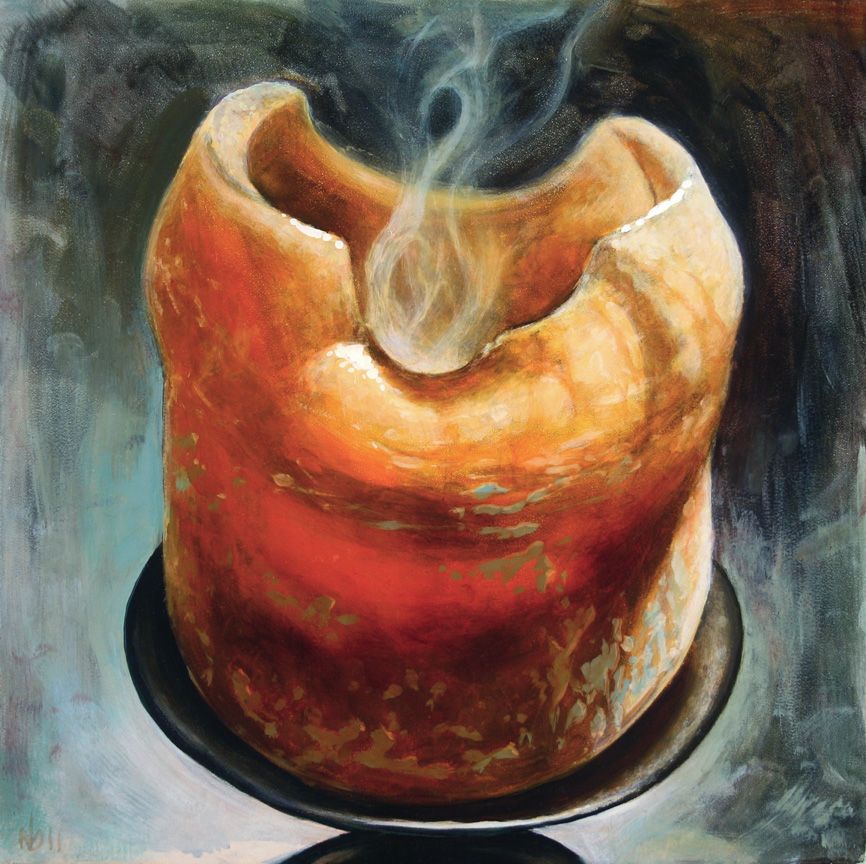
Working Smarter, Not Harder Here are two more quick paintings from my visit to Jeff Gogue’s studio last summer, which I’ve blogged about here and here. These paintings were executed (almost) entirely in Jeff’s very direct Alla Prima working process, with his stripped-down palette of Titanium White, Alizarin Crimson, Prussian Blue, and Transparent Orange. "Extinguished 1" Oil on Panel, 12 x 12 in, 2011 The goal during the several hours it took to paint each of these was, first and foremost, to let the spontaneity and expressiveness of each brushstroke remain apparent, to let the paint breathe in all of its wet, visceral uneven glory. In other words: not turning into a self-indulgent artist and over-brushing everything to death. Or, in other, other words: not using my normal sharp-focus realism techniques or process. "Extinguished 2" Oil on Panel, 12 x 12 in, 2011. These candles are a metaphor for the passing of time and worldly things, the aging of mind and body. The still-smoking wick represents the fundamental stillness of mind, accessible through meditation, which becomes clear once all thoughts, concepts and constructs have been extinguished. The half-melted candle represents the slow aging and decay of the body, our physical vessel. The theory behind this approach is that over-working the paint takes you out of the moment, masking the raw emotion that may be transferred from body to brush to canvas, that infuses a picture with a sense of life and mystery. Emphasis is placed on accurate and efficient reproduction of what you’re seeing: hold brush confidently, make your mark with discriminating force, leave it alone. As a realist, this exercise is a valuable lesson in efficiency, allowing you to access the ability to commit the most information with a single stroke. More accuracy with the least amount of physical brushwork or artistic manipulation. Its simplicity is quite beautiful, really, like Buddhist meditation practices. It’s also quite painful for the neurotic who wants everything to be smooth and perfect, everything resolved and solved so that the final illusion is primary while the physical surface of the painting melts into oblivion. The working process I’ve developed over the years is patterned after many of the Renaissance masters who used many layers and subtle glazes to achieve convincing illusions. These results are often dependent upon a process of highly refined brushwork, and arrived at through precise technique, planning, and strategy. So, needless to say, each of these candle still lifes were a monumental struggle from start to finish, as I forced myself to make marks and then leave them alone–moreover, to make “mistakes,” and then leave them alone. Ultimately, I’m pleased with the results as well as the experienced gained from the exercise. When I returned home and began painting again in my usual manner, I found myself able to loosen up my brushwork to achieve illusions more efficiently. Incorporating the ‘observe, make mark, move on’ attitude helps me, as a painter of realism, focus on committing only the necessary information, more accurately and more quickly. I see this as the next level of learning, after an artist learns simply how to work with paint. It’s the process of learning how to work smarter, not harder. To achieve greater results, in less time and with less struggle.
Read →
January 12, 2012
Realism Techniques 1
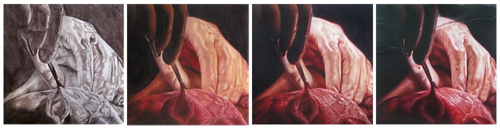
This is the start of an occasional ongoing series on this blog where I’ll be discussing the process and techniques of sharp-focus realism oil painting. Here’s the evolution of the painting I began at my parents’ house during a recent visit. The phases of development you see here represent approximate divisions into layers, i.e. major progress stages of the painting (click on the image below to make it larger). In actuality, there were a few more partial layers and back-and-forth adjustments made to various areas of the piece which are not shown here, as they didn’t constitute major turning points. Generally speaking, after the first two complete layers, it’s then possible to break off into intense development on one section of the piece if desired or needed, since at that point enough information has been recorded to establish a failsafe foundation upon which to build endless subtleties. I believe that the most convincing photorealist paintings cannot be achieved through anything other than this subtle progression of multiple layers. This piece is part of a new series nearing completion, which will debut officially on May 26th at Last Rites Gallery in N Value study, block-in, development of detail and form, final adjustments and refinement. YC. More details of that show will be available in the coming months.
Read →