Journal
Practice & process notes
Occasional writing on my art practice, techniques, process, and the ideas behind the work.
10 articles on Photoshop
March 12, 2020
My 20-Step Program for Perfect Art Reproductions
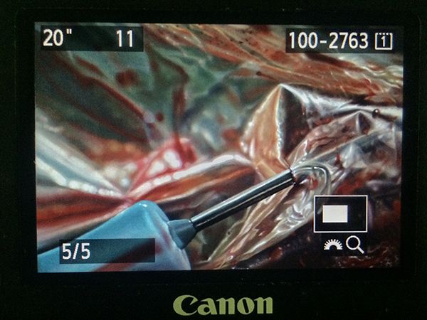
If you’re a painter or visual artist working in any traditional media, capturing digital images of your work is practically a requirement nowadays, and has been for a while. I don’t know any artist who could survive without getting images of their work onto the internet, submitted to publications, made into prints, or a variety of other applications that require a quality reproduction. And quality is the key word here: representing yourself with a poor version of your work will hurt your chances of success. You wouldn’t think that capturing quality images of a completely still, flat object in a controlled indoor setting would be one of the most challenging photography jobs, but it is. I’ve actually paid pro photographers to shoot images of my paintings, and gotten a disc full of yellow-tinted garbage and flat-out unusable files, because those photographers weren’t well versed in the highly specific nuances of this photography application. (untitled), oil on linen panel, 8 x 10 inches, 2016 The details matter here, and skipping any of the major or sometimes even minor steps will usually compromise the end result, to varying degrees. With so many factors that can go wrong, it’s wise when possible to devote an area of your studio to this, with dedicated lighting, equipment, and pre-measured distances and angles. Depending on the level of compromise or imprecision in your studio setup, the more editing of your raw files you’ll need to do on your computer. But even the best photography results will still require basic cropping and picky stuff like smoothing over a blown pixel from your camera’s sensor, or eliminating a small cat hair that somehow floated and stuck to the painting (cats are thoughtful like that, always trying to help…). So here’s the equipment you’ll need (with what I currently use in parentheses), followed by the process, which was taught to me by the talented and wonderfully kind British painter Edward Povey and his wife Donna Tolar. I’ve added some of my own Adobe Photoshop expertise to their process for correcting photography shortcomings, and that’s included as well, but you’ll need a fairly good understanding of the program to follow my brief notes (or else this would be book length, not blog post length, sorry). Equipment Camera: full-frame sensor DSLR (Canon EOS 5D Mark III) Lens: anything in the 50mm range, without a zoom (Canon EF 50mm 1:1.2 L) Tripod: sturdy, with fully adjustable ball joint mount (Manfrotto 290 and 496RC2) Remote shutter cord (Canon RS-80N3) Circular Polarizer Filter to fit lens (Promaster) 2 adjustable freestanding studio lights with daylight balanced bulbs 2 Polarizer filters for the studio lights (Visual Pursuits Glare-Stop 8M Filter) Easel or flat wall space for mounting artwork 90º perpendicular to floor. Tape measure and/or ruler Level (the straight/flat tool with the little air bubble vials) White, neutral gray, or black sheet or walls Enclosed, light-proof studio space (for best results, it should be on par with a film processing darkroom, or shoot at night with all curtains/blinds drawn) Computer (Imac, 4.2 GHz Intel Core i7, Radeon Pro 580 8 GB) Photoshop CS4 or newer (CC 2019) Process Set up photo area with everything at right angles where necessary, and parallel where necessary. 90º angles and parallel planes are crucial for minimizing lens distortion. Your artwork needs to be perpendicular to the floor, as does your camera lens. The front glass edge of the lens needs to be parallel to the artwork. Use your level to check artwork angle and other things, and use the level sensor on your camera to make sure it is both vertically and horizontally balanced, and pointed precisely to the exact center of the painting. Use a tape measure to calculate any measurements needed or to check straight alignments. Set up 2 studio lights at 45º angles to your artwork, halfway between your camera and the artwork. Each light should point towards the opposite vertical edge of the artwork, at the halfway point of the artwork’s vertical measurement. Set up a black, gray, or white sheet behind your artwork, if your studio wall isn’t already white, gray, or black. The background that your camera sees around the artwork will influence how it processes color and adjusts its white balance. For really dark artworks, I like a black background, and for really light ones, a white background. Attach polarizing filters to the front of each studio light, as flush as possible to the light hood without touching the bulb (which could melt the filter gel). I rigged my own attachment system for the lights I have out of wire and masking tape. Adjust camera speed to 100 ISO, and match its white balance to the type of bulbs you’re using in your studio lights (if tungsten, choose tungsten setting, etc) Set image quality to the highest setting (camera RAW) Set lens to whatever its midpoint aperture is, usually F8-11 for your typical F16 or F22 capable lens. Attach remote switch, and use screen view instead of eyepiece viewing so that you don’t risk bumping or shaking your camera. With all overhead and ambient lights off, and only the two filtered 45º angle studio lights on, spin the circular polarizer filter on your lens until all glare highlights on the artwork disappear (when viewed through the camera lens). If some glare or highlights remain, you may need to rotate the 2 filters on the lights a bit. There should be no other light entering the room or hitting the artwork. Focus the lens as tightly as you can on the artwork. Adjust camera shutter speed according to these final calibrations. For me it’s usually in the 20-30 seconds range. With such a long exposure there can be absolutely no movement or shaking of the artwork, the camera setup, the floor, or the room you’re in, or else you’ll get a slightly blurry or hazy image. Bracket your shot, meaning find what appears to be the most accurate shutter speed as indicated by the camera sensor, then also shoot one or two speeds slower and faster than that, just to ensure you have the proper exposure. Cameras can be fooled by paintings with a high degree of contrast between their lightest light areas and darkest dark areas. You can use the compensation settings on your camera to help with this as well. On your computer, make sure your monitor is calibrated and you’re working with the proper display brightness. Make sure the lighting in your computer area is balanced daylight bulbs or natural daylight from windows. Place the artwork next to or near the computer monitor, in the same balanced/neutral lighting. Open your raw files in Photoshop and select the most accurate exposure by comparing to the original artwork. Edit as needed to crop, straighten, or correct lens distortion. Just about all lenses will distort or warp the picture plane as it gets closer to the edges of the lens’s viewing area. If your artwork is a perfect rectangle but is no longer geometrically perfect in the photo, drag horizontal and vertical guidelines onto the image and use EDIT > TRANSFORM > DISTORT and/or WARP functions to correct the artwork’s shape. Edit any inaccuracies in color with adjustment layers and layer masks as needed, comparing against the actual artwork next to your hopefully decently calibrated monitor, in the same balanced lighting. The most effective adjustment layers for these minor tweaks are HUE/SATURATION, COLOR BALANCE, LEVELS, and SELECTIVE COLOR. Since my studio setups at the various places I’ve lived over the years have almost never been ideal, I usually need a combination of all of these adjustment layers on every image to get it 95-100% accurate. In rare cases I’ve used multiple of each, with parts of each erased in order to let parts of the other layers show, to match what was happening in each area of the painting. As noted above, these last 2 steps can get very technical and require a good working knowledge of Photoshop, which can be gained by tutorials or books of course, or simply from hours of controlled experimenting on a sample image. Edit any blown pixels, dust, hairs, or other minor imperfections with CLONE STAMP tool. If you plan to turn the digital file into a physical print, you’ll likely have a second round of color editing to do on the file, once you see a proof from whatever printer you’re using. Printer ink on paper is a much different process and effect than a backlit digital screen, and every print format is a little bit different in how it needs to be prepped. Wow, being a professional artist is a lot of work. This isn’t really a step, I just wanted an even 20 steps because it looks better and makes me feel good. So that’s it! Just a really quick and simple process (just kidding) for getting guaranteed amazing, coffee table book, professional-ass website, or giclee print quality artwork reproductions every time. Enjoy!
Read →
June 28, 2015
On The Road 9: Detroit
Detroit is a city where the environment itself takes center stage and needs no actors, a scene and setting so ghostly unnerving that one seemingly enters a land outside of time, a post-apocalyptic playground frozen in charred stillness, awaiting future inhabitants. It is a beautiful and frightening place, and in the tension between curiosity and revulsion I found untold artistic inspiration. A part of me needs to experience places like this in order to feel alive, to feel the sinewy tautness of real human struggle against all odds, against seemingly crushing decay and despair. The people I met there and the others I learned about during my stay all love their home through the good and the bad, and that was enough to convince me of another form of unlikely beauty that exists in Detroit. Thank you to all of them and to the interesting, dynamic city that inspired these photos.
Read →
March 9, 2014
Take Refuge: Fallout Shelter Designs
Here are some graphics I designed for a tattoo-related project last year, with accompanying text (see the final product here ). I made the following images around the same time as these, using the same original photographs (shot with a Canon EOS Rebel before I even owned a digital camera…I feel old) and Photoshop CS4. The concept of the fallout shelter gained popularity in the 1960s, in response to the threat of nuclear annihilation posed by the Cold War. These protected spaces offered survivors of a nuclear blast a life-saving refuge from the deadly radioactive energy and debris, which would rain down in the aftermath of a detonation. As part of the nationwide fallout shelter program, the U.S. government unveiled a symbol depicting three inverted triangles within a circle, which would become prominent throughout the urban landscape for several decades. But in the 1980s, the threat of worldwide nuclear war was averted with the fall of communism. This new era completed the rise of powerful corporations, as Big Business brought their own version of peace and prosperity to the world. As a result, the fallout shelter and its symbol have largely faded from public consciousness. Yet unbeknownst to many, a certain Cold War still rages on—not externally, but internally—as an all-out assault on our minds and spirits by the cultural influence of the aforementioned capitalist elites. Their fantasy of escape through mindless consumption is served to resigned, debt-ridden and overstimulated masses, who despite living in material abundance, often report increasing levels of angst, anxiety, depression, and a lack of fulfilment. It’s in this 21st century war zone that the fallout shelter concept can re-emerge with a new significance. So I say to those in search of a meaningful and passionate life, the rebels and social misfits, the misunderstood and the cast aside, the spiritual seekers and restless explorers, creatives, visionaries and dreamers, and of course, all the artists striving to bring forth authentic and original works expressing beautiful truths: Take refuge in yourselves. Build shelter in your minds and hearts. Cultivate in that place an inspiration that may overcome the corporate enforcers of the dull and dreary, the false idols of passivity and obedience. Strengthen your will for the cultural battle of our era, this New Cold War.
Read →
September 20, 2013
On The Road 7
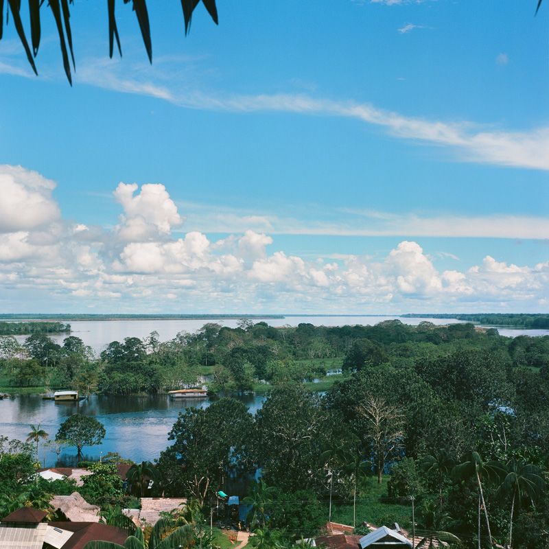
In honor of an upcoming journey back to the chaos and adventure that is South America, here are some medium format film shots from my last trip to Colombia and the Amazon River. All images were shot with an old, rickety Yashica Mat-124G on Kodak Ektar 100 film, with the help of a light meter app on my iPhone 4s, and edited in Photoshop CS4 from high resolution film scans.
Read →
June 13, 2013
On The Road 6
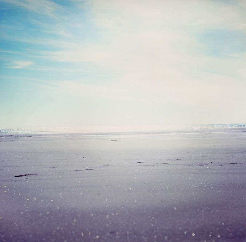
In my last few On The Road installments, I posted lots of iPhone photos from a trip across the Pacific early this year. During my stops in Hawaii and New Zealand I also shot several rolls of medium format film, which I finally processed recently. All of these images were shot with an old, rickety Yashica Mat-124G, with the help of a light meter app on my iPhone 4s, and edited in Photoshop CS4 from high resolution film scans.
Read →
November 22, 2012
Then, And Now 3
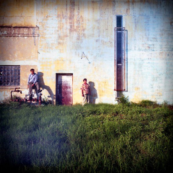
My recent post about medium format photography adventures reminded me of the last time I had some fun with it, in 2009 when my parents were in town for a visit. My photographer friend got ahold of a loaner Hasselblad 6 x 6 medium format camera and a tilt-shift lens for the occasion, and I dug out some expired old film to see what would happen. Here are my favorite images from that day. (Hasselblad 6 x 6 medium format with tilt-shift lens on Fujicolor Reala 100. Negative scan to digital, Photoshop) (Hasselblad 6 x 6 medium format with tilt-shift lens on Ilford Delta 3200 Pro. Negative scan to digital, Photoshop)
Read →
November 13, 2012
On The Road 4
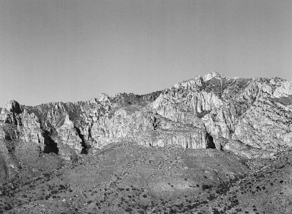
A few weeks ago I spent two quick but relaxing days in the Middle Of Nowhere, rediscovering my medium format camera with some long-expired film, then hoped and prayed for some advantageous developing defects (which can be unpredictable on old color film). Lacking traditional darkroom access and skill, I get high resolution scans of my negatives, and do all editing in the “digital darkroom” with Photoshop CS4. For the non-purist photographer, this mixed-media, mixed-era process creates a satisfying blend of traditional and modern aesthetics, while exponentially increasing one’s creative options. Guadalupe Mountains, West Texas (Mamiya 645E medium format with 80mm f/2.8 on Kodak Plus X-Pan Pro 125. Negative scan to digital, Photoshop) Marfa, Texas (Mamiya 645E medium format with 80mm f/2.8 on Kodak Portra 400UC. Negative scan to digital, Photoshop)
Read →
August 23, 2012
On The Road 2
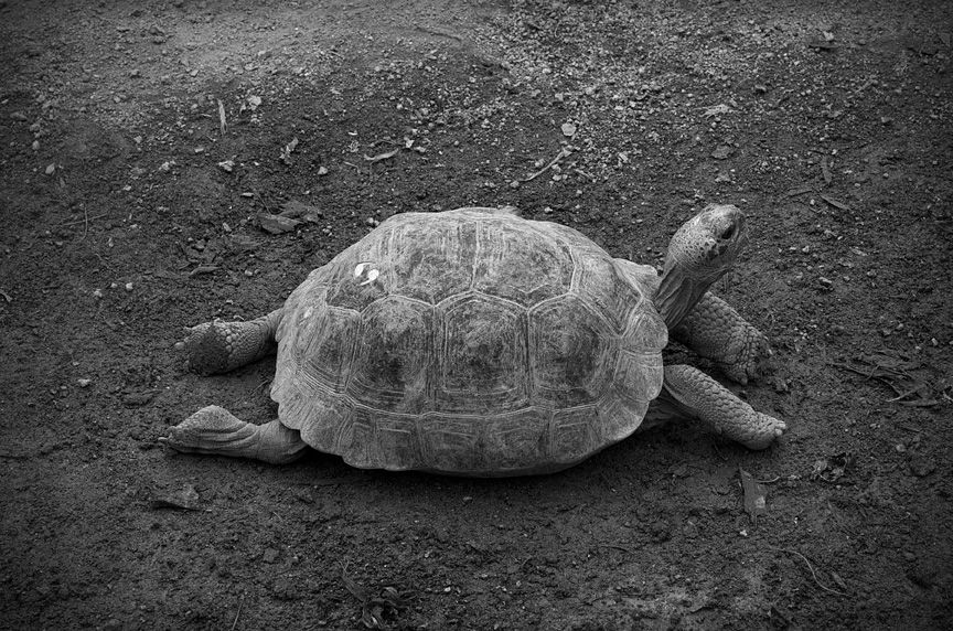
I (Canon EOS 30D, with 100mm f/2.8 macro & 50mm f/1.8 standard Photoshop) II (Canon EOS 30D with Sigma 17-70mm F2.8-4 DC macro OS HSM, Canon PowerShot SD1100 IS, Photoshop)
Read →
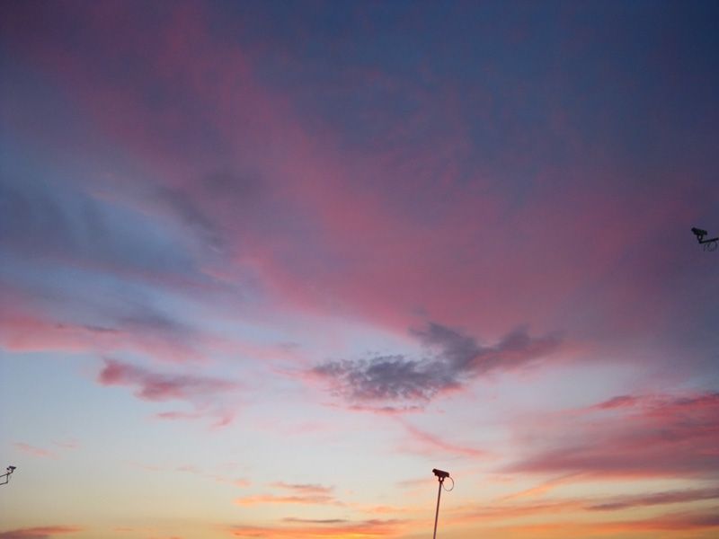
July 4, 2012
Photo/Digital Manipulation 2
Happy Independence Day. “Postmodern Sunset”, photo/digital, 2012
Read →
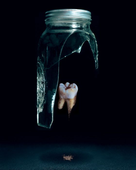
January 31, 2012
Photo/Digital Manipulation
I’ve always been just as in love with photography as I am with painting. Because I paint in a highly realistic style, they’re two disciplines that go hand in hand in supporting my overall aesthetic and conceptual goals. Photography is arguably the most convincing lie of the visual arts. It intersects with cultural conditioning and social norms in a way that I find intriguing and inspiring. What I mean is, as 20th and 21st century human beings, we’ve been more or less culturally and socially trained to accept the photograph as a factual–even scientific–representation of physical reality, due to its ubiquitous use and massive omnipresence throughout our entire lives. This belief, which can approach the level of faith, presents an irresistable opportunity for manipulation of perception by illusionists and countercultural provocateurs such as myself. Long having been an artistic obsession of mine–to subvert the audience’s assumptions and paradigms–the advent of Photoshop was a digital godsend. I’ve spent years honing my craft of button-pushing and mouse-clicking in order to take my illusions one step further into disorienting believability. Whether the end result is a reference image for a painting, or a finished piece of art in its own right, the aesthetic I attempt to achieve is the same. This is how the two mediums work in concert for my overall artistic advancement. This practice of “wanting-to-be-believable” manipulation to the visual field is also quite important to my conceptual mission as an artist: to inspire the viewer to question everything, to dig deeply behind the limiting surface appearance of not only reality, but their own selves, to take nothing for granted. In this way, I hope to make my art the embodiment of one of my favorite quotes: “Art is the lie that tells the truth.” –Pablo Picasso Here’s my latest experiment combining photography and digital manipulation: "Glass & Dust", photo/digital, 2012 And a few other favorites from recent years: "Call It A Day", photo/digital, 2010 "Archetype", photo/digital, 2009 "Capsized", photo/digital, 2008
Read →