Journal
Practice & process notes
Occasional writing on my art practice, techniques, process, and the ideas behind the work.
24 articles on Photography
March 12, 2020
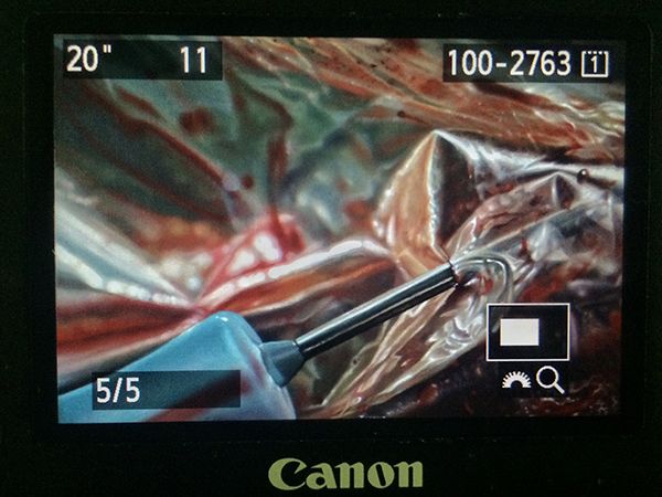
My 20-Step Program for Perfect Art Reproductions
If you’re a painter or visual artist working in any traditional media, capturing digital images of your work is practically a requirement nowadays, and has been for a while. I don’t know any artist who could survive without getting images of their work onto the internet, submitted to publications, made into prints, or a variety of other applications that require a quality reproduction. And quality is the key word here: representing yourself with a poor version of your work will hurt your chances of success. You wouldn’t think that capturing quality images of a completely still, flat object in a controlled indoor setting would be one of the most challenging photography jobs, but it is. I’ve actually paid pro photographers to shoot images of my paintings, and gotten a disc full of yellow-tinted garbage and flat-out unusable files, because those photographers weren’t well versed in the highly specific nuances of this photography application. (untitled), oil on linen panel, 8 x 10 inches, 2016 The details matter here, and skipping any of the major or sometimes even minor steps will usually compromise the end result, to varying degrees. With so many factors that can go wrong, it’s wise when possible to devote an area of your studio to this, with dedicated lighting, equipment, and pre-measured distances and angles. Depending on the level of compromise or imprecision in your studio setup, the more editing of your raw files you’ll need to do on your computer. But even the best photography results will still require basic cropping and picky stuff like smoothing over a blown pixel from your camera’s sensor, or eliminating a small cat hair that somehow floated and stuck to the painting (cats are thoughtful like that, always trying to help…). So here’s the equipment you’ll need (with what I currently use in parentheses), followed by the process, which was taught to me by the talented and wonderfully kind British painter Edward Povey and his wife Donna Tolar. I’ve added some of my own Adobe Photoshop expertise to their process for correcting photography shortcomings, and that’s included as well, but you’ll need a fairly good understanding of the program to follow my brief notes (or else this would be book length, not blog post length, sorry). Equipment Camera: full-frame sensor DSLR (Canon EOS 5D Mark III) Lens: anything in the 50mm range, without a zoom (Canon EF 50mm 1:1.2 L) Tripod: sturdy, with fully adjustable ball joint mount (Manfrotto 290 and 496RC2) Remote shutter cord (Canon RS-80N3) Circular Polarizer Filter to fit lens (Promaster) 2 adjustable freestanding studio lights with daylight balanced bulbs 2 Polarizer filters for the studio lights (Visual Pursuits Glare-Stop 8M Filter) Easel or flat wall space for mounting artwork 90º perpendicular to floor. Tape measure and/or ruler Level (the straight/flat tool with the little air bubble vials) White, neutral gray, or black sheet or walls Enclosed, light-proof studio space (for best results, it should be on par with a film processing darkroom, or shoot at night with all curtains/blinds drawn) Computer (Imac, 4.2 GHz Intel Core i7, Radeon Pro 580 8 GB) Photoshop CS4 or newer (CC 2019) Process Set up photo area with everything at right angles where necessary, and parallel where necessary. 90º angles and parallel planes are crucial for minimizing lens distortion. Your artwork needs to be perpendicular to the floor, as does your camera lens. The front glass edge of the lens needs to be parallel to the artwork. Use your level to check artwork angle and other things, and use the level sensor on your camera to make sure it is both vertically and horizontally balanced, and pointed precisely to the exact center of the painting. Use a tape measure to calculate any measurements needed or to check straight alignments. Set up 2 studio lights at 45º angles to your artwork, halfway between your camera and the artwork. Each light should point towards the opposite vertical edge of the artwork, at the halfway point of the artwork’s vertical measurement. Set up a black, gray, or white sheet behind your artwork, if your studio wall isn’t already white, gray, or black. The background that your camera sees around the artwork will influence how it processes color and adjusts its white balance. For really dark artworks, I like a black background, and for really light ones, a white background. Attach polarizing filters to the front of each studio light, as flush as possible to the light hood without touching the bulb (which could melt the filter gel). I rigged my own attachment system for the lights I have out of wire and masking tape. Adjust camera speed to 100 ISO, and match its white balance to the type of bulbs you’re using in your studio lights (if tungsten, choose tungsten setting, etc) Set image quality to the highest setting (camera RAW) Set lens to whatever its midpoint aperture is, usually F8-11 for your typical F16 or F22 capable lens. Attach remote switch, and use screen view instead of eyepiece viewing so that you don’t risk bumping or shaking your camera. With all overhead and ambient lights off, and only the two filtered 45º angle studio lights on, spin the circular polarizer filter on your lens until all glare highlights on the artwork disappear (when viewed through the camera lens). If some glare or highlights remain, you may need to rotate the 2 filters on the lights a bit. There should be no other light entering the room or hitting the artwork. Focus the lens as tightly as you can on the artwork. Adjust camera shutter speed according to these final calibrations. For me it’s usually in the 20-30 seconds range. With such a long exposure there can be absolutely no movement or shaking of the artwork, the camera setup, the floor, or the room you’re in, or else you’ll get a slightly blurry or hazy image. Bracket your shot, meaning find what appears to be the most accurate shutter speed as indicated by the camera sensor, then also shoot one or two speeds slower and faster than that, just to ensure you have the proper exposure. Cameras can be fooled by paintings with a high degree of contrast between their lightest light areas and darkest dark areas. You can use the compensation settings on your camera to help with this as well. On your computer, make sure your monitor is calibrated and you’re working with the proper display brightness. Make sure the lighting in your computer area is balanced daylight bulbs or natural daylight from windows. Place the artwork next to or near the computer monitor, in the same balanced/neutral lighting. Open your raw files in Photoshop and select the most accurate exposure by comparing to the original artwork. Edit as needed to crop, straighten, or correct lens distortion. Just about all lenses will distort or warp the picture plane as it gets closer to the edges of the lens’s viewing area. If your artwork is a perfect rectangle but is no longer geometrically perfect in the photo, drag horizontal and vertical guidelines onto the image and use EDIT > TRANSFORM > DISTORT and/or WARP functions to correct the artwork’s shape. Edit any inaccuracies in color with adjustment layers and layer masks as needed, comparing against the actual artwork next to your hopefully decently calibrated monitor, in the same balanced lighting. The most effective adjustment layers for these minor tweaks are HUE/SATURATION, COLOR BALANCE, LEVELS, and SELECTIVE COLOR. Since my studio setups at the various places I’ve lived over the years have almost never been ideal, I usually need a combination of all of these adjustment layers on every image to get it 95-100% accurate. In rare cases I’ve used multiple of each, with parts of each erased in order to let parts of the other layers show, to match what was happening in each area of the painting. As noted above, these last 2 steps can get very technical and require a good working knowledge of Photoshop, which can be gained by tutorials or books of course, or simply from hours of controlled experimenting on a sample image. Edit any blown pixels, dust, hairs, or other minor imperfections with CLONE STAMP tool. If you plan to turn the digital file into a physical print, you’ll likely have a second round of color editing to do on the file, once you see a proof from whatever printer you’re using. Printer ink on paper is a much different process and effect than a backlit digital screen, and every print format is a little bit different in how it needs to be prepped. Wow, being a professional artist is a lot of work. This isn’t really a step, I just wanted an even 20 steps because it looks better and makes me feel good. So that’s it! Just a really quick and simple process (just kidding) for getting guaranteed amazing, coffee table book, professional-ass website, or giclee print quality artwork reproductions every time. Enjoy!
Read →
November 1, 2019
On The Benefits of Drawing
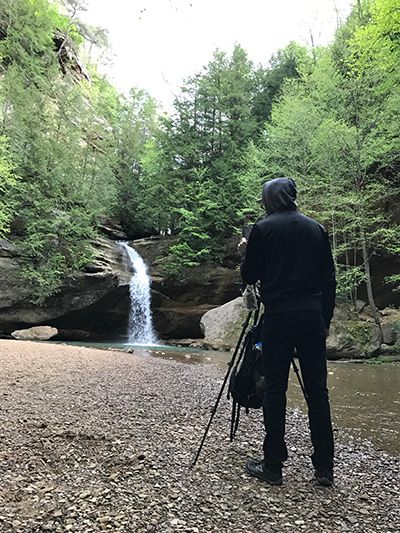
About 10 years ago I leveled up my artistic practice in all areas after discovering the classical atelier system of art education. Before that time I had been piecing together my own slow, winding learning trajectory in the realism painting genre, unintentionally slowing my progression with an over-reliance on photographic reference. In contrast, the atelier system is based on working directly from life, whether it be a live model, a still life, or a landscape. Painting from life in Ohio, 2017 In short, observing directly with one’s own eyes forces the brain and the artist’s hand to convert the 3 dimensions of real life into the 2 dimensions of a flat canvas. Over time our eyes-brain-hand feedback loop becomes seamless, and we learn how to reproduce exactly what we see. The real-time, real life mental calculations of angles, lines, curves, planes, perspective, light and shadow, and millions of color possibilities have a measurable result: if the drawing or painting looks indistinguishable from what we’re observing, then those myriad calculations are overwhelmingly correct. Of course, eventually, an artist needs to learn how, when, and where to diverge from absolute accuracy in order to create a work of art that transcends the mere replication of reality…but the learning process that we submit to in order to reach that point is surprisingly valuable in its own right. “Lower Falls at Old Man’s Cave”, 8x 10 inches, oil on panel, 2017 Arguably the single most important artistic discipline or skill, simple life drawing is actually a fairly complex amalgam of skills, requiring at least a rudimentary working knowledge of geometry, physics, optics, and the ability to plan sequentially. True life drawing begins as little more than primitive map making–the plotting of coordinates in space–and ends ideally with an incredibly nuanced understanding of the physics of form, mass, and light. This great article I stumbled across got me thinking about drawing; what it forces our brains to do, and how it benefits our brains. While intended for the non-artist reader, it makes great cross-disciplinary connections and serves as a nice reminder and motivator for anyone who is an actual practicing artist, of just how valuable drawing is to our art. https://qz.com/quartzy/1381916/drawing-is-the-best-way-to-learn-even-if-youre-no-leonardo-da-vinci/ “Form & Emptiness”, graphite on paper, 2012 Form & Emptiness (detail), graphite on paper, 2012
Read →
May 7, 2017
Blood Rituals: Redux
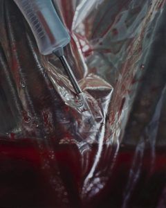
Photoshoots for last year’s Blood Rituals series of still life paintings yielded several interesting macros which did not fit the aesthetic of classical still life that evolved out of my initial brainstorming sessions. I extracted four compositions from these photos, and after perfecting them in the digital darkroom, recreated them as hyperrealist oil paintings. This miniseries pursues a different avenue of exploration of the same subject matter, presenting another aspect of my artistic vision and skill set as a painter. These claustrophobic and intimate closeups border on the abstract, as the complex color patterns of wrinkled plastic bags and condensation covered glass lose their original context of setting and scenery. Within this unfamiliar space, the jarring appearance of blood is a beautiful, rich and vibrant color that makes these compositions pop, while providing symbolic depth. The narrative of what’s happening and why is largely absent from these images–intentionally–as they strive for a disorienting sense of wonder by honoring the genre of true photorealism. Uncanny likeness to the “real” provides an illusion that in turn may open up new ways of perceiving the ordinary, mundane objects of the world around us. Our physical reality contains infinite detail, but to help us move efficiently through the world, our brains eliminate much of what our eyes are capable of perceiving. When given an up close, sustained glimpse of the material complexity we inhabit, the result is often overwhelming, surreal, and disorienting, as our simplified view explodes with new detail. This is the point at which assumptions and certainties are compelled to crumble, opening the intellectual space for new truths to be realized and deeper understanding to form. BLOOD RITUALS: REDUX (untitled), oil on linen panel, 8 x 10 inches, 2016 (untitled), oil on linen panel, 8 x 10 inches, 2016 (untitled), oil on linen panel, 8 x 10 inches, 2016 (untitled), oil on linen panel, 8 x 10 inches, 2017
Read →
September 15, 2015
On The Road 10: Peruvian Plein Air
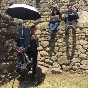
Earlier this month I traveled to Peru, where I trekked to majestic Machu Picchu for the first time, documenting the epic Andes landscape throughout the journey with some plein air studies. Being new to plein air painting, I took a few months before the trip to dial in my portable painting setup, experimenting with different materials and products in order to arrive at something as travel-friendly as possible. Thumbnail sketching with my South American friends on Machu Picchu. Not only did everything need to clear foreign and domestic customs, the intense hiking aspect of the forthcoming journey required it to be as small, lightweight, and efficient as possible. After getting the initial inspiration from my summer workshop teacher Thomas Kegler ‘s novel and ingenious modifications to the traditional plein air pochade box, I searched the internet and local stores for a few more ideas and products. In the end I devised something very functional, fairly efficient, not terribly expensive (as far as high-end art and travel equipment goes), acceptably small, and certainly lightweight. NOTEWORTHY GEAR Tripod: The most important part of a plein air easel is the tripod, and to get one that is (1) reliable, (2) sturdy, (3) small, and (4) lightweight, you have to spend some money. It’s not worth the headaches later on, out in the field, to mess around with the cheap stuff. So I read reviews online and settled on the Manfrotto Befree, which seemed to intersect all of the 4 criteria above at an optimal place. After buying the tripod, I modified it by drilling a hole through the center stem a few milimeters from the bottom, in order to be able to hang a weight (my backpack) from it while working outdoors, which is crucial for keeping the very lightweight tripod sturdy in any kind of wind. So far it’s working out great, I just wish it went just a few inches higher like their studio tripods do, but, you can’t have it all when you’re concerned about size and packing space. (Grade: A). Pochade Box: Ethically, I strongly dislike Walmart, but when it’s the only large store in your small Texas town, sometimes you go there for the one random thing you want that they have (and comfort yourself afterwards by remembering that the entire world is headed for doomsday anyway because of capitalist greed causing global warming, and your minuscule nonsupport of Walmart wouldn’t do shit to stop that, really). In this case, it was the unlikely and unexpected score of a lightweight, plastic, 3-part folding notebook holder thing (with perfectly placed interior velcro elastic straps?!). For around $10.00, and requiring only a few small tripod-mounting holes to be drilled into it, this was an absolute bargain. …and wait, that’s not all!! It’s perfectly sized to fit two 9 x 12 inch panels in such a way that it doubles as your take-home wet painting carrier when you’re done with your session!! Call now, and this product can be yours for only 4 easy payments of literally $2.99!! Seriously though, I’m so pumped about this thing that I want to make an infomercial about it to spread the word. (Grade: A) Paint Carrier: Just a small bait holder from the hunting and fishing section at…Walmart. Or probably most hardware stores. It worked well enough, but I’m still on the hunt for one of equally small size, but with an airtight seal and divided into cubes instead of just rows. The paint mixed together somewhat during transport and higher temperatures, and began to dry out as well due to airflow (a rag soaked with moisture-enhancing Clove oil placed into the container drastically delayed drying time, though). Customs/TSA ProTip: If asked to explain what your oil paint is, never say they are paint! Always refer to them as “artist colors”! “Paint” tends to get lumped in with the general category of industrial, toxic materials banned for civilian flight, and they try to take those away from you, or at least tend to give you a hard time about it. Flying with as few “artist colors” as possible, and always packing them deep in your checked baggage rather than carry-ons, will also minimize hassles. (Grade: C+) Umbrella: At first these seem frilly and wasteful but after a few nasty plein air session sunburns, you realize how crucial they are when you’re standing still in any kind of direct sunlight for any length of time. I’ve been happy so far with my very first umbrella purchase, the Multi Mount Collapsible Umbrella from Guerilla Painter. It packs very small, and doesn’t weigh much. I wish the fabric wasn’t black though, because that can make your workspace very dark. And I also wish the mounting clamp had more angle options but that might be wishful thinking given its price range, size and weight. (Grade: A-) Crucial Miscellaneous Supplies: (1) Cheap zippered cloth bags from Walmart for carrying whatever. (2) Tiny bungee cords from the local hardware store. I use the Cords to keep my pochade box setup sturdy and still–just hook them anywhere, to anything, for some instant tension. These things have been really handy, and surprisingly one of the most indispensable things I bought for the setup. (3) Large industrial rubber bands, also surprisingly useful, in this case for making sure the pochade box doesn’t come unlatched unexpectedly and spring open, and ditto for the paint carrier. (4) Tiny glass vial for carrying solvent. Juuust big enough to hold enough solvent to dip your brush into and sort of clean them after you’re done, until you can give them a thorough cleaning at home. Carrying solvent around really sucks, it’s the worst part of plein air oil painting for me. It’s a health and safety hazard, of course, and not healthy for the environment that you’re trying so hard to appreciate. So, “as little as possible” has been my goal ever since beginning oil painting, and certainly since starting my plein air journey. Customs/TSA ProTip: Because I am a bad person, I have forgotten about and accidentally flown with this single tiny vial containing a mere several drops of solvent, buried deep in my checked baggage, a few times before. Obviously doing this isn’t advisable, and obviously I procure solvent at my destination whenever feasible, and properly dispose of it there as well. So my tip is to scout out in advance where you can get mineral spirits at your destination, and always keep it to an absolute minimum quantity. While on the go, wrap the jar or vial thoroughly with plastic and then double-bag it with ziplocs or anything else you can think of. (Grade: A-) Backpack: I’ve been so happy with my Osprey Comet 30L over the past few years of heavy, rugged use. It’s comfortable, durable, has enough pockets and compartments for everything I tend to carry, and is also Camelbak compatible, which came in handy during this trip, because carrying separate water containers is a drag. I was able to stuff my 2.0 liter reservoir into my backpack along with every single other supply needed, including energy bars, and the whole pack wasn’t unbearably heavy. It was certainly doable over short periods for someone of average to slightly above average fitness range (and not to mention at an elevation of, in this case, 6000-10,000 feet). So as for my portable painting setup criteria mentioned earlier, here’s how I rate my current setup overall: Functionality: A Efficiency: B+ Cost: A- Size: A- Weight A- Being new to the plein air community, I’m sure there’s further improvements to the system I can make and of course, much more experience and knowledge to be gained, but this recent journey was successful enough that I wanted to share and add to the body of helpful knowledge out there. As for the experience and the work itself, here are some photos. Three location shots: First stop in Cusco, Peru: 2 hour sunset study. Second stop in Ollantaytambo, Peru: 2 hour sunset study. Third stop, Machu Picchu, Peru: 4 hour study. Three finished studies, 9 x 12 inches each, oil on panel: “Above Cusco” “Ollantaytambo Sunset” “Huayna Picchu” And some iPhone 5s photography shot throughout the trip, for good measure:
Read →
June 28, 2015
On The Road 9: Detroit
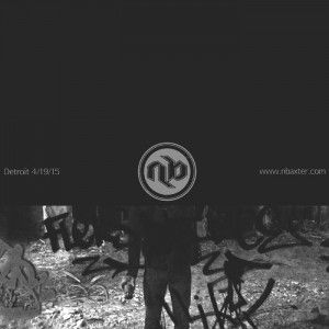
Detroit is a city where the environment itself takes center stage and needs no actors, a scene and setting so ghostly unnerving that one seemingly enters a land outside of time, a post-apocalyptic playground frozen in charred stillness, awaiting future inhabitants. It is a beautiful and frightening place, and in the tension between curiosity and revulsion I found untold artistic inspiration. A part of me needs to experience places like this in order to feel alive, to feel the sinewy tautness of real human struggle against all odds, against seemingly crushing decay and despair. The people I met there and the others I learned about during my stay all love their home through the good and the bad, and that was enough to convince me of another form of unlikely beauty that exists in Detroit. Thank you to all of them and to the interesting, dynamic city that inspired these photos.
Read →
May 17, 2015
Photo Essay: The Caldwell County Jail
Read →

January 25, 2015
On The Road 8: Bolivian adventures and a Diablada Mask
Here’s a poster commission I completed last year that got lost in the shuffle and forgotten about: “Diablada” Oil on Panel, 11 x 14 inches, 2014 I attempted to utilize a much looser painting style to complement the hand-painted folk art look of this traditional Bolivian ceremonial mask. It’s so harrrrd for my neurotic perfectionist brain to not. overblend. every. millimeter. of. paint. but I want to keep trying a more expressive use of paint in this new year. We’ll see how that goes… ha. In a fortunate twist of fate I had the pleasure of visiting Bolivia last year after completing the commission, and got to experience the intensely macabre blend of indigenous and Christian/colonial cultures being celebrated in their annual Natitas festival. Here are some iPhone photos from that experience and the rest of this latest South American adventure:
Read →
October 28, 2014
In Review 2: Forever Losing Sleep
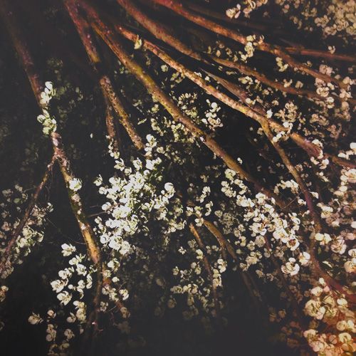
Indie rock band Forever Losing Sleep recently released a new album titled I Lost Myself Again, which features one of my photographs as the album cover. I’m honored to have provided the visual accompaniment to these amazing sounds, and my ears confirm to me that my grainy nighttime tree image snapped while roaming the quiet streets of Evian, France this past April is indeed the match to the mood of this music. (untitled), photo/digital, 2014 Active for the past few years, FLS hails from New Jersey with a slow and darkly melodic sound influenced by the melancholy Seattle grunge of the early 90’s as well as the most successful wave of emo bands who peaked a decade later. Throughout this collection of songs, moody ethereal passages complemented by soft crooning build up to crescendos of heavier crashing chords and tasteful throaty howls, with plenty of reverb and echo sprinkled throughout, finally giving way to the open space of sparse, ringing feedback. Forever Losing Sleep’s debut LP …Like staring up at the moonlit trees on a midnight walk through the hushed small town you know too well, too full of skeletons in dusty closets to be quite hushed enough for you to catch any sleep. Complete your insomniac’s soundtrack at the Forever Losing Sleep bandcamp page, and be sure to name a price worthy of the cost, work, and time put into the independent recording and releasing of a fine debut album. (P.s. see my first “In Review” blog post here )
Read →
April 30, 2014
What Is Art? (Part 2)
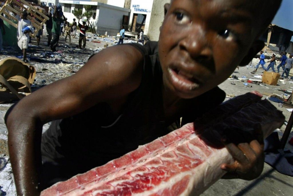
Last year I started collecting my thoughts on the continual debate in my head about what art is, and how it can be (among other things) an effective form of communication. That effort was and still is intertwined with the process of further understanding my own art, and all other art, as well. In hindsight, I thought the initial writing ( here and here ) was a bit unfocused, and since it was also incomplete, I took the time recently to revisit those blog entries and rework them into a more cohesive essay. The final part of that essay, as mentioned in the second of those prior blog posts, is about my belief that photojournalism can be viewed as a creative art form, possessing an almost-accidental form of raw beauty capable of inspiring other works of art (such as many of my own). This critique of photojournalism introduces broader questions about the “unintended” as art, and–for now–completes my investigation into the sneakily complicated debate “What is art?” In the future I’ll post the final version of the essay in its entirety, but for now here is the “part 2” continuation of those prior blog posts. Photojournalism and the Unintended as Art In the last 100 years, photojournalism has become a fixture of our visual landscape. On the surface, it’s simply defined as the use of images to tell a news story or to report on current events. In this role, the photos are not art, and their photographers are not acting as artists, which means their images are typically held to strict ethical standards of honesty, impartiality, and objectivity. But these attributes are graded on a scale that becomes increasingly inexact amidst the complexity of postmodern thought and the digital age of endless reproduction and re-appropriation. This is the point at which the question “What is art?” becomes relevant and fascinating to me, when applied to the medium of photojournalism. I’ve always appreciated the naïve purity of an image that’s been produced with no pretense of art, utterly uninhibited by the finicky shackles of artistic rules or the whims of unreliable muses like inspiration. In this open and wild space, artistic qualities and natural beauty are given the chance to emerge on their own, unintended and raw, like the strongest of weeds in a perfectly manicured lawn, and photography seems to be an ideal medium for this phenomenon. This element of chance can produce quite powerful images, capable of communicating intensely to the viewer while remaining—and precisely because they remain—firmly grounded in the truth of reality “as it happened.” And so the commonplace photos we’re bombarded with through ever-increasing media saturation begin ostensibly as visual data comprised only of ‘facts’ or neutral information, yet end up loaded with symbolism, embedded with the perceptions and beliefs of their creators and audience after becoming the subject of this artistic line of inquiry. One of my all-time favorites (sorry I could not find the photographer or image credit online). In studying art history, it seems this afterlife of the journalistic image became much more possible in the wake of the Dada movement, when artists (including photographers) carved out new niches for their work beyond mere decoration or commemoration of important people or places. Art in the 20th century became increasingly deconstructivist, philosophically charged, and conceptual in nature, filling multiple roles while having its meaning manipulated by the increasingly complex worldviews of both creator and audience1. Because of this evolution, just about anything could be considered art in the right context, meaning that most contemporary art now resides as much in the blurry, ambiguous realm of provocative ideas as it does in the realm of traditional craft. Hence a museum visitor might encounter an exhibit of random paint splotches that, beneath its completely underwhelming, childlike appearance, contains a metaphor referencing complex political or psychological theories learned by the artist through years of intense academic study. This can be maddening to the viewer who simply wants to marvel at a skillfully executed object of beauty, or it can be liberating for those who want to engage in debate, controversy, or social change through the arts. My own art has always attempted to straddle this fence by incorporating the best of both worlds: technical, precise handling of paint in the realism tradition, yet depicting modern subject matter and informed by the angst and alienation of postmodern philosophies. It is my belief that photojournalism in the modern age, thanks to that 20th-century process of expansion and deconstruction, straddles a similar fence, one separating objective observations from subjective beauty and meaning. This ability of the journalistic photograph to transcend genres is confirmed in the academic community by the fact that “Breaking News Photography” is a Pulitzer Prize category. This prestigious yearly award started in 1917 as a way to honor impactful achievements in American journalism, literature, and music. Winning photographs are resurrected as art objects, receiving appreciation for their poignancy and beauty—a second life of sorts, after their initial purpose or function in the journalistic media has been served. This second life also takes the form of photo essays, curated and arranged into cohesive narratives, which are now commonly presented in art and lifestyle publications, fine art galleries, and museums throughout the world. Depending on the intentions of the photographer and exhibiting institution or publication, as well as the sensibilities of the viewing audience, these photographs may be appreciated for their communication about the world events that comprise their content, or for their artistic qualities—or both. In his 1995 essay about the modern age of photojournalism, writer Richard Lacayo wades into the debate surrounding artistic subjectivity and meaning: “Photojournalists tend to stay aloof from talk about camera aesthetics. There is something about dodging gunfire in Beirut that discourages ruminations on style, understandably enough. More to the point, no one who catalogs bloodshed or poverty wants to be thought of as yet another vendor to the senses. Some news photographers spend half their lives chasing wars; who can blame them if they reach for the door when they hear the word art? …The stereotype survives: artists have visions; journalists have assignments. They may both think to themselves, ‘I am a camera,’ but each means something different. “Yet aesthetic questions have a moral dimension. Color is pretty; misery is not. How does one keep the simple appeal of color from confounding the full range of meanings a photograph may convey? If pictures of genocide come to us in the muted pastels of a GAP ad or the vivid hues of a rock video, how does a photographer keep atrocity from looking palatable?”2 While the moralist in me sympathizes with this sentiment, the artist and rebel in me, raised in an age of cynicism, desensitization, and ambiguity, views adjectives like ‘palatable’ as mere subjective opinions, impossible to resolve into an absolute truth for all to agree on. Human culture is so diverse that practically anything could be considered palatable art, by someone. And so I answer Lacayo’s question with another question: “Why should the photographer keep atrocity from looking palatable?” I want to ask this question not because I enjoy atrocity, but because I am capable of the postmodern complexity of holding multiple feelings and competing appreciations within me simultaneously. In this case, that multiplicity includes the horror and revulsion at the tragic events occurring in our world as well as the aesthetic delight at the spectacle of color, shape, line, emotion, symbolism, and meaning on vivid display, emerging somewhat accidentally (and perhaps with more purity) through the photojournalistic medium. As if to concede this very point I’m making and pay homage to the “What is art?” debate, the author goes on to admit, “The most capable photojournalists…have learned to incorporate the unruliness of color into a deliberate statement. …Barbaric rule can operate in the broadest daylight, suffering can happen in sensual settings, a place can be cruel and inviting at the same time.” And so we see that through the inescapable conduit of subjectivity, passive observation becomes intentional communication, and thus, photojournalism can also be the highest of art forms, loaded with inspiration for artists working in any medium. I’ve always appreciated the best journalistic photography for this transcendent ability, the point at which the happenings of this world become awe-inspiring images, and the deepest truths contained in the human condition are put on poetic display. Various newspaper and magazine clippings I’ve saved over the years for reference and inspiration. So once and for all, “What is art?” This question may never be fully answered. But with an integral approach and an open mind, artists and viewers alike can use this line of inquiry to enrich their experience of reality, to deepen the communication that is the purpose of all art, and to find beauty everywhere, even where it may be unintended. Another powerful, poetic image (sorry I couldn’t find the photographer or image credit online for this one either). 1The Situationists of the 1960s took this evolution to the extreme, espousing radical anarchist views on art that embraced destruction and merciless re-appropriation of all imagery, in the service of transforming society and conscious reality into a powerful and playful dialogue with the present moment. 2Lacayo, Richard. “IV: Resurgence 1980-1995.” Eyewitness: 150 Years of Photojournalism. New York CIty: Time, 1995. 166. Print. 2 Comments Notes & Advice 8 | TAM Blog says: June 30, 2014 at 1:06 pm […] And then there’s this insight regarding the public perception of “fine art” and the communicative power, which is a timely reinforcement of some of the conclusions about modern art I described in my “What Is Art?” essay: […] Nick Baxter: Notes and Advice 9 | TAM Blog says: October 29, 2014 at 1:25 pm […] is working with or wishes to communicate through their work (I’ve written a lot about this here and here, with a future post coming as well). This relates to the study of your own mind, to […]
Read →
March 9, 2014
Take Refuge: Fallout Shelter Designs
Here are some graphics I designed for a tattoo-related project last year, with accompanying text (see the final product here ). I made the following images around the same time as these, using the same original photographs (shot with a Canon EOS Rebel before I even owned a digital camera…I feel old) and Photoshop CS4. The concept of the fallout shelter gained popularity in the 1960s, in response to the threat of nuclear annihilation posed by the Cold War. These protected spaces offered survivors of a nuclear blast a life-saving refuge from the deadly radioactive energy and debris, which would rain down in the aftermath of a detonation. As part of the nationwide fallout shelter program, the U.S. government unveiled a symbol depicting three inverted triangles within a circle, which would become prominent throughout the urban landscape for several decades. But in the 1980s, the threat of worldwide nuclear war was averted with the fall of communism. This new era completed the rise of powerful corporations, as Big Business brought their own version of peace and prosperity to the world. As a result, the fallout shelter and its symbol have largely faded from public consciousness. Yet unbeknownst to many, a certain Cold War still rages on—not externally, but internally—as an all-out assault on our minds and spirits by the cultural influence of the aforementioned capitalist elites. Their fantasy of escape through mindless consumption is served to resigned, debt-ridden and overstimulated masses, who despite living in material abundance, often report increasing levels of angst, anxiety, depression, and a lack of fulfilment. It’s in this 21st century war zone that the fallout shelter concept can re-emerge with a new significance. So I say to those in search of a meaningful and passionate life, the rebels and social misfits, the misunderstood and the cast aside, the spiritual seekers and restless explorers, creatives, visionaries and dreamers, and of course, all the artists striving to bring forth authentic and original works expressing beautiful truths: Take refuge in yourselves. Build shelter in your minds and hearts. Cultivate in that place an inspiration that may overcome the corporate enforcers of the dull and dreary, the false idols of passivity and obedience. Strengthen your will for the cultural battle of our era, this New Cold War.
Read →
November 14, 2013
Notes & Advice 6
I came across this quote today by a plein air pastel artist, and found it to be a perfect description for the process of realism painting. In my own work, time and again, I find I need to come back to basics in order to accurately portray the form and mass of an object or the atmosphere of a scene–to see things simply, before choosing to add complexity and detail. The ongoing challenge that all of us who undertake the realist genre have is depicting the true, unmistakable essence of an object or scene without being a slave to reference or the infinite detail of reality. When we manage to accomplish this tightrope walk, we create an illusion that ironically seems more real than reality, in turn creating a sense of awe and wonder in the viewer. Simplify the Scene by Richard McKinley “Because light changes, it’s important to work with efficiency and power when you’re working en plein air. Detail is not an artist’s friend; it’s easy to believe it holds the answers, but in fact it becomes the diversion. Simplifying what you see is a necessity. Remember, it isn’t individual blades of grass that make the field rise and fall across the landscape. “Without light, we see nothing, so light falling on form is the key to communicating what we see. It’s by arranging shapes and creating the form that you represent the scene to the viewer. Your goal isn’t to create a painting that’s polished and finessed, but rather to capture the essence of the light and the magic that captured your attention in the first place. “Ever since the arrival of photography, artists have had to fight the urge to see it as the master of what is real. There’s no doubt that photography, used carefully, is a valuable tool. What limits its usefulness is the belief that it can’t tell a lie. That can prejudice your thoughts more than you realize. Try to imagine what artists thought the world looked like two hundred years ago. It’s difficult to do when you’ve never known a time without the printed picture as a part of your consciousness. “When you take photos back to the studio to use as reference, be sure to ask yourself: What is it that the camera won’t capture? That’s what you want to infuse into the painting.”
Read →
September 20, 2013
On The Road 7
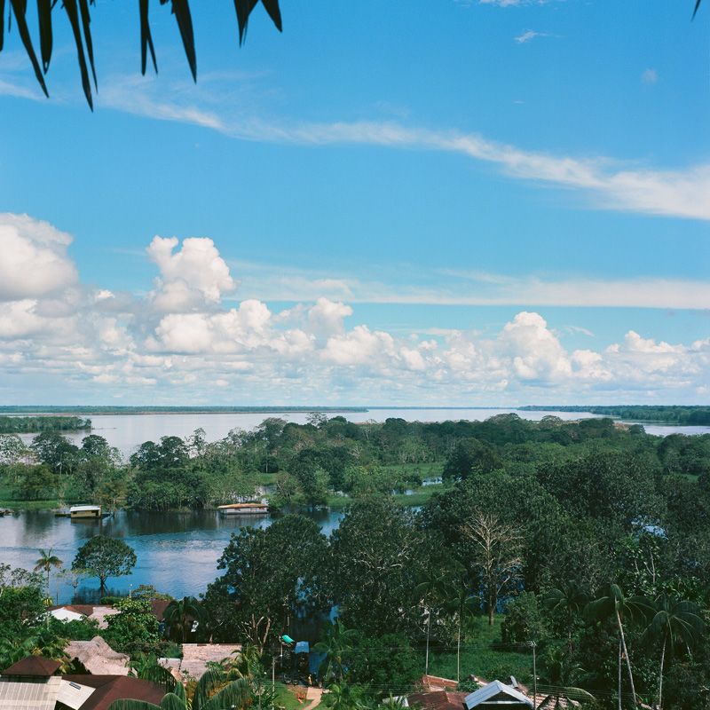
In honor of an upcoming journey back to the chaos and adventure that is South America, here are some medium format film shots from my last trip to Colombia and the Amazon River. All images were shot with an old, rickety Yashica Mat-124G on Kodak Ektar 100 film, with the help of a light meter app on my iPhone 4s, and edited in Photoshop CS4 from high resolution film scans.
Read →
August 1, 2013
Invocation Of Trust
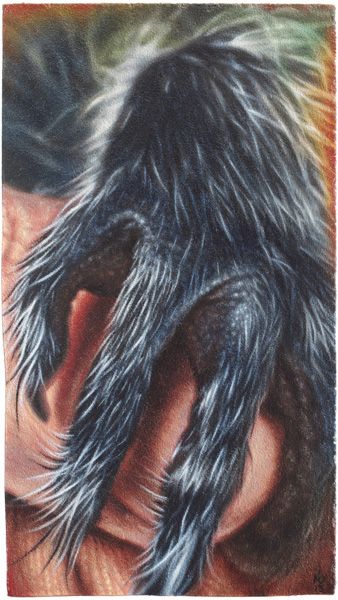
Invocation Of Trust, oil on panel, 4.5 x 8 inches, 2013 Here’s a recent piece I completed for submission to an upcoming charity art exhibit at The Egan Gallery in Fullerton, California, curated by friend and fellow artist Cody Raiza who is a passionate animal welfare activist. This tiny painting was inspired by events this summer at my house in Austin Texas involving the rescue of 2 baby raccoons from a rain catchment bin in my backyard by my partner and I. These two little fuzzballs, normally capable of being quite ferocious, were reduced to feeble, trembling snugglebugs by their traumatic night spent flailing and trying not to drown. They instantly grasped and climbed my extended arms seeking warmth and comfort, and stole our animal-loving hearts in the short time before we entrusted them to the care of an area wildlife rehabilitation center. Of course, never one to miss any artistic photo-op, I snapped away with my iPhone camera and ended up with some gorgeous, heartwarming shots, which after the usual in-phone editing, made their way first to Instagram *, and then to the easel when I realized they were perfectly suited to the theme of this upcoming art show. Edited reference photo from my Instagram account. Here’s the evolution of this image, which just as the title declares, was intended as an invocation of trust in my life, to overcome barriers of fear and isolation, and to elicit sacred tender moments of unity between humans, other beings, all life. Pencil transfer drawing and Grisaille, followed by color block-in and 2-3 layers of color adjustment and glazing. (*This is the first time I’ve painted an image originally intended solely for my Instagram gallery…not sure how I feel about that. I routinely attempt to post content there which is reminiscent of my paintings, and certainly aligned closely with my overall artistic aesthetic, often self-critiquing them afterwards as if they were paintings…but I really despise the over-saturation and cultural-race-to-the-bottom of social media, despite my own degree of participation in it. I’m curious to see how the Ig creative outlet will affect my art in general. To be continued…)
Read →
June 13, 2013
On The Road 6
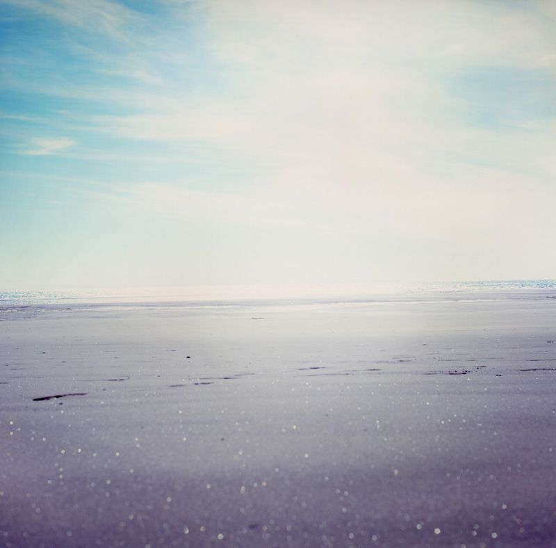
In my last few On The Road installments, I posted lots of iPhone photos from a trip across the Pacific early this year. During my stops in Hawaii and New Zealand I also shot several rolls of medium format film, which I finally processed recently. All of these images were shot with an old, rickety Yashica Mat-124G, with the help of a light meter app on my iPhone 4s, and edited in Photoshop CS4 from high resolution film scans.
Read →
March 7, 2013
On The Road 5.5
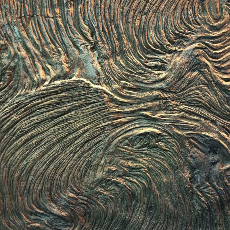
Adventure photos from my recent trek across the great Pacific. All images created with my iPhone 4s. I ( Hawai’i ) II ( New Zealand )
Read →
November 22, 2012
Then, And Now 3
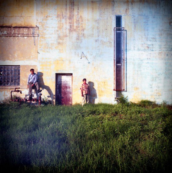
My recent post about medium format photography adventures reminded me of the last time I had some fun with it, in 2009 when my parents were in town for a visit. My photographer friend got ahold of a loaner Hasselblad 6 x 6 medium format camera and a tilt-shift lens for the occasion, and I dug out some expired old film to see what would happen. Here are my favorite images from that day. (Hasselblad 6 x 6 medium format with tilt-shift lens on Fujicolor Reala 100. Negative scan to digital, Photoshop) (Hasselblad 6 x 6 medium format with tilt-shift lens on Ilford Delta 3200 Pro. Negative scan to digital, Photoshop)
Read →
November 15, 2012
In Review: Union of Art and Sport
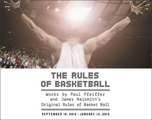
The Rules of Basketball: Works by Paul Pfeiffer and James Naismith’s “Original Rules of Basket Ball” September 16 – January 13, 2013 Blanton Museum of Art at The University of Texas at Austin In an unlikely combination of history and psychology, this exhibit pairs basketball inventor James Naismith’s 1891 document “Original Rules of Basket Ball” with contemporary artist Paul Pfeiffer’s basketball themed digital works. In hindsight, the Naismith material seems like it’d be merely a passing curiosity for most, and only significant for true sports geeks and devout basketball fans, as the real philosophical and entertaining meat of the exhibit is the collection of work by Paul Pfeiffer. This basketball-specific compilation of pieces is dominated by enormous C-prints of mostly vintage and notable game photographs whose removed logos, names, and team colors imbue them with the ghostly hollow silence of a haunted house. Interspersed among these are tiny viewing vessels affixed to the walls, where short-length video clips run in fast highlight-reel styled loops. Pfeiffer’s knack for selecting just the right 3 seconds of game footage to convey his symbolism is evident in the same unexpected walk-through-a-graveyard, eerie feeling they impart. Some of the images and video border on absurd, utilizing the unreal juxtaposition of blanked-out team jerseys with highly memorable sporting moments. Taking all of this in, I found myself suppressing alternating fits of amused, snickering laughter, chest-vibrating tension, and fond childhood sentimentality. Paul Pfeiffer Four Horsemen of the Apocalypse (08), 2005 Fujiflex digital C print, 60 x 48 in. Collection Glenn and Amanda Fuhrman NY, Courtesy The FLAG Art Foundation ©Paul Pfeiffer. Courtesy Paula Cooper Gallery, New York Like nearly all contemporary art, this work is primarily conceptual, deeply embedded within the theoretical realm of symbolism rather than in the organic lineage of traditional craftsmanship…what most tend to quickly appreciate as “skill.” As such, sadly, only the most informed viewers are likely to truly appreciate the full significance of what the artist has made (“Some photoshopped video clips–so what?”). And this, of course, embodies so much of what’s wrong with art in postmodern society, and isn’t necessarily the average viewer’s fault (but that debate gets complicated, and needs its own future blog post or 7). But, as guest curator for the Blanton exhibit Regine Basha insightfully describes, “Paul Pfeiffer frames media, spectacle, and masculinity [and, I’d add–race] in a way that sheds new light on the game of basketball.” His clever digital work “adopts today’s frenetic visual language in order to consider the role that mass media plays in shaping consciousness,” according to the exhibit’s press release. As such, Pfeiffer’s retouched photographs and manipulated video clips are sneakily at the epicenter of some of the most pressing and pivotal conflicts smoldering, unresolved, in the heart of our first-world empire of consumption and spectacle. In Germany in 2000 the Kunst-Werke Berlin e.V., Institute for Contemporary Art, presented the first comprehensive one-man-show of Paul Pfeiffer, offering a beautiful description of his symbolism and process: Pfeiffer’s digital videos are “moving still-lives,” challenging human perception as well as exploring long-standing issues of painting. Due to the accelerated repetition of short sequences, the essential codes of perception, such as the instant recognition of fore- and background, depth and surface, motion and unmoving, blur or cease to be of relevance. For example, in JOHN 3:16 Pfeiffer took found video footage of a basketball game and re-edited it in order to place the ball in the central foreground of the screen with the play swirling around it. The seeming fluidity of the image belies the painstaking nature of the production process: over 5000 individual video frames have been enlarged and repositioned to create the moving image of a ball in play. ( http://kw-berlin.com/deutsch/archiv/pfe/pfe.html ) As a lifelong sports fan, artist, and cultural deconstructionist I had three inherent and unlikely leverage points with which to appreciate this exhibit. Having long ago dissolved the barriers of the self-limiting, culturally-reinforced disparity between “jock” and “artist” stereotypes/archetypes within myself, I felt as though Pfeiffer’s work was made for–and was speaking intimately to– me. I was thrilled to stumble upon these eerily-altered iconic sports images on my recent museum trip, having planned my visit around the Blanton’s simultaneous exhibit of classic Western Americana paintings. Fragment of a Crucifixion (after Francis Bacon), 1999 (Filmstill) ©Paul Pfeiffer In one short video clip that’s both instantly terrifying and hilarious, digital editing and repetition turn the post-dunk celebratory scream of a basketball player into an unnerving, awkwardly aggressive expression of rage. What gives this art added significance to me–perhaps belying the original intent of the artist, who has purposefully removed any team, league, corporate or personal identifiers from the scene–is that I know the basketball player is former college and pro star Larry Johnson, who in Pfeiffer’s video was playing for the Charlotte Hornets, and whose promising career was disappointingly cut short due to injury. I used to watch him enact that primal ritual on live TV as a child, reveling in his athletic prowess, imitating it in my makeshift driveway basketball court, and collecting his basketball cards. It’s in this sentimentality that the work touches a deeper human chord within me, and I feel like a participant in Pfeiffer’s visions, embodying a small part of the very unresolved conflicts that his work calls forth.
Read →
November 13, 2012
On The Road 4
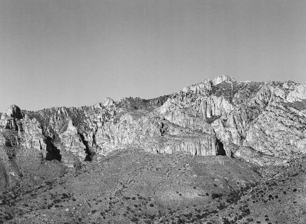
A few weeks ago I spent two quick but relaxing days in the Middle Of Nowhere, rediscovering my medium format camera with some long-expired film, then hoped and prayed for some advantageous developing defects (which can be unpredictable on old color film). Lacking traditional darkroom access and skill, I get high resolution scans of my negatives, and do all editing in the “digital darkroom” with Photoshop CS4. For the non-purist photographer, this mixed-media, mixed-era process creates a satisfying blend of traditional and modern aesthetics, while exponentially increasing one’s creative options. Guadalupe Mountains, West Texas (Mamiya 645E medium format with 80mm f/2.8 on Kodak Plus X-Pan Pro 125. Negative scan to digital, Photoshop) Marfa, Texas (Mamiya 645E medium format with 80mm f/2.8 on Kodak Portra 400UC. Negative scan to digital, Photoshop)
Read →
October 13, 2012
Notes & Advice 3: Photographs vs. Paintings
The appropriate and effective use of reference material–notably, where and how to deviate from it to actually heighten illusions, ironically–has been an ongoing commentary of mine on this blog, being mentioned in a few past entries. I consider this issue a central concern for any painter working in the realist genre, or who depends upon “fool the eye” illusions for the success of their images. I’m always trying to increase my knowledge and refine my skill in this area, as well as find succinct and poignant ways of explaining it to others. Austin-based, British-born artist Edward Povey, whom I’ve recieved valuable instruction and mentoring from over the past few years, had an interesting take on this concept in a recent email newsletter: Artists and photographers are really both image-makers. The camera truly sees, and the artists could learn from its honesty. The photographers could learn from the artists’ profound sense of composition, knowledge of color, tonal value constructions, and expressiveness–relying less on the cleverness of the modern camera. I believe that the wisest artists will be intimately aware of this dichotomy, and will strategically use the best of each world for the overall success of their images.
Read →
September 18, 2012
Wildlife In the Post-Natural Age 2
This past Friday, September 14th was the opening reception of my friend Cara ‘s curatorial debut at the WIlliamsburg Art & Historical Center in Brooklyn, NY, in which I had 2 hand-retouched photographs featured. Tonight I found a rather heartwarming email in my inbox regarding the exhibit, and thought to share it here. I’m honored to be a part of this, and I’m proud of my friend’s accomplishment: Dear Cara, the participating artists, interns, volunteers and staff members and all. I and the WAH staff members want to thank you for bringing a great show to the WAH Center. It is a big duty for a curator to put up a show as big and as excellent as this one. Cara is not only a fine artist but also a great curator/organizer who could see with her keen aesthetic judgement and logistical abilities how to bring the show to fruition. The opening was a full house with many new and young visitors all celebrating with good cheer. We would like to share with you this video of the opening reception on Youtube. Since the show still goes on for another two weeks, please tell your friends and people whom you know to come and enjoy it, as it is a worthy show that one cannot miss. Many many thanks again, Much Love, Yuko Nii, Founder & Artistic Director WAH Center (Williamsburg Art & Historical Center) “WAH means peace, harmony, or unity in Japanese” Unfortunately I was not able to attend the opening reception, nor will I be able to view the exhibit in person before it comes down, but here is the video mentioned in the email above.
Read →
September 5, 2012
Wildlife In the Post-Natural Age
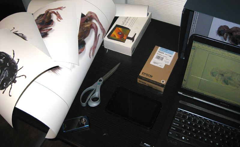
I have two recent photographs included in a group show this month at the Williamsburg Art & Historical Center in Brooklyn, NYC, called Wildlife in the Post-Natural Age. This thoughtful and gorgeous collection of work, featuring several renowned contemporary artists (who I’m humbled to be showing alongside), was curated by my talented friend Cara DeAngelis. If you’re in the Northeast and have any interest in wildlife, ecology, or environmentalism, this show is worth checking out. Cara’s eloquent press release describes the concept that inspired the exhibit: “The show focuses on work that addresses the interplay between wildlife and our domesticated selves and spaces. It probes the persistence of wildlife in American culture and individual imagination through the work of a diverse group of city-based artists. The varied works evoke a reconsideration of the term ‘wild’ in what Gary Snyder has called a Post-Natural Age, and the role that artists are playing in exploring these issues.” The photos I submitted for the exhibition are from an ongoing series of macro studio photography I’ve been working on for approximately 2 years now. These digital images are a scientific document of the myriad lifeforms I discover or interact with in my travels and adventures on Planet Earth. This project was partly inspired by the Terry Gilliam version of 12 Monkeys, a surreal post-apocolyptic harbinger, which took hold of my teenage brain and hasn’t ever truly let go. The photos below reveal some of the process of preparing my prints for display, followed by the original digital versions of the images featured in the show. Stay tuned for more images from the series, which has a working title of Specimens. At Jeff’s house proofing the images. Taking an image from digital to print for the first time is tricky–this was an all-day affair. A print emerging from Jeff’s monster EPSON 5million (ok, thats not a real model number. But it’s huge). The reds in this image proved incredibly difficult to dial in. Back at the studio with all my proofs. Hand-painting, signing, and numbering each one to make a little series of prints I can sell. No sense in throwing away all these proofs that were nearly indistinguishable from the final full-sized print. Hand painting some effects on the full-sized prints that will be mounted and sent to the exhibition. Mounted up and varnished, drying. Detail of some of my paint/re-touching effects. “Frailty (Grackle, Austin, Texas)”, photo/digital, 2011 “Gluttony (Engorged Wood Tick, Turtle Mountain Indian Reservation, North Dakota)”, photo/digital, 2010
Read →
August 23, 2012
On The Road 2
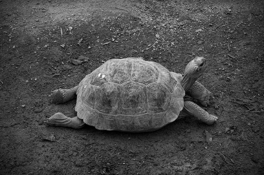
I (Canon EOS 30D, with 100mm f/2.8 macro & 50mm f/1.8 standard Photoshop) II (Canon EOS 30D with Sigma 17-70mm F2.8-4 DC macro OS HSM, Canon PowerShot SD1100 IS, Photoshop)
Read →
July 4, 2012
Photo/Digital Manipulation 2
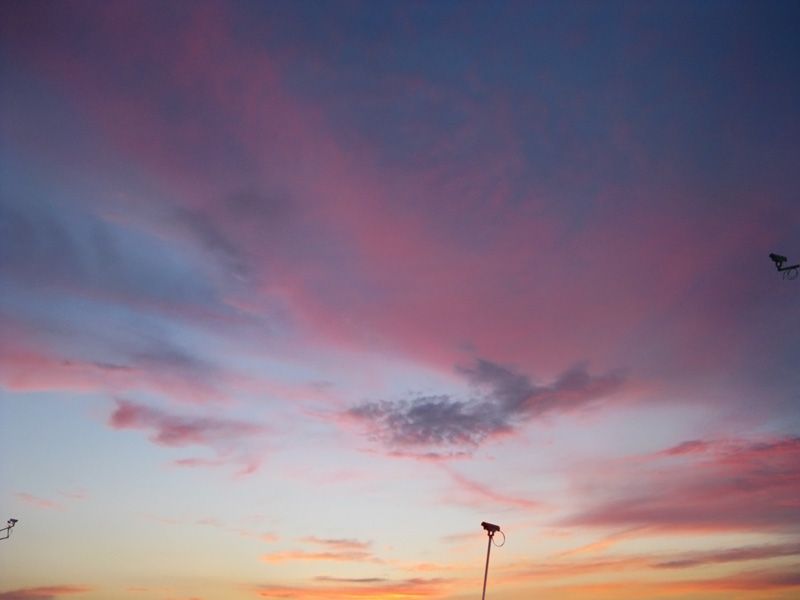
Happy Independence Day. “Postmodern Sunset”, photo/digital, 2012
Read →
January 31, 2012
Photo/Digital Manipulation
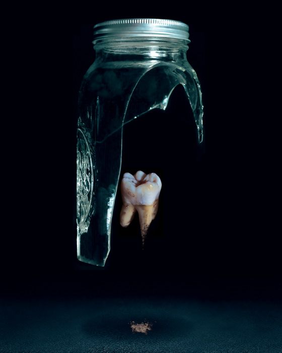
I’ve always been just as in love with photography as I am with painting. Because I paint in a highly realistic style, they’re two disciplines that go hand in hand in supporting my overall aesthetic and conceptual goals. Photography is arguably the most convincing lie of the visual arts. It intersects with cultural conditioning and social norms in a way that I find intriguing and inspiring. What I mean is, as 20th and 21st century human beings, we’ve been more or less culturally and socially trained to accept the photograph as a factual–even scientific–representation of physical reality, due to its ubiquitous use and massive omnipresence throughout our entire lives. This belief, which can approach the level of faith, presents an irresistable opportunity for manipulation of perception by illusionists and countercultural provocateurs such as myself. Long having been an artistic obsession of mine–to subvert the audience’s assumptions and paradigms–the advent of Photoshop was a digital godsend. I’ve spent years honing my craft of button-pushing and mouse-clicking in order to take my illusions one step further into disorienting believability. Whether the end result is a reference image for a painting, or a finished piece of art in its own right, the aesthetic I attempt to achieve is the same. This is how the two mediums work in concert for my overall artistic advancement. This practice of “wanting-to-be-believable” manipulation to the visual field is also quite important to my conceptual mission as an artist: to inspire the viewer to question everything, to dig deeply behind the limiting surface appearance of not only reality, but their own selves, to take nothing for granted. In this way, I hope to make my art the embodiment of one of my favorite quotes: “Art is the lie that tells the truth.” –Pablo Picasso Here’s my latest experiment combining photography and digital manipulation: "Glass & Dust", photo/digital, 2012 And a few other favorites from recent years: "Call It A Day", photo/digital, 2010 "Archetype", photo/digital, 2009 "Capsized", photo/digital, 2008
Read →